Marc Jacobs Beauty Enamored Hi-Shine Nail Lacquer in Gatsby #110 ($18 for 13 ml/0.43 fl oz) is a metallic champagne pink. It’s rich pigmented shade with a metal-like finish. I found the color to be unique compared to other metallic pinks. Gatsby has a slight mauvey tone to it. The formula was a bit difficult to work with – I found this one to be thicker than most shades that applied with a streaky finish and visible brush strokes. Once dried and with two coats applied the strokes blended out a bit. The metallic quality is a bit sharp with this one contrasting with my olive skintone. I’m not sure whether I like it or not – I’m on the fence with this color. More photos and swatches below.
In sunlight:
Swatches:
A few comparisons below to Le Metier de Beaute True Romance, Guerlain Petite Robe Noire and Chanel Violette.
Overall – still undecided. I know it’s expected that brush strokes are visible with metallics. I’m not sure if the photos captured those streaks. Gatsby is a lovely striking shade that’s neutral but with that edge from the shimmer. You can find Marc Jacobs beauty exclusively at Sephora.
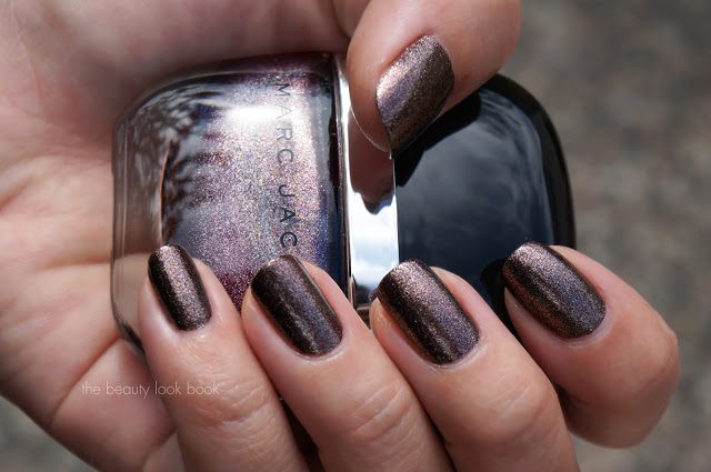
Marc Jacobs Petra #140 Enamored Hi-Shine Nail Lacquer ($18 for 13 ml/0.43 fl oz, Sephora.com) is a rich complex sparkly plum-taupe-silver. It’s one of those shades loaded with multi-colored shimmers giving a foiled metallic look (think along the lines of Chanel Graphite and Delight). Petra has a thick formula that requires a slow and steady application. You need to let the first coat dry entirely before you apply the second. I had to redo several nails as I tried to smooth out the first coat (which didn’t work too well). The finish is smooth and streak-free. It has a smooth texture and feels like one of those shades that will adhere well to the nail and last a long time.
Here it is swatched with two coats, although one coat covered the nail entirely. It’s mostly a purply-taupe on me, but looks silvery depending on how the light captures the silver flecks.
In sunlight with flash:
In sunlight, no flash:
I couldn’t find anything quite like Petra. In the store it looked like it could match a few OPI shades but when I pulled comparisons, I couldn’t find any dupes. Here it is compared to Rococo Metal Jacket, OPI Holiday Glow, OPI The World is Not Enough and Dior Aztec Chocolate (now called New World Purple). All of these shades are rather complicated shimmers. Here are 2 sets of the same shades so you can see the shimmers:
I love the color. I wish I had this in an eyeshadow and eyeliner form. I wish I had this color in my closet as well. It’s perfect for this time of year and I found it unique. It’s a beautiful complex metallic without being too glitzy. I love that Petra has a lot of purple, taupe and brown mixed into the color with a tiny bit of silver. I’m currently testing and swatching half a dozen nail polishes or else I’d have this color on my nails the rest of the month – tips and toes. Marc Jacobs Beauty is currently exclusive to Sephora.
Marc Jacobs Beauty launched at Sephora last week. I stopped by my local store to check out the line and picked three of the Enamored Hi-Shine Nail Lacquers ($18 each for 13 ml/0.43 oz). There is a wide range of colors and textures to pick from. I saw creams, shimmers, frosts, glitters and some sheers. I picked out three of the shimmery shades in Gatsby, Le Charm and Petra as my first intro to the line. I’m working on reviews and swatches as fast as I can on each shade. For now, here is a sneak preview. The bottles are so cute. They have a pull off cap and I love that the bottles feel very sturdy. Part of the display at Sephora.
The packaging and brush:
Gatsby, Le Charm and Petra close ups:
Detailed report to follow shortly. Did you check out the Marc Jacobs Beauty collection at your Sephora? Did you pick anything up? I’m all ears for what everyone has tried 🙂
By popular request, here is a simple step-by-step guide to cleaning candle jars so you can recycle and reuse them as decorative containers. This will work for most candles. My favorites to re-use are Diptyque and Henri Bendel mainly because the jars are sturdy and even if there is a slight burn on the sides, the glass is strong enough so it doesn’t leave burn marks (most of the time). I like the way Henri Bendel candles are simple and clean looking. For Diptyque, I love the oval stickers and the fact that heat from the flames doesn’t change the color or make them peel.
Tools needed:
Hot running water, paper towels and a flat-edged spoon (I prefer spoons because they are safer to use) … and of course a finished candle! The spoon below is a hot chocolate spoon from Crate and Barrel from several years ago.
Step 1: Make sure your finished candle has finished cooling. Take the spoon and carve or scoop out any wax. The hard edges make the wax easier to scoop from the bottom corners where the sides meet the base. Work around the candle in a carving motion around the sides and then on the bottom. Depending on the candle, room temperature, how much you’ve burned, you may find some waxes more stubborn than others. Having remnants is ok, we will remove in the next few steps.
Step 2: Take a paper towel and wipe down any excess burnt pieces and wax. A stiffer paper towel will help pick up some of the wax you scraped off. If it doesn’t come completely clean, not to worry. Most of the cleaning has to be done in a series steps where the jar gets progressively cleaner.
Step 3: If stubborn wax remains, fill the jar with hot water. Make sure it’s not too hot (definitely not boiling). If the heat is too high it can crack the glass. Let it sit for 30 seconds to soften the glass. Note that you can re-arrange any of the steps. I like to scrape, wipe and then fill with water to remove as much wax and burnt edge remnants as possible before adding water to soften the excess.
Step 4: Now that the warm/hot water has softened the waxes on the sides, repeat the cleaning process with a paper towel to wipe the inside completely clean. The wax should glide off easily and adhere to the paper towel. If there’s still wax remaining, repeat the above steps by adding hot water for an additional 30 seconds to soften wax and wipe clean again.
Now your candles are cleaned and ready to use for decoration!
There are a number of different ways to clean out your candle jars. This is just one I’ve found works. Some recommend freezing the jars to help the wax pop out. I haven’t tried it – if you have I’d love to hear how it worked for you. For me, I tend to leave things in the freezer and forget about them. Also using the method listed above is faster for me rather than having to wait for the jars to cool/freeze in the freezer. Others recommend pouring boiling water to soften and remove the wax – I personally wouldn’t recommend boiling water since the glass might not be strong enough to sustain the shock in different temperatures.
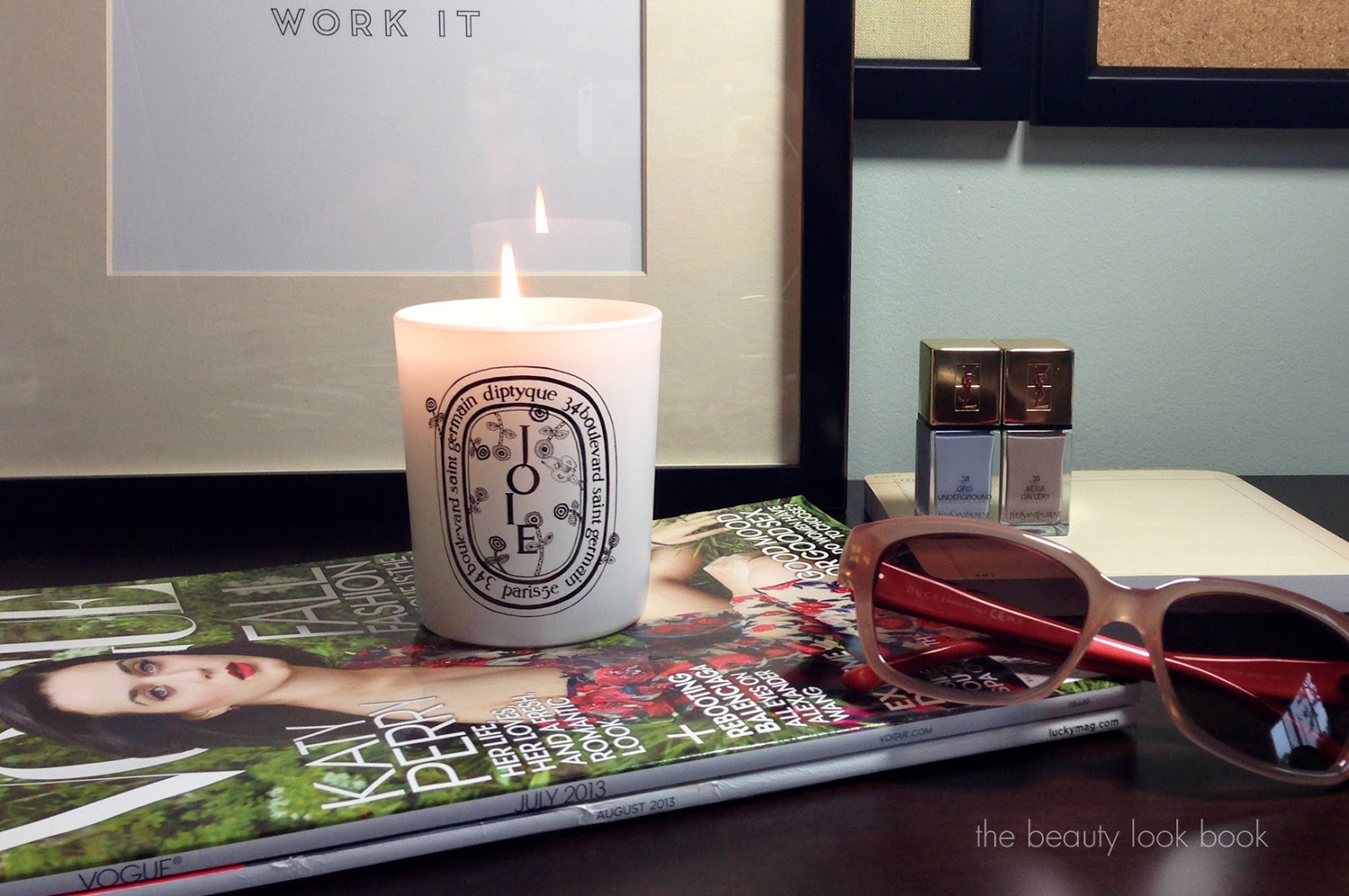
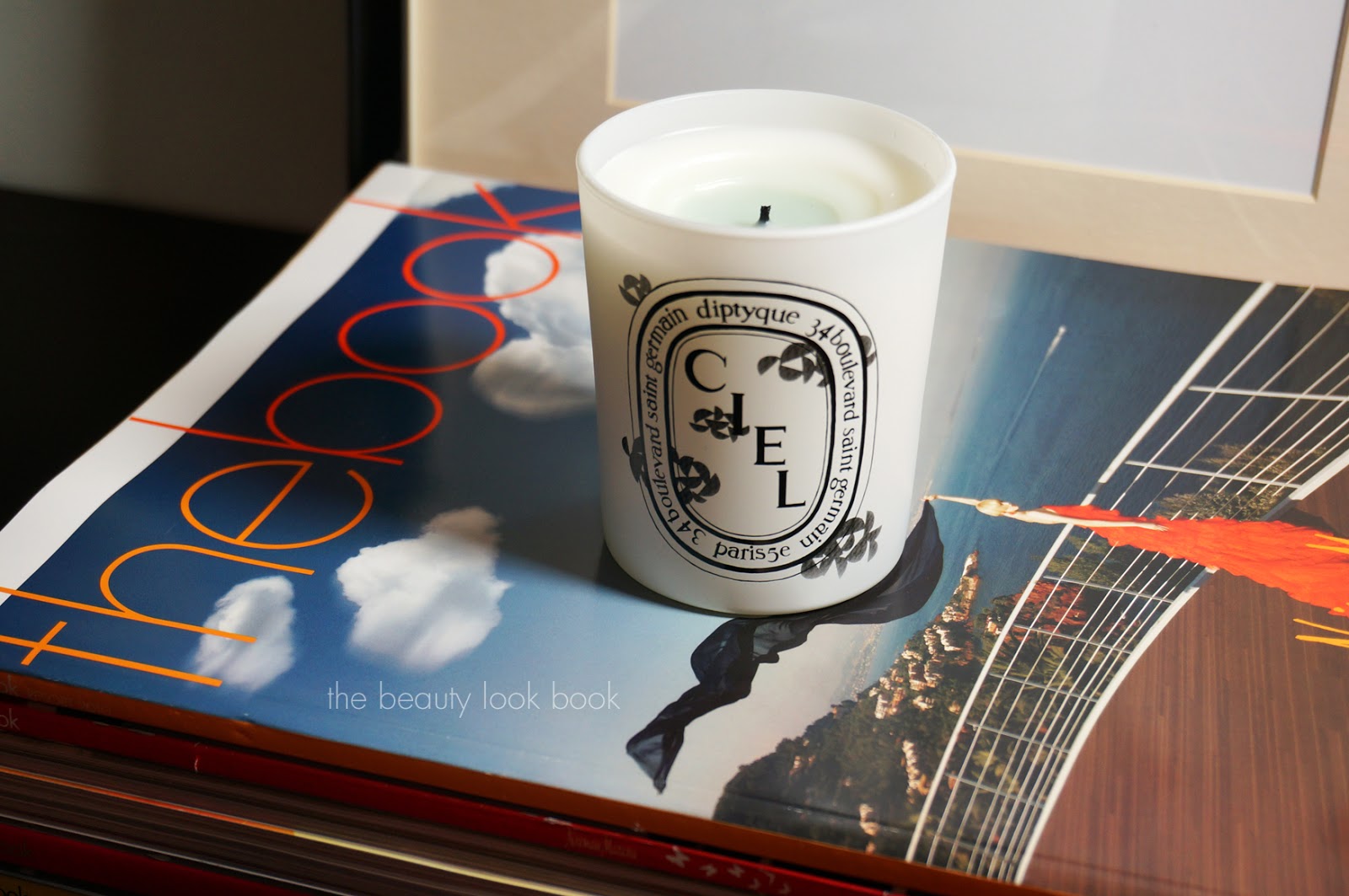
Diptyque has collaborated with Minä Perhonen to release new special-edition candles inspired by poems written by Akira Minagawa. There are three scents each encased in a beautifully designed white brushed glass jar. The three Diptyque Minä candles are Joie, Ciel and Infini ($65 each). The scents are lighter than most Diptyque candles are. I wasn’t quite sure how these would burn since I’m not typically a fan of airy florals when it comes to home fragrance but am happy to report they burn quite beautifully – both individually, or all three at the same time.
____________________________
Joie is a floral described as “a fresh floral fragrance, bucolic and delicate, with dewy and aromatic notes.” It’s a lovely fresh soft floral, not overpowering. It almost has that baby-skin feeling to the scent due to the delicate nature. It’s both refreshing and soothing.
Ciel is classified as an herbal scent described as “ice vapor, iris powder, sweet dew, an enveloping and nostalgic fragrance.” To me this doesn’t quite fit the herbal category. It’s a soft airy fragrance with a hint of licorice. This one is calming.
____________________________
Infini is described as woody, “recalls an association of woods, incense, and spices, for a mystic fragrance.” There is a green-ness to this scent. It reminds me of GAP’s heaven and dream scents (from the 90s) mixed together. It has an earthy but fresh linen-like feel.
Some decor and desktop photos of each candle, they make lovely accent pieces for the home. I love re-using the jars for brush or pen holders after they finish burning.
I found mine at Nordstrom (gift with purchase going on online) and also spotted them at Barneys NY in Beverly Hills. I love each one, although my favorite is Joie. These are limited-edition, if you can get to your local Diptyque store or counter soon to smell in person I recommend it.
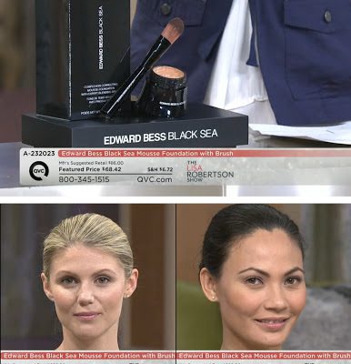
Edward Bess fans like myself were ecstatic to learn he had his first debut on QVC this past Friday on the Lisa Robertson Show where he launched his new Black Sea Mousse Foundation with Expert Blending Brush (exclusive to QVC.com). I caught the end of his appearance on TV Friday night and by that time, Fair and Light had already sold out. Edward was kind enough to send me samples to try and I was beyond thrilled. Some product information along with my testing experience, thoughts on the formula and color selection.
The Black Sea Mousse Foundation is a breakthrough mousse foundation formulated with anti-aging ingredients inspired by the Black Sea to help reduce the appearance of the visible signs of aging. It has an innovative air-whipped mousse texture that floats on the skin for the feel
of wearing no makeup at all, while still providing full coverage with
its pigment-rich formula for a flawless complexion in an instant. QVC set comes in five shades, Fair, Light Medium, Tan and Deep (1.5 oz) with the Expert Blending Foundation Brush (prices online at QVC subject to change). In case you missed the segment, you can watch the Video online (click below, models are wearing Light and Medium, Edward demonstrated application of Fair):
I’ve been lucky to have really good experiences with his Compact Foundation (I use Beige) and his new Complexion Cream (I use Medium, reviewed here). Foundation is one of the trickiest makeup items to find because of color/skintype/coverage matching preferences. I almost never buy foundation without trying first. Since this was a gift from Edward (sight unseen), as I opened my package I kept my fingers crossed.
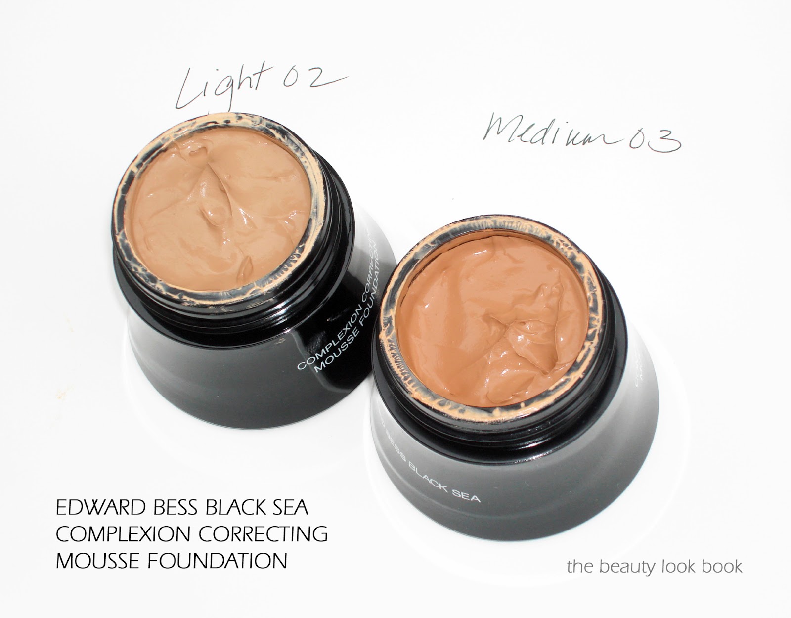
Color thoughts: When I opened up Medium 03 first and was surprised at how dark it appeared. The next shade down Light 02 also appeared quite dark. I tested both, each on separate days all over the face to see how the color looked. I was relieved to find that these blend out on the skin beautifully and once blended don’t look as dark as they do in the pots.
Light is an exact match for my skin, although sometimes that exact match ends up looking a bit too light when applied and blended all over. This can sometimes be fixed by mixing in something darker or setting with a darker powder. Medium is visibly dark on my skin when swiped, but blended out for a pretty good match as well. I wore this and it looked just slightly too dark. So what’s my color? I would say I’m in between, but closer to Light which is a 95% good match on me right now. I was happy to find that it does warm up on the skin slightly but doesn’t darken or oxidize.
Formula thoughts: The formula is really incredible. Years ago one of my holy grail matte-finish foundations was Chanel’s Double Perfection (the one that came in the black squeeze tube). I literally had a meltdown when they discontinued it and was sad they never re-released it. Edward Bess’s Black Sea Complexion Correcting Mousse Foundation is the closest thing I’ve found but better in terms of wear, texture, blendability. The video segment on QVC will show you how well this foundation covers. It’s lightweight but gives full natural coverage and dries to a semi-matte finish. You don’t need to set with any powder. On the 2.5 days I’ve tried this I found it lasted well into the afternoon without requiring any touchups. I like that it’s full coverage but not heavy.
Brush thoughts: I applied the foundation with the Expert Blending Brush and it really provided perfect streak-free application.
Photos of Light and Medium below, they look really dark in the pots:
I swatched them along my jawline on a bare face, swatched heavily, blended only a little bit. Light 02 might be a bit hard to see because it matches closely. Note this photo was taken under artificial light which makes my skin look more yellow than it is in real life.
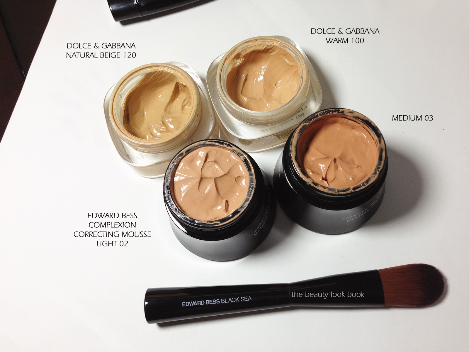
Since it can be hard to gauge the colors, I highly recommend you look at QVC’s color chart. I debated what other foundations to compare these to. Formulas and textures can impact the color and blending will affect how certain colors mesh with one’s skintone. I picked a few to show, it’s not as comprehensive as I’d like, but foundations are difficult for me to photograph accurately. They tend to dry and darken if I don’t photograph right away.
I picked the other foundations I have that are creamy pot formulas. Dolce & Gabbana’s Perfect Creamy Foundation has a wider color selection but a more dewy finish while the Edward Bess is matte. I’ve always been in between shades for Dolce & Gabbana and currently mix Warm 100 and Natural Beige 120 (see the Dolce & Gabbana review/swatches here).
I only swatched the Dolce & Gabbana Warm, but added Edward Bess’s Complexion Cream in Medium for comparison purposes (that review is here).
I’m overall very pleased with Edward’s new Black Sea Mousse foundation. The formula is really best in class with the coverage, texture and blendability. Huge thumbs up. The color selection however is limited, leaning towards the darker side. The formula is melds with your skin so it is possible that you don’t need an exact match (these days I’ve been buying 2 shades in NARS, Armani and Dolce & Gabbana anyways). I do think fairer skin ladies with yellow or olive tones might find it challenging to get a good match. Right now the foundations are exclusive to QVC.com and the lightest shades are on waitlist. I hope that Edward might consider extending the color options in the future. I was really lucky to find a good match in Light.
Did you watch Edward on QVC last Friday? Have you had a chance to try the foundation? If so please share what color and perhaps other brands/shades you use to help the rest of us who are debating whether or not to try.
This post contains a press sample provided without charge for review. For more information please see the About/FAQ section.
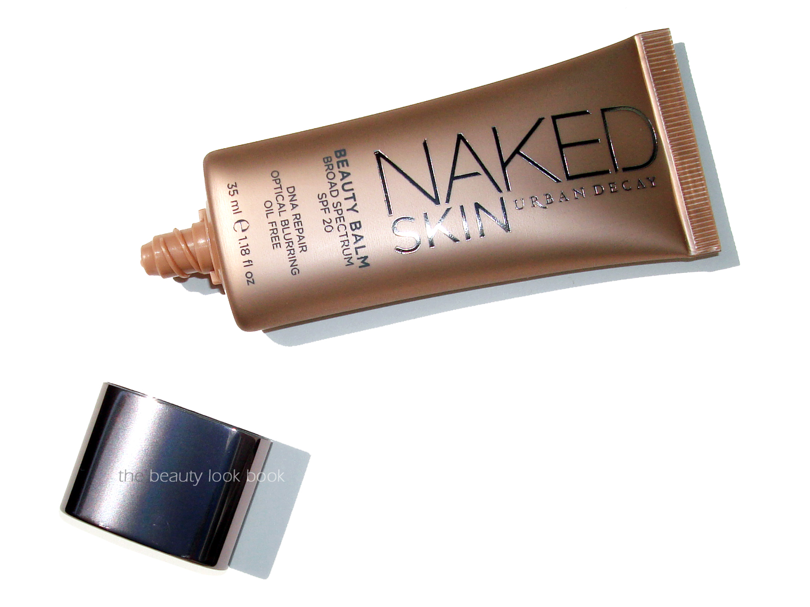
My latest skin/foundation/primer discovery is Urban Decay’s Naked Skin Beauty Balm ($34 for 35 ml/1.18 fl oz). I had been saving my Sephora Beauty Insider Points for months but as soon as I saw the Naked Skin minis available in-store, I redeemed some points for two mini 3.7 ml samples to try. I liked it so much after using a few days that I immediately ordered a full size tube from Urbandecay.com when they had their Friends and Family Sale.
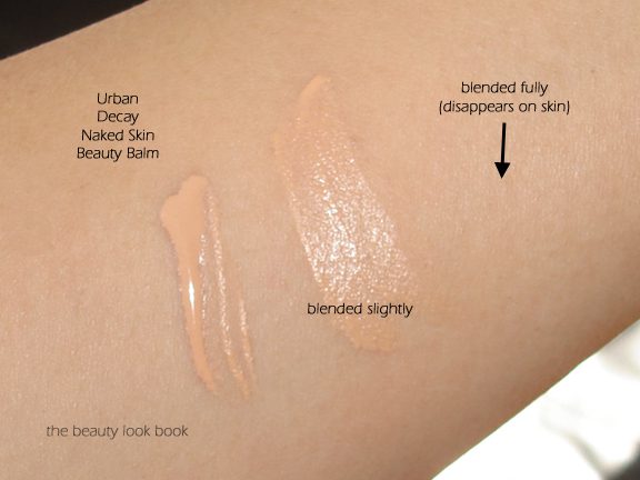
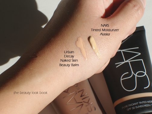
After reading numerous reviews on this product, I decided to try this as a primer, over moisturizer but under foundation. I found that the Urban Decay Naked Skin Beauty Balm has a peachy beige color but applies to an almost transparent finish. Since it comes in only one shade I was concerned about the way it would look on my skin. I have light-medium olive skin and right now use NARS Tinted Moisturizer in Alaska and Chanel’s Perfection Lumiere in B30 along with Dolce & Gabbana’s Warm 100 in the Powder and Cream. I think I’m at the right skintone where the Urban Decay Naked Balm is perfect for my skin. I’ve been using it two ways:
1) Apply moisturizer, then layer Urban Decay’s Naked Beauty Balm, then dust powder foundation on top (I like Dolce & Gabbana’s and Chanel’s): the beauty balm helps to even out and prime the skin to help the powder adhere better but apply evenly, sometimes layering powder foundation over foundation can be too heavy, but applying powder foundation over moisturizer only doesn’t give enough coverage, the UD beauty balm helps give a good in-between
2) Apply moisturizer, layer Urban Decay’s Naked Beauty Balm, then feather in liquid foundation on areas that need coverage: the beauty balm helped the overall application of foundation and also helped it last longer on my skin throughout the day
I have normal but sensitive skin, I don’t typically use primers or beauty balms. When it comes to foundation, I like to keep the layering as minimal as possible: moisturizer, foundation then powder. Adding anything else usually ends up feeling too heavy for me although I have used and loved Guerlain Meteorites Perles Light Diffusing Perfecting Primer, Chanel Le Blanc de Chanel and Chanel Base Lumiere. The results of the Urban Decay Beauty Balm surprised me. I haven’t used it a full eight weeks to test out everything such as improvement of lines, lift, smoothness. After using it for a little over two weeks now, I can say that the overall look of my skin with foundation added has improved tremendously. There is a soft slightly minty fresh scent to the balm, it seems odd, but it’s really subtle and rather refreshing. The scent disappears on me after a few minutes of wear.
Right now, NARS Pure Radiant Tinted Moisturizer in Alaska is a good match for me, you can see side-by-side the Urban Decay Naked Skin Beauty Balm is warmer/peachier, it does blend out to an almost transparent finish.
Here are the ingredients from the sample package:
For me, I was lucky to try a sample (thanks to Sephora VIB points) long enough to see how it worked. This allowed me to decide whether or not to buy. I give it a huge thumbs up. However, given the fact that it comes in only one shade, I don’t think it will work for everyone. Also note that I like it as a primer which I don’t think is the intended purpose of this, so your mileage may vary. Hundreds of people have written reviews on Sephora.com and Urbandecay.com – I found them helpful.
Did you try Urban Decay’s Naked Skin Beauty Balm? What did you think? Did it work for your skin tone or skin type? Do you have any favorite primers or beauty balms?