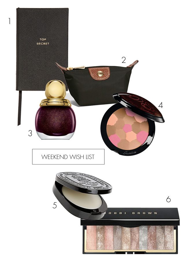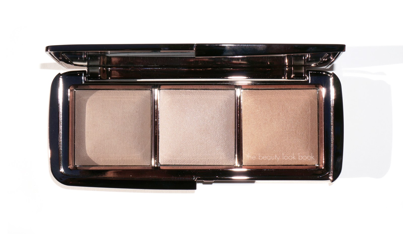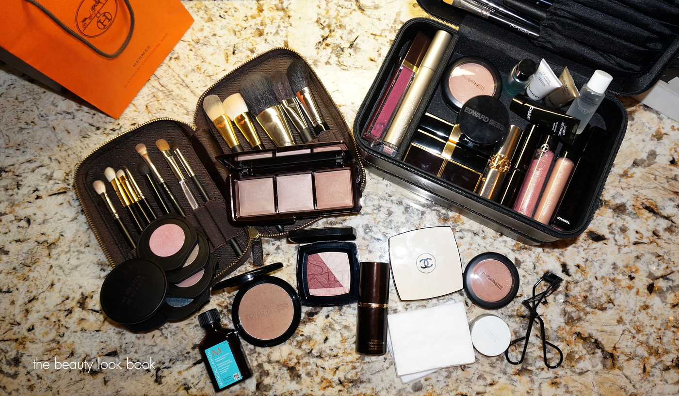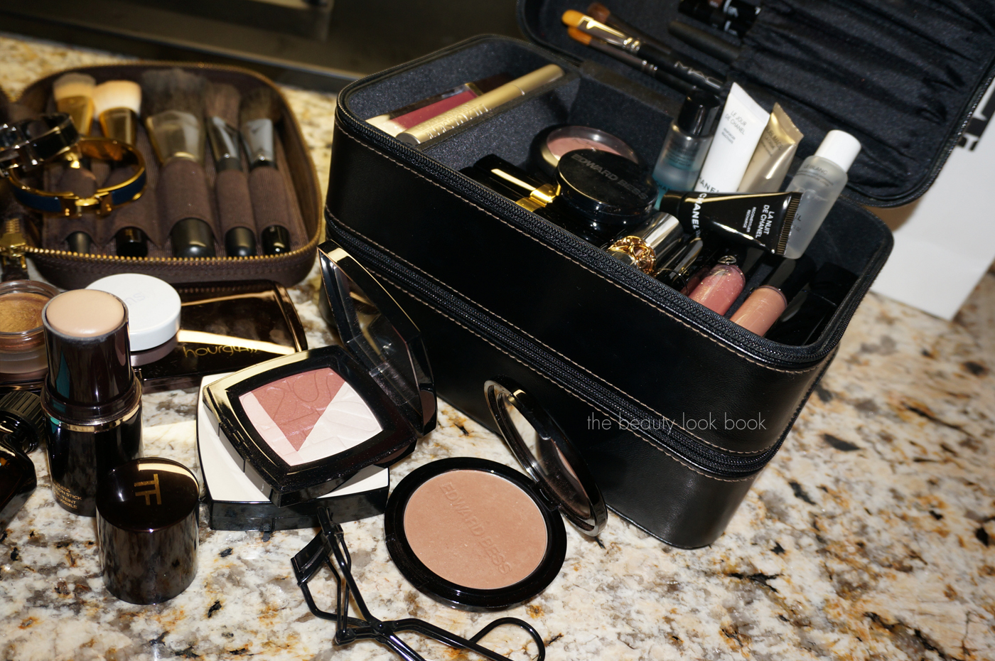
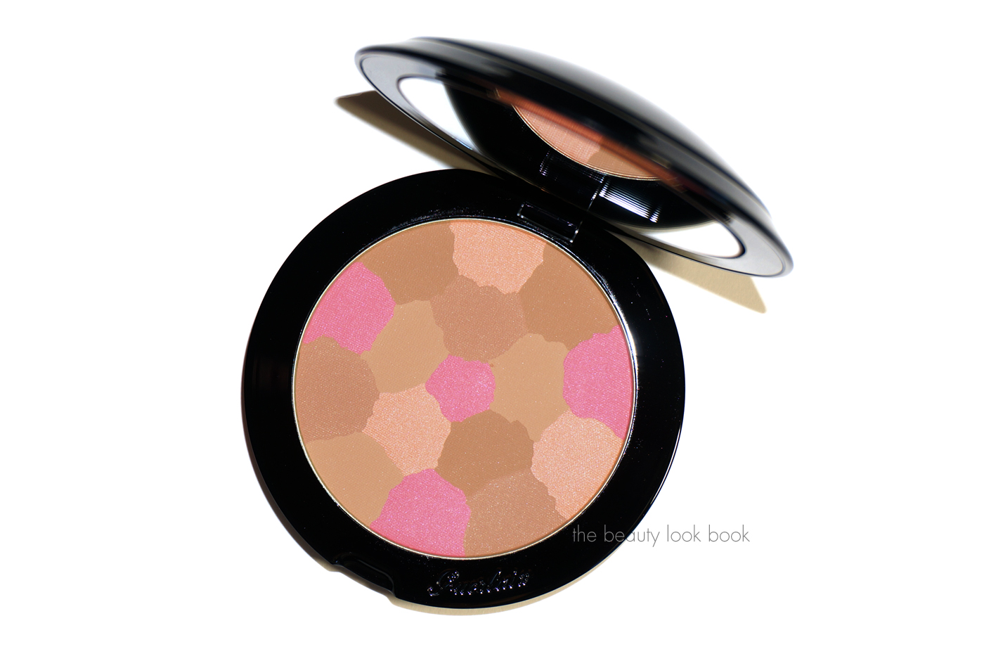
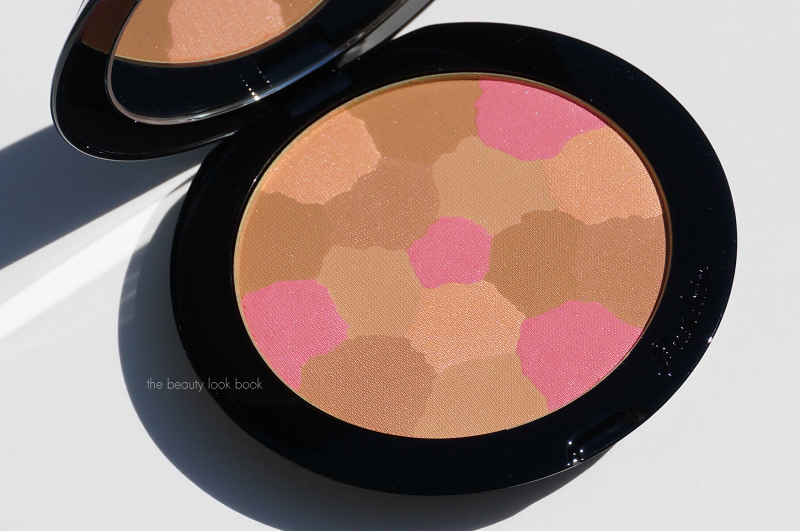
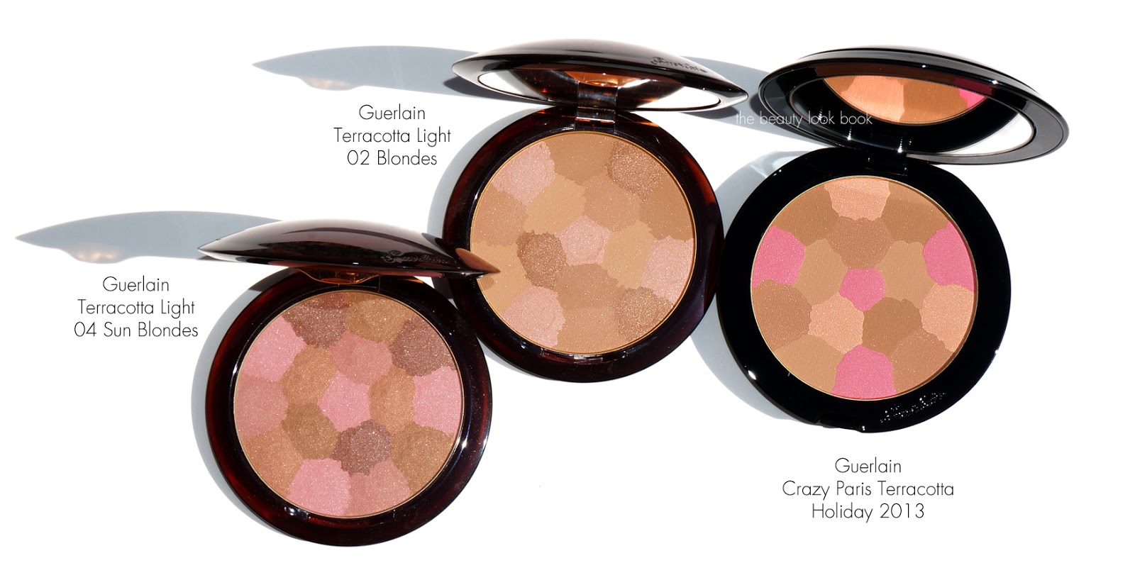
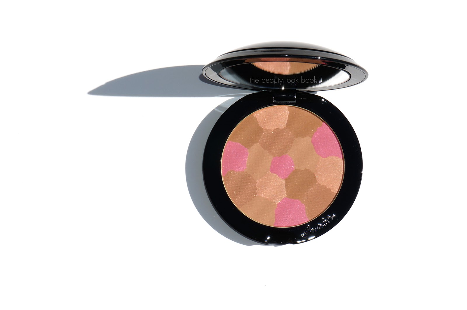
I purchased the Guerlain Crazy Paris Terracotta Bronzer ($69 for 10g/0.35 oz, limited-edition) while traveling in San Francisco a few weeks ago. The mix of pink, peach and bronze was just so pretty it was nearly impossible to pass even though I have enough bronzers to last at least 10 lifetimes. When swirled together the powders create a soft peachy bronze glow. The pink portions are very subtle when mixed with the other colors but it makes this bronzer apply more like a soft nude blush rather than a traditional bronzer. There’s a good mix of matte and shimmer in this that it makes the skin glow. It reminds me of the Chanel Soleil Tan de Chanel Bronzer from 2012 in the sense that it makes a nice non-traditional bronzer. The mix of pink and peach prevents it from looking muddy on the skin.

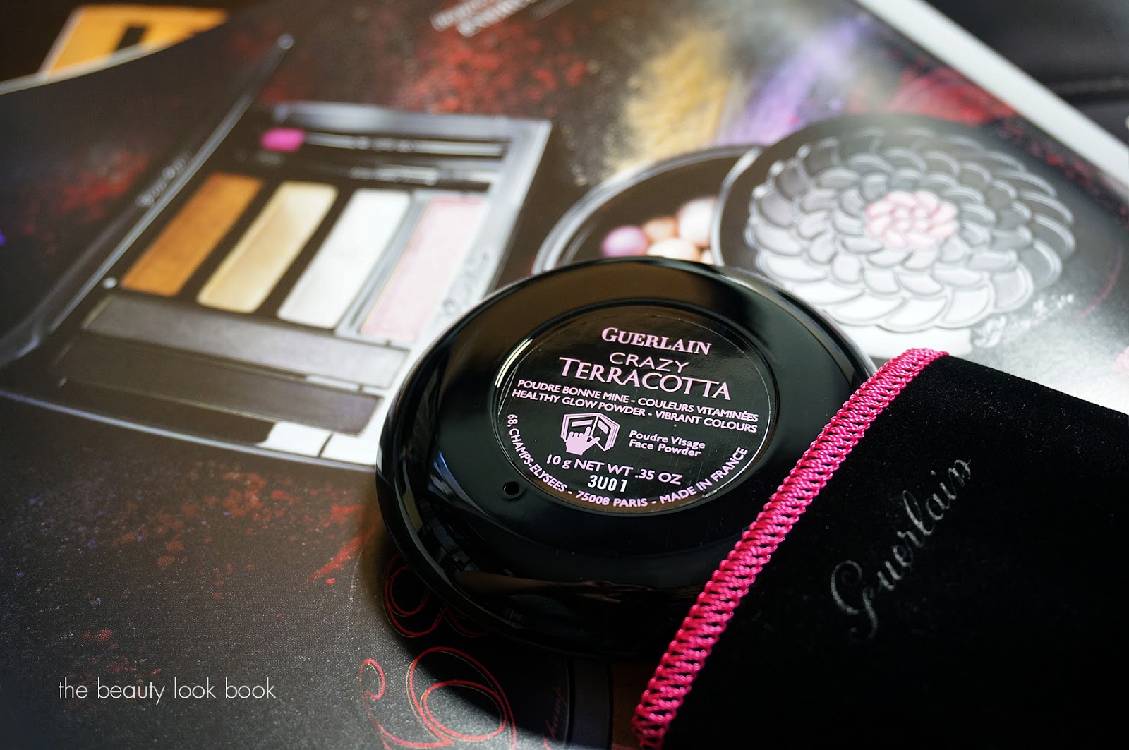
The Guerlain Crazy Terracotta comes in a little black and pink pouch. The compact is quite heavy and domed at the top.

The bronzer under artificial light:
Closeups:

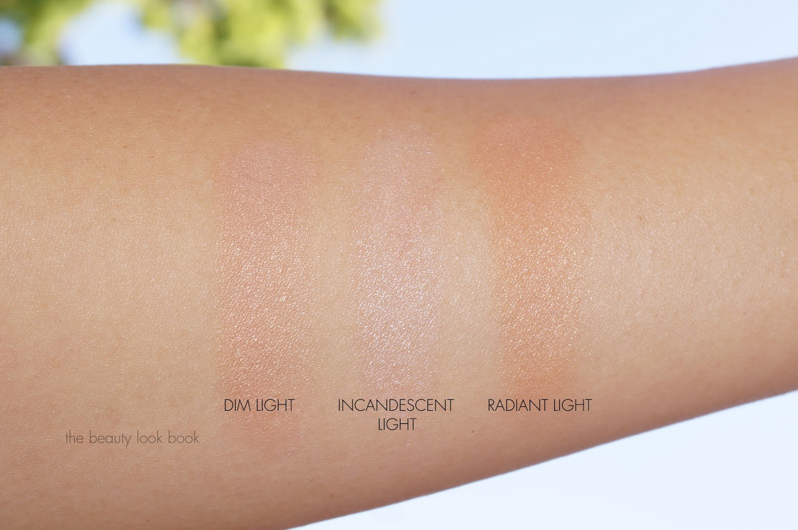
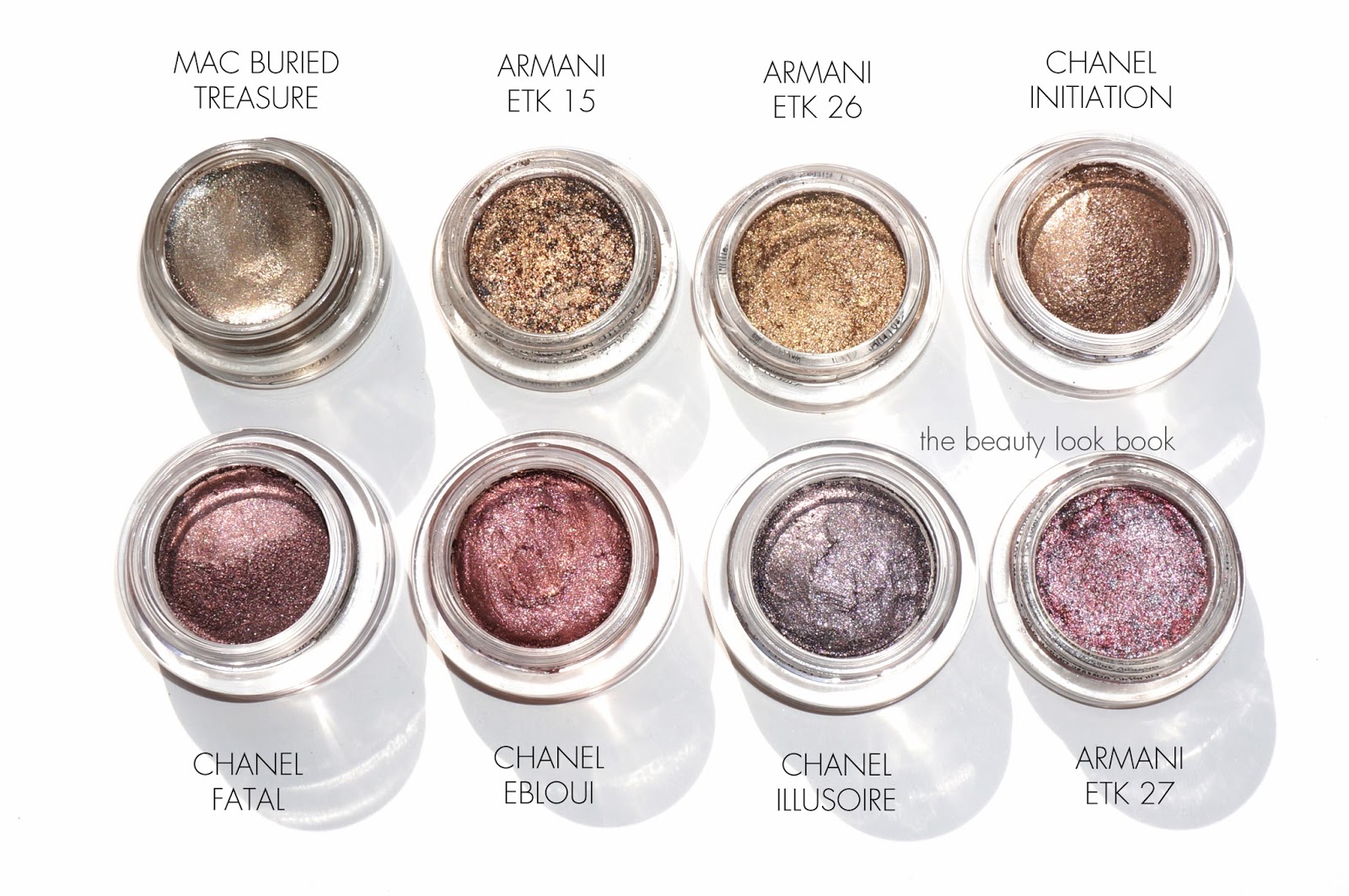
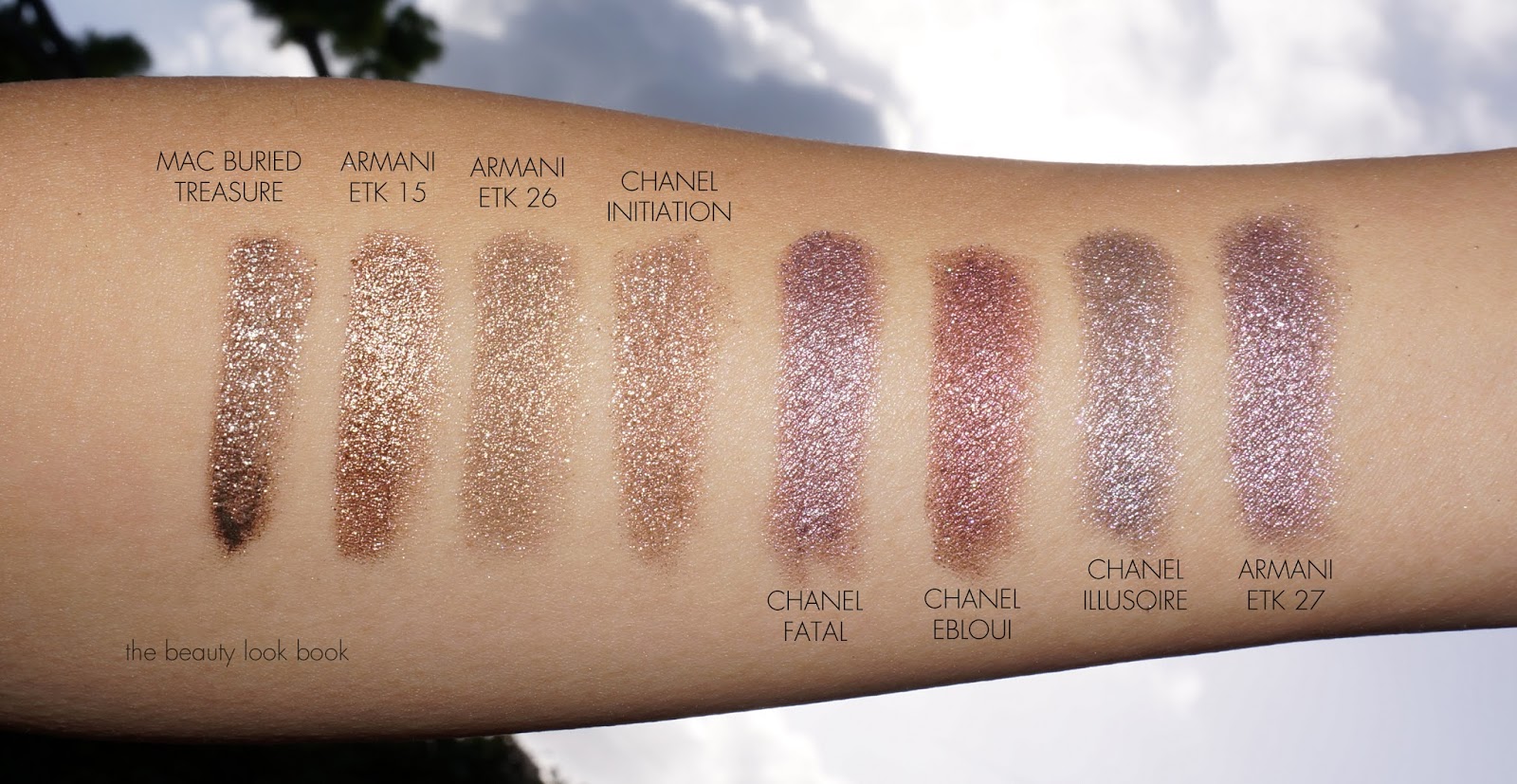
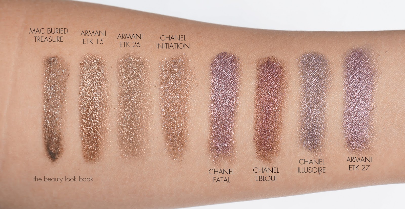
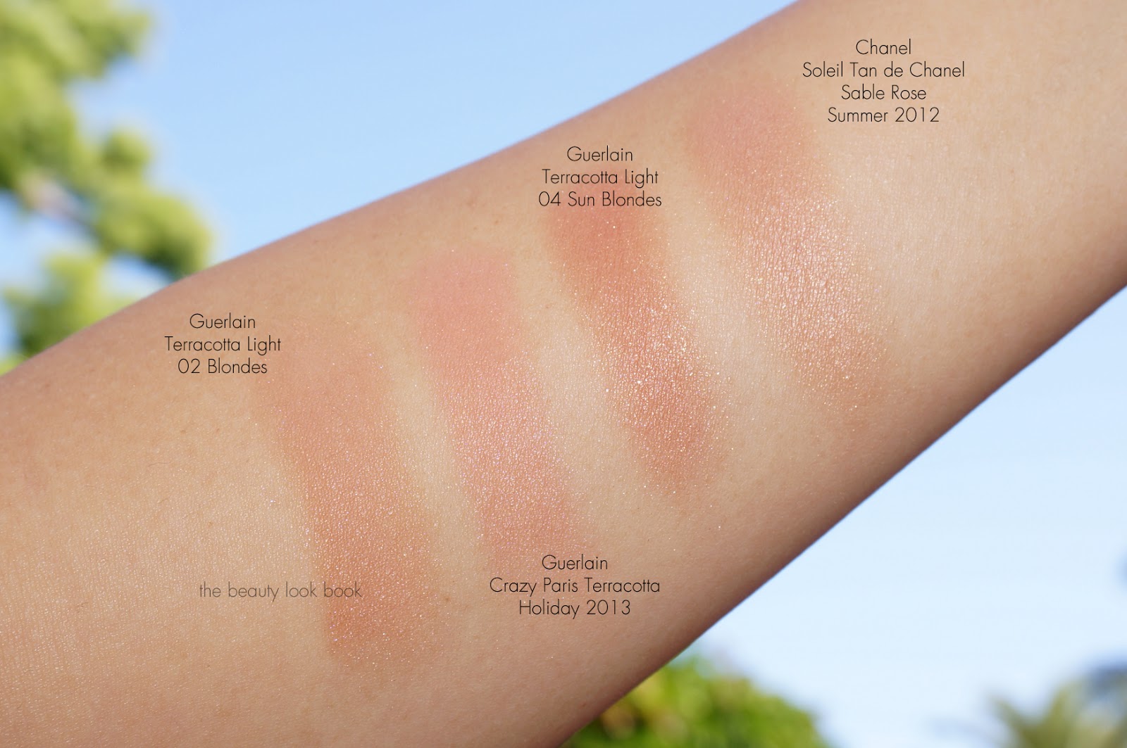
Swatches:
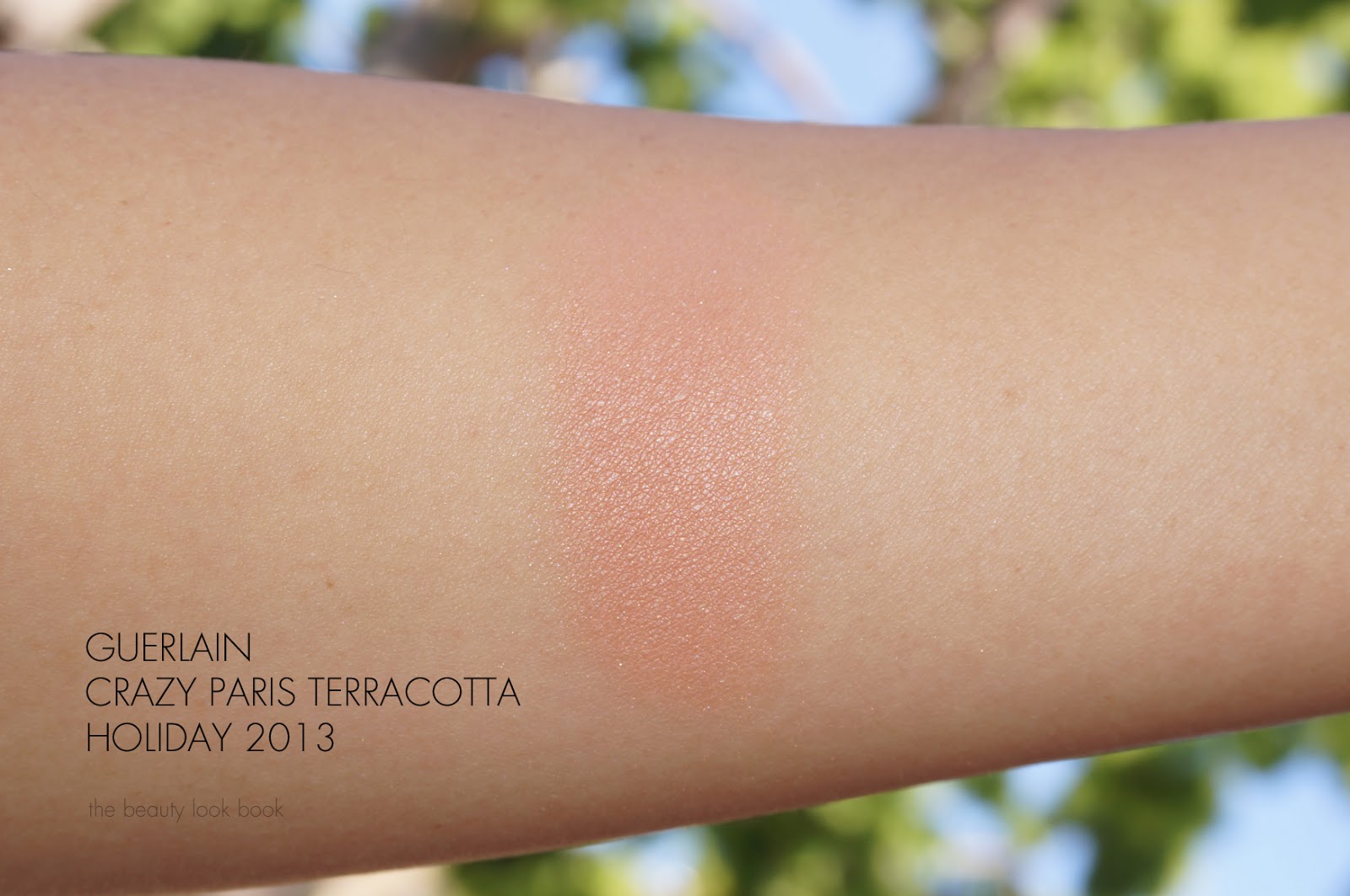
You can achieve a similar effect with regular peachy blushes however the mix of colors in Guerlain Crazy Terracotta gives a glow with some depth. This is hard to achieve with other regular blushes. The pink adds a unique touch of pink/peach when mixed with the shades of bronze. It has shimmer but it’s not quite as shimmery as the Guerlain Blondes or Sun Blondes. I’ve also swatched next to Chanel Sable Rose (from 2012) below.
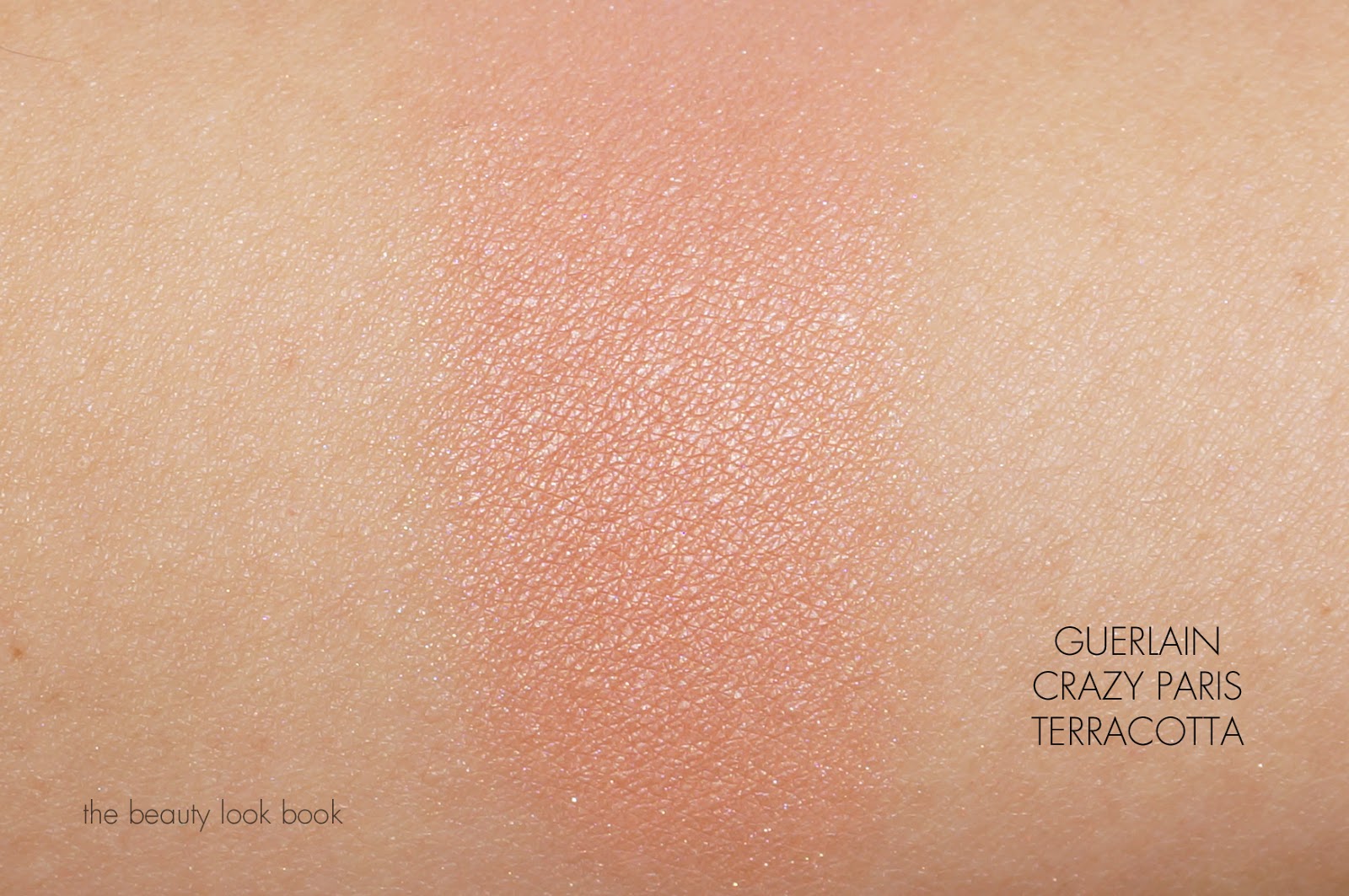
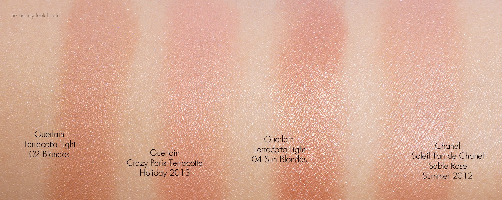
Swatched with a heavy hand:
Overall a lovely glowy bronzer. It shows up well on my light-medium skin in a natural glowy way. I love it on the cheeks as a blush. If you have a lot of bronzers you can probably skip this – for me any face product with a hint of pretty pink mixed in is hard for me to pass. The glowy nature of this bronzer is enough for me to call it a must-have. You can find it at Guerlain counters now for a limited time, online at Nordstrom, Saks and Sephora.