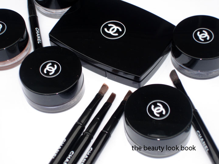
Thanks to Becca for the question: How do the Spring Ombres Perleés de Chanel compare to the new Illusion d’Ombres for Fall?
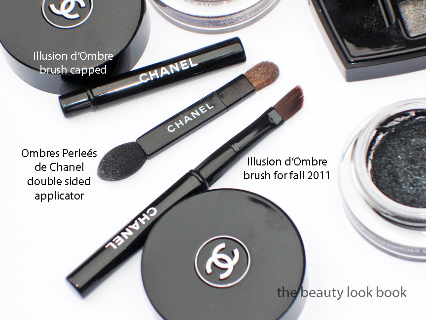
Price: The Spring Ombres Perleés de Chanel retailed for $65 (see my review here) and was packaged in a black mirrored compact. I searched online and it appears to no longer be available for sale anywhere. If you’re still looking for this I highly recommend searching instore to see if they still have stock. (Do it now before they are gone forever!) The Fall Illusion d’Ombres retail for $36 each and come with a capped angled brush.
Texture: The Spring Palette is softer and smoother in texture with a slightly powder feel. The Fall shadows are stickier in texture, mainly because of the jelly-gel like consistency. They are not sticky upon application though.
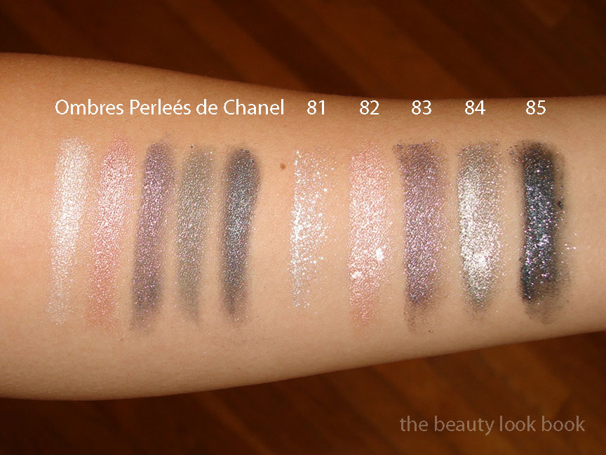
From what I see (might not translate to what you see on the computer screen):
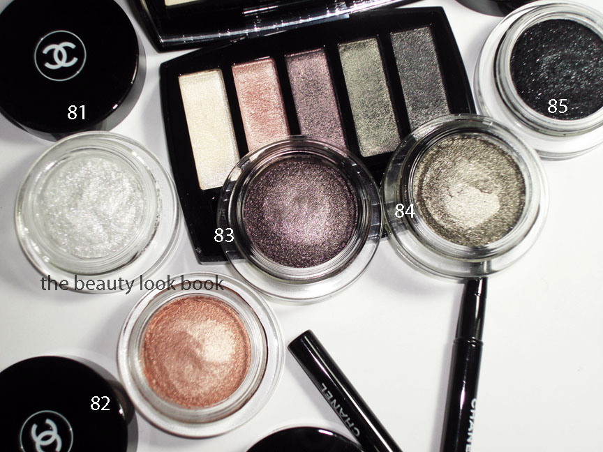
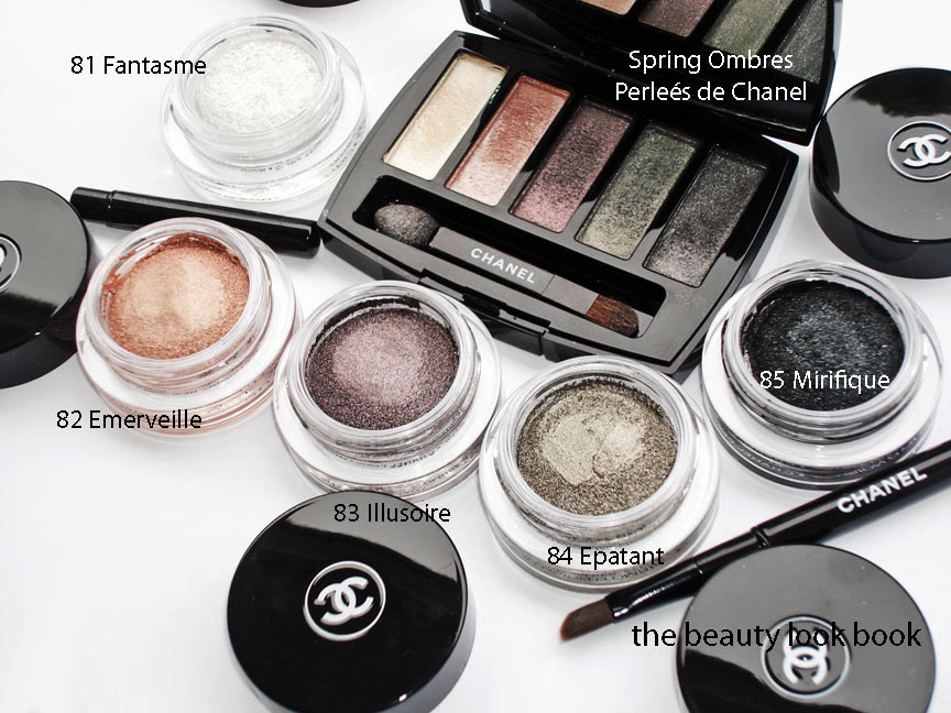
Spring White is a pearly white, cool-toned
Fall 81 is a brighter white, even more cool, with glitter flecks/chunks
Spring Pink/Peach is a pearly frosted pink with a slight hint of peach
Fall 82 is a straight peach, but on my skin looks strikingly similar to Spring
Spring Purple is a complex fusion of purple, red, blue shimmers
Fall 83 is a straight purpley-grey shimmer, almost lilac, no red
Spring Green is a multichromatic green that flashes pink, dark green, light green (no silver)
Fall 84 is a khaki silver, no pink tones, more metallic, more silvery
Spring Blue-Grey is a blue-grey smokey shimmer, also complex
Fall 85 is a black with blueish tones and big silver chunks
Pigment and Shimmer: I found the Spring Palette to be high-shimmer, but is more finely milled and luminous. The Fall shadows are high-shimmer and highly metallic with visible flecks of sparkle. They are more chunky. Pigment of both are layerable and blendable for either a sheer or pigmented look. I would say the Fall Shadows have the ability to be layered for a more intense look though (emphasis on intense).
Lasting Power: As mentioned in my previous post, I have not yet had a chance to test lasting power of the fall shades. I found the lasting power of the Spring Palette to be medium-wear. It did not last the full day from 6 am to 8 pm, but it did last well into the afternoon.
Application: I used fingers for the spring palette. For the fall shadows, I prefer the brush since it helps pick up more color and allows for more control.
Swatches in different lighting/angles/etc.
The colors: Are the colors the same? I would say no. They have similar undertones. The shimmer blinded my camera and when you add the cloudy lighting, it was hard to get an exact photo. The Spring Palette shimmers are multi-colored. The Fall shadows are metallic with different intensity of flecks and sparkles but not quite as multi-colored as Spring.
Overall: I personally prefer the Spring palette by far. While it might look untouched, I’ve actually used this palette on a regular basis with my fingers. (Finger application seems to smooth out the surface.) I had ordered everything from Fall sight unseen so I didn’t really know what to expect. I know these won’t make me look like the models on the Chanel runway, but I couldn’t help being completely blown away by the gorgeous looks Peter Philips created for the metallic smokey eyes. How could I resist trying these?
I will need to experiment more with the new Illusion d’Ombres to find an application technique that is wearable for me (as in not-too-metallic). I think they are definitely worth checking out. Even if they don’t seem to be “you” (they aren’t very “me”) it’s always nice to try something different once in a while, even if it’s just for fun.
Availability: I bought mine from Bergdorfs. The whole collection is on Chanel.com. I haven’t seen it anywhere in-store on the West Coast although I suspect any day now. Last year Fall hit stores on June 27th. (No, my memory isn’t that good, I just looked at my archives.) From what I heard last time I checked my local Nordstroms and Macys – all sales associates said “sometime in July.”
And to answer 1 more question: what camera do I use? See this post here.
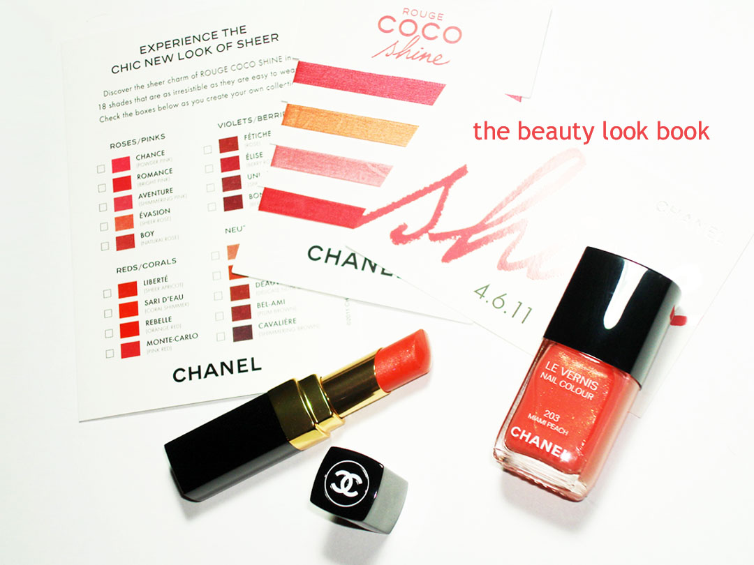
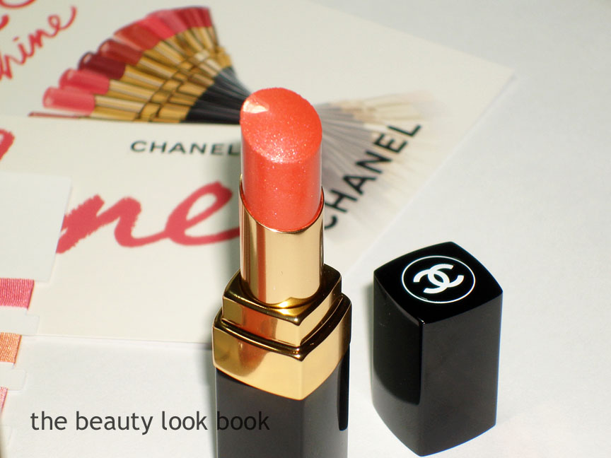
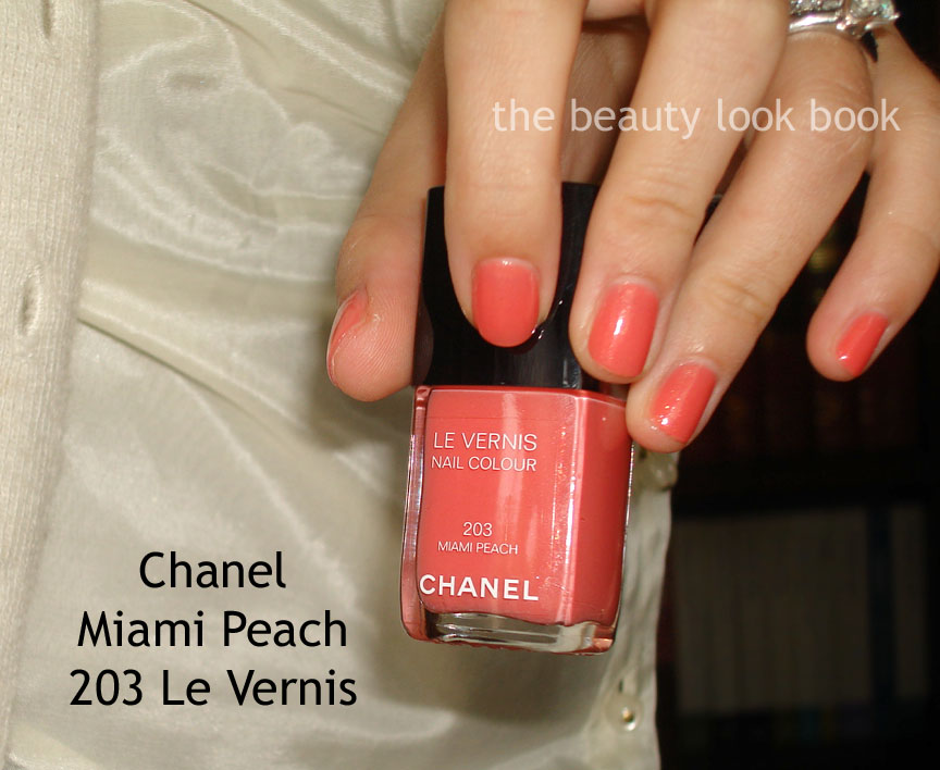
Chanel Rouge Coco Shine was launched in the US yesterday. I stopped by Neimans to pick up the two exclusives: Rouge Coco Shine in Misia 45 (bright tangerine with a silvery sheen) and Le Vernis in Miami Peach 203 (repromote from years past but exclusive to Neimans). Both are perfect for summer.
Miami Peach & Misia (click picture to see the shimmers better):
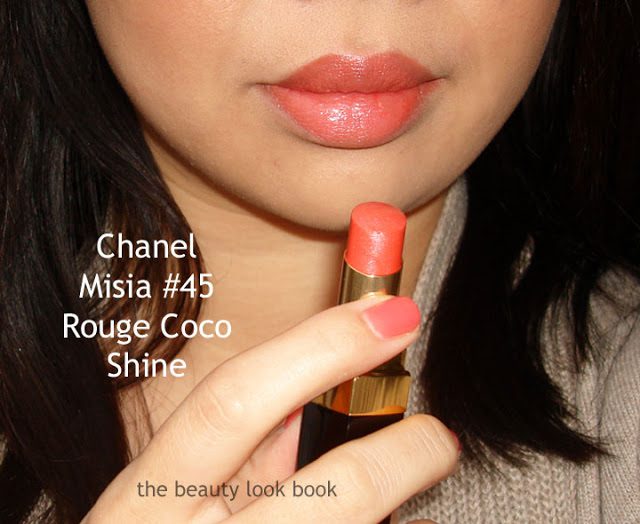
Rouge Coco Shine Misia 45 is a bright tangerine with a slight silvery sheen. It does have shimmer but on the lips it doesn’t really show the frost. It glides on like a lip balm. Texture is sheer but since this is a brighter color it does show up on me. I do need a few swipes on the lip to get it to show. I’m unsure of the lasting power of this. I’ll report back later when I review a few of the other shades. It does feel weightless on the lips and moisturizing. It’s an easy to apply color with a flawless glowy finish.
Two swipes each lip (taken early morning, I think the lighting makes me look darker than I really am):
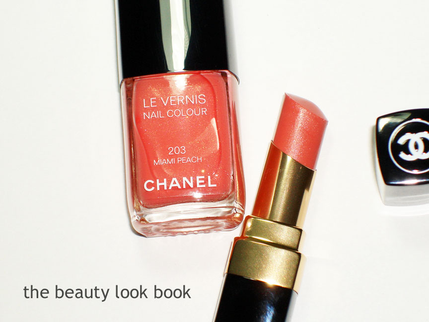
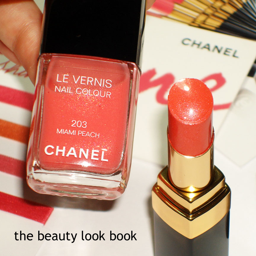
Miami Peach 203 Le Vernis is a repromote. It’s a soft but bright coral with a slight hint of pink. It has tiny bits of gold shimmer but you can only see it on the nails in direct light. It applies like a jelly color – slightly transparent. I asked for 3 coats because I wanted more color but 2 coats was just fine.
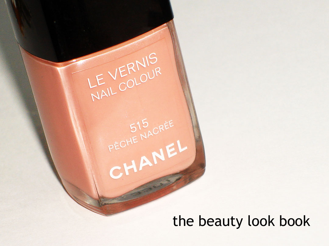
Chanel’s summer collection is due to be released very soon, but I still can’t get enough of the Spring 2011 Le Vernis shades (all nail polishes featured, reviewed and compared here in Dear Chanel, I Love You!). I’ve worn Black Pearl 513 on numerous occasions on tips and toes since December and I’ve worn Pearl Drop 511 twice.
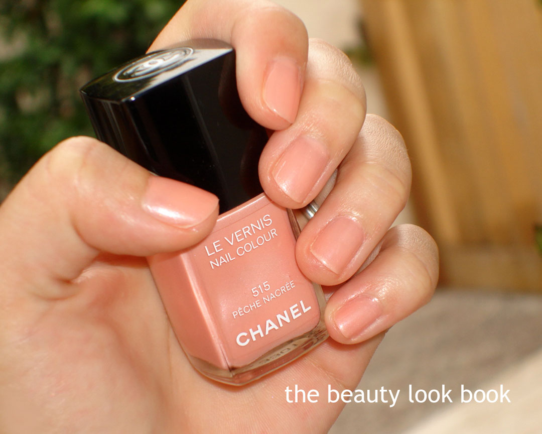
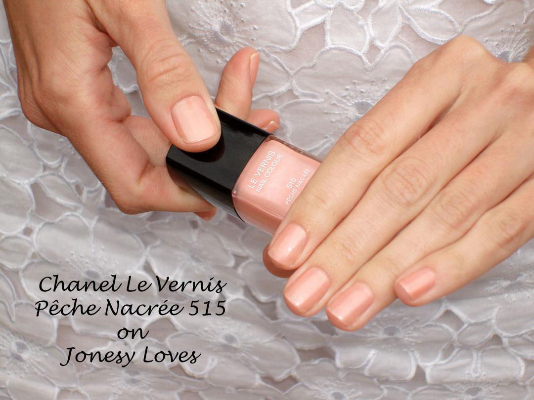
Right now, Laura from Jonesy Loves and I are both smitten with Pêche Nacrée 515, a beautiful soft luminous peachy pearl that has the perfect balance of shimmer and cream. We got matching manicures this weekend after a scrumptious lunch. It was the perfect way to cheer up a gloomy cloudy day.
Below is what it looks like on me (two coats and it just glows):
Here it is on Laura who is fairer and cooler than me (Chanel Pêche Nacrée went with her white dress perfectly, see her full dress here):
On me (left) versus her (right), both of us had two coats applied, I like it better on Laura:
Bottom line: We can’t stop staring at our nails! It’s subtle but polished. Plus we’ve both agreed that nobody beats Chanel Nail Polishes with their perfect color, texture and sheen 🙂
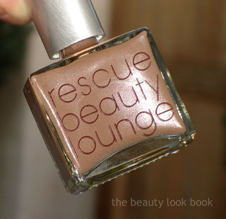
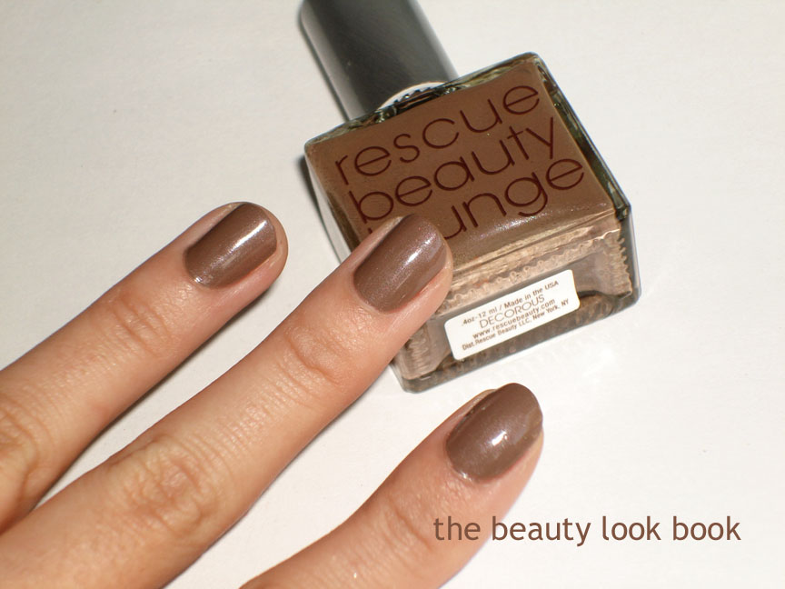
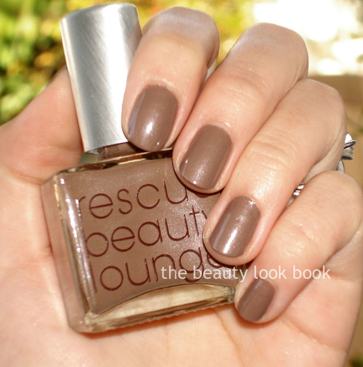
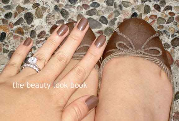
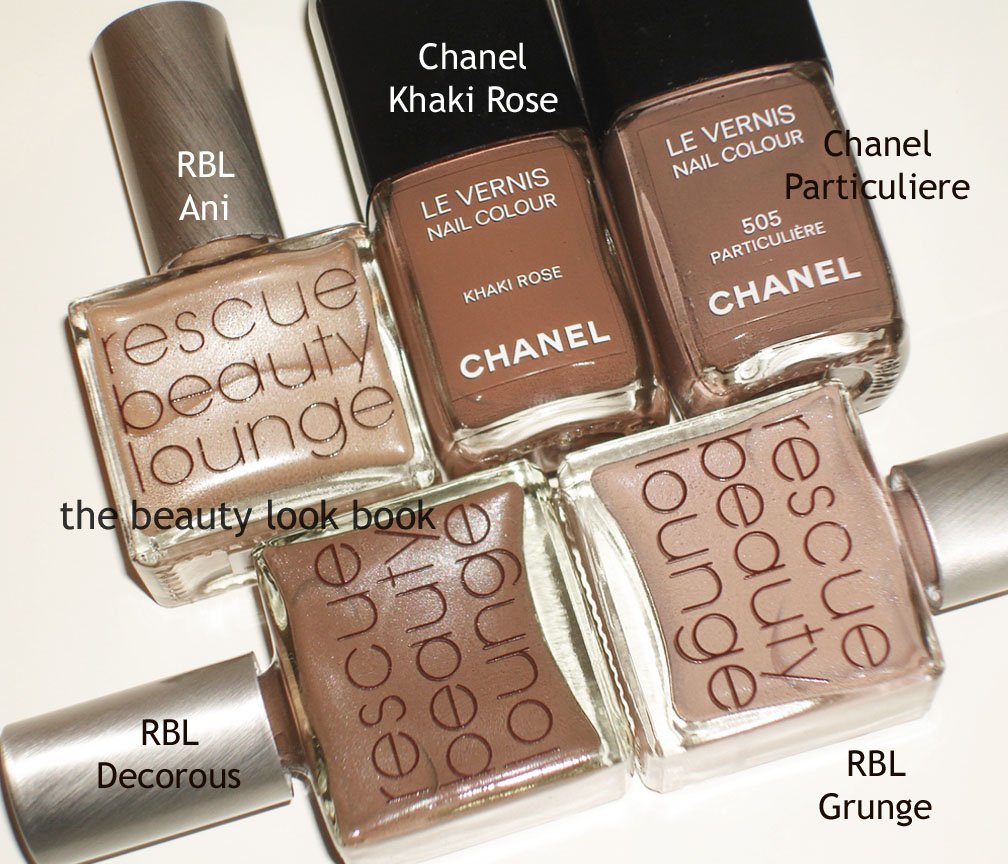
Here is RBL’s Decorous. Two coats to achieve a creamy cocoa brown with a slight sheen. I loved it on Gaia of The Non-Blonde, Temptalia and KarlaSugar. On me, not so much. I think it’s better as a toe color for me. Much like Butter London’s All Hail McQueen – pretty in the bottle, not so flattering for me with my olive tones. Comparisons below. I found it unique in my collection and couldn’t find any dupes – but I don’t have many browns for nail polish colors. I like that it matches my J.Crew flats in Coconut Shell though 🙂
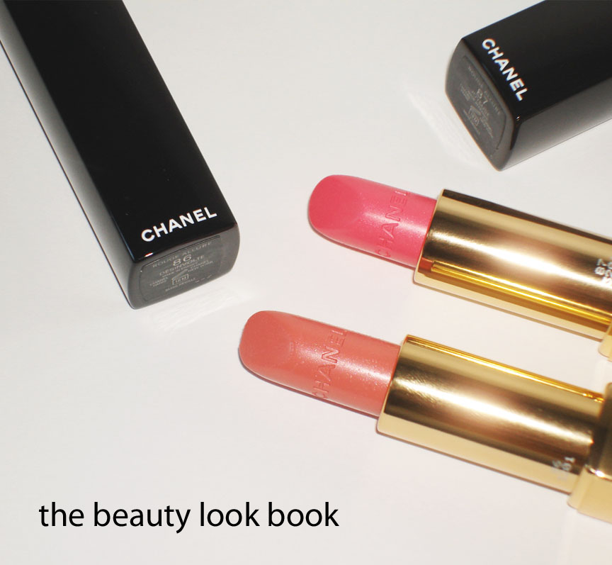
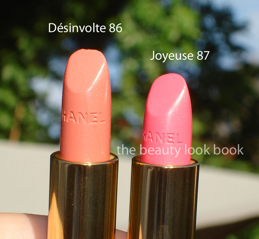
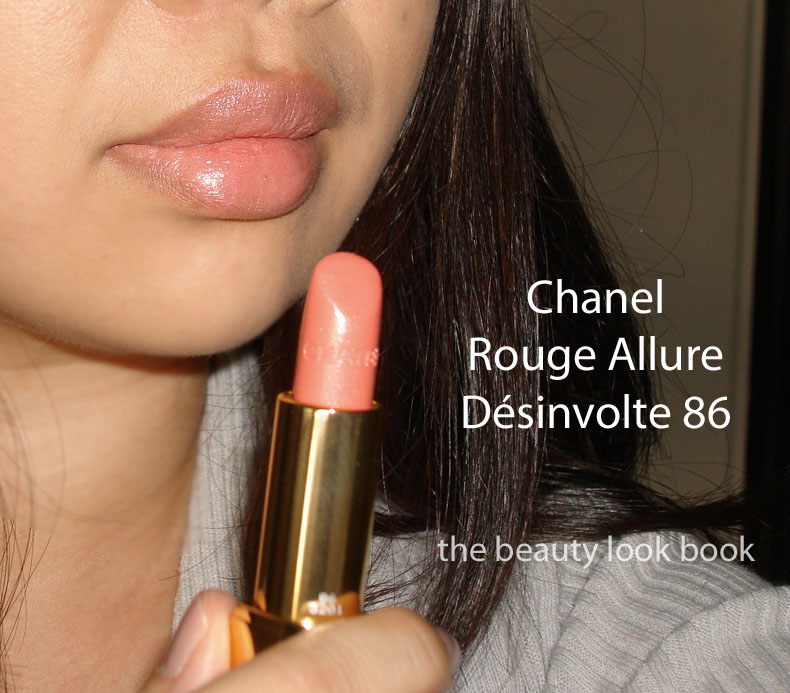
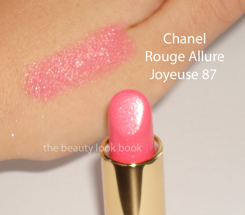
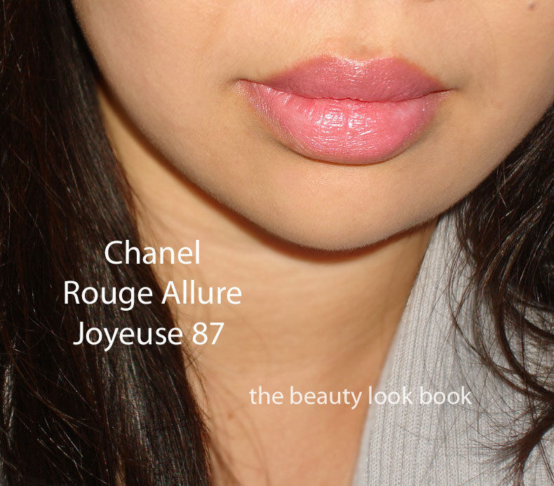
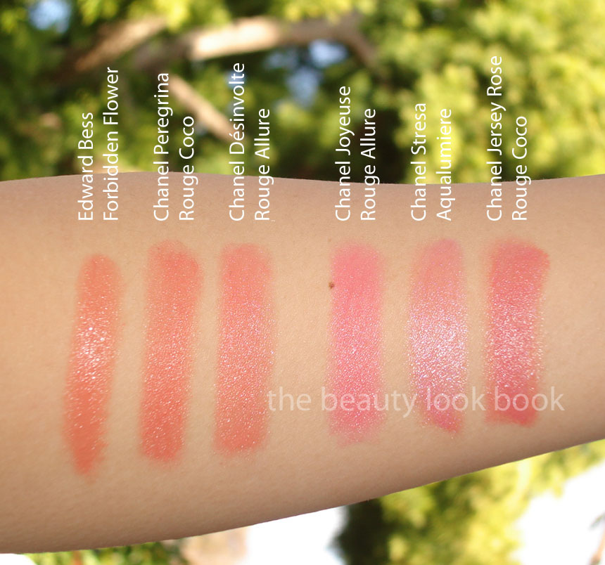
This will be my last Chanel Le Blanc feature. Rouge Allures Désinvolte 86 and Joyeuse 87 are beautiful combination of bright and fresh. Désinvolte is a soft pinky-peach with a soft sheen. Joyeuse is a sheer hot bright pink. Both go on with a natural sheen and fairly sheer on my lips. These are of the typical Rouge Allure texture – smooth, soft and creamy.
Désinvolte looks like a straight soft peachy-apricot in the tube, however it goes on very sheer on my lips and looks like a pinky-peach than peach. See the hand versus lip swatch. There is a soft silvery sheen to the color which I think is why it goes on so sheer. Due to the limited nature of these I know many of you are wondering if there is anything similar. For Désinvolte, I would say yes. It reminds me of a softer/sheerer version of Chanel’s long discontinued Lola Hydrabase. I think MAC has made quite a few Lustres with a similar finish. Compared to Peregrina Rouge Coco from Spring, Désinvolte is similar but softer.
Joyeuse is a cool bright hot pink with a soft sheen. I love it. For me it’s hard to find a cool hot pink that doesn’t look blueish on my lips (since I have a lot of olive). This one is hard to dupe in my opinion. NARS Venice is significantly more frosty, NARS Roman Holiday is significantly more pastel, MAC’s bright pinks are all a lot more sparkly or opaque. Compared to Jersey Rose, it’s a lot cooler and sheerer.
Here are my comparisons to the peach and pink Rouge Cocos from the Spring 2011 Collection (previously reviewed, swatched, and compared here) plus a few a few more.
Edward Bess Forbidden Flower
Chanel Peregrina Rouge Coco
Chanel Désinvolte Rouge Allure
Chanel Joyeuse Rouge Allure
Chanel Stresa Aqualumiere (discontinued)
Chanel Jersey Rose Rouge Coco
As of now, I believe these two are still exclusive to Asia. The Chanel Beaute Studios I called have said no, they will not be receiving anything from the Le Blanc collections. I have not contacted Chanel.com to inquire about it though. If you don’t want to scour e-bay or have a friend in the Asia regions able to do a custom purchase, you might want to keep your eye on Izzy’s Perfume & Beaute Shoppe, I know in the past they have carried Asia/Europe exclusives from Chanel and Dior. (Not affiliated with them and FYI they have their own prices that are higher than US retail.)
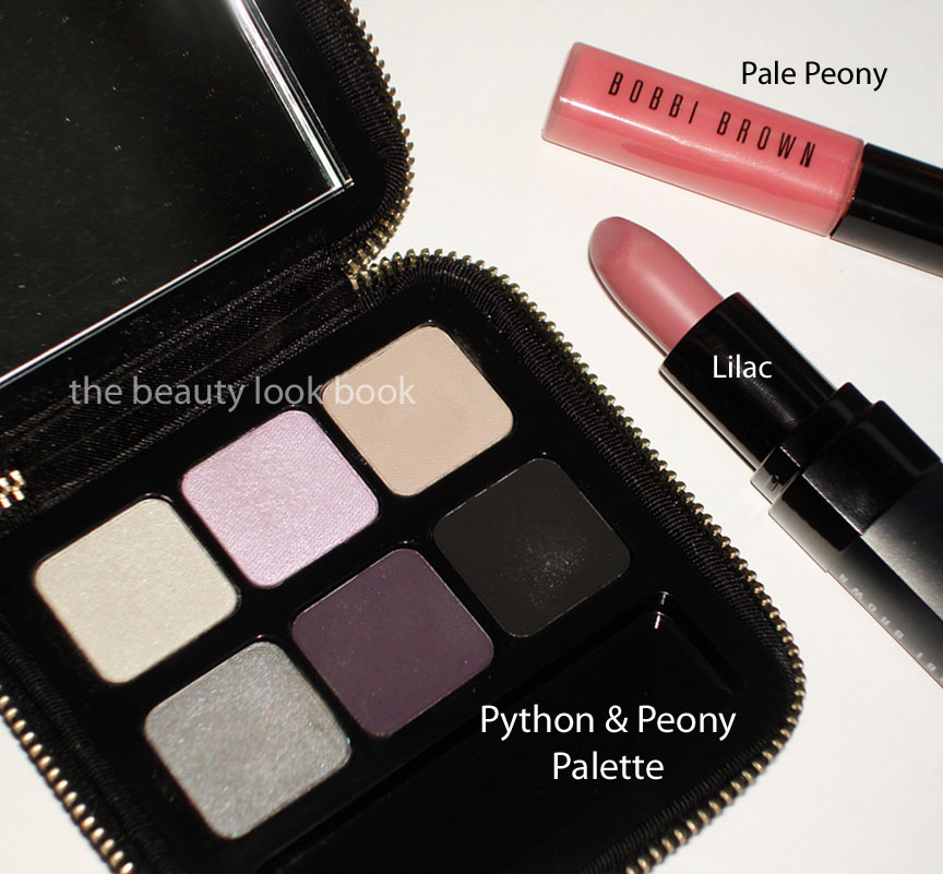
Here is the second installment of the Bobbi Brown & Tibi collaboration, new for spring 2011. We got our first sneak peek with an exclusive set from Neimans Preview Set (reviewed here). I finally had a chance to see the other items in the Python & Peony Collection and fell in love with the new eyeshadow palette, Lilac lipstick and Pale Peony gloss.
Lilac Rich Lip Color has previously been reviewed and swatched here. To recap, it’s a lovely lilac-pinkish cream color. It’s on the neutral-cool side, but not too cool. Beautiful full coverage, soft lightweight but creamy texture, long lasting. Pale Peony Rich Color Gloss is a sheerish cream pink – compared to other colors in this formula I found Pale Peony on the sheer side, but it still gives a noticeable coverage. There is a slight mint scent. Texture is not as sticky as her regular glosses. Here they are compared to the Pink Lilac Brightening Gloss so you can gauge how cool/lavender/pink these are.
Pale Peony lip-swatched by itself (no liner or lipstick underneath):
I was going to pass on the Python & Peony Eyeshadow Palette mainly because I wasn’t too keen on the packaging. The zip closure is a bit difficult to handle for me (not to mention a bit difficult to hold while applying). However I was smitten with the color palette – I do wish these were available in individual pan form (would have passed on Cool Ivory, Plum Orchid and Eclipse). Opal is a pale cool greyish cream, Lavender is a cool pinkish lilac, Cool Ivory is a grey beige, Cobra is a metallic steel grey, Plum Orchid is a sheer plum, Eclipse is a sheer black. I found the matte colors chalky by themselves, but liked the way they layered over her gel liner or applied with a slightly damp brush.
Over the weekend, I applied Laura Mercier’s Gold Metallic Creme shadow on the lids and topped with Opal 1/2 way up the lid, layered Cobra on top mixed with the Plum Orchid & Eclipse over a dark black liner smudged and then blended.
Today for work, I applied UD’s Sin Primer Potion all over the lids, applied Opal as a wash with Lavender on the center of lids and blended softly upwards. Then I mixed Cobra with Eclipse together as a smokey liner over her Caviar Ink Gel Liner.
Swatched on the arm:
I do think the Lavender in the palette can look a bit too cool if applied with a heavy hand by itself. I’m one who loves light purples but often times in saturated doses it can look very dated. I personally think it looks best when combined with the other colors in the palette. Layering it over a sheer gold cream shadow (not something I think most think of) like Laura Mercier’s Gold Metallic Creme shadow can help balance out the pink/cool tones. If you are finding it too cool – play around with it and layer it on top of other shades or add a smokey silver on top and blend together.
Overall love but I do hope Bobbi Brown slows down with the palettes. I like to pick out my own colors =)
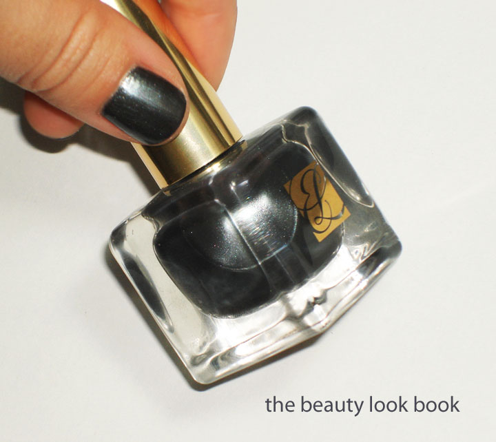
I couldn’t resist the stormy steel blue grey shimmer from Estée Lauder’s Spring 2011 collection. I picked up Wild Storm ($19) the day it was released instore at Nordstrom about one month ago. Most of you have probably had a chance to test it out or see it in person by now. I haven’t tried many nail polishes by Estée Lauder but have been impressed by the ones I had tried to date. Wild Storm however was a bit of a disappointment for me. The silver shimmer left it looking a bit dull even with a shiny top coat. It’s a pretty color but just lacked luster for me. The wear was ok with no chips, but it wore down on the tips of the nails very fast, much to my disappointment (by the end of the day I saw visible tip wear). I have tried it three times (two manicures and one pedicure) with different top coats but all applications had the same dull finish. That being said, my hair dresser loved it when she saw it on me. Perhaps it will be something I’ll like later on in the season, this spring I think I have just been so completely smitten with Chanel Black Pearl, it’s hard for other darker shimmers to live up to it (for me).
Still the product is good for the price. Application is smooth with 2 coats. The texture is easy to apply and layer for intensity. The color is listed as Limited Edition for Spring 2011.
Overall – pretty, but not really my favorite for nails. I prefer this color for eyeshadows like these from MAC, NARS, Urban Decay and Paul & Joe (picture taken for Josie months ago). But who knows what my mood will be like 6 months from now. (My nail polish preferences are highly dependent on mood.)


