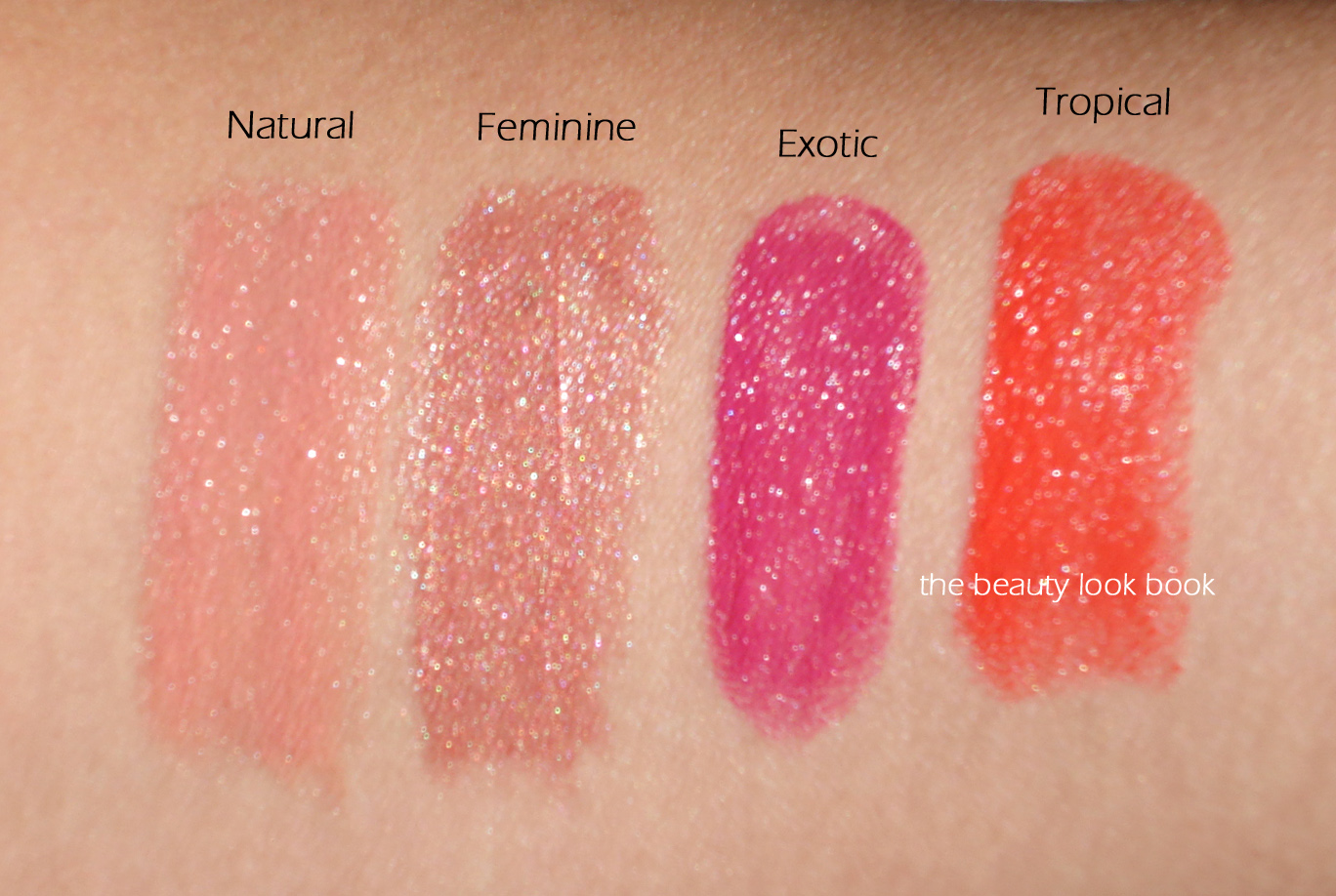
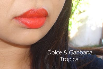
This summer, Dolce & Gabbana has released eight new shades of their best selling item: Passion Duo Gloss Fusion Lipsticks ($34 each, available at select Saks counters and Saks.com). These are a gloss-lipstick hybrid and come in a wide range of shades and finishes including reds, plums, pinks, beiges, nudes, bronzes, shimmers, creams, golds etc. (See prior reviews and swatches here and here.) I’ve been a huge fan of the formula and couldn’t wait to see the new releases. I purchased Natural and Feminine from Saks Houston and PR provided Exotic and Tropical for review. Here are four of the new shades, left to right: Natural, Feminine, Exotic and Tropical:
Close ups of the shades with some matching nail polish suggestions:
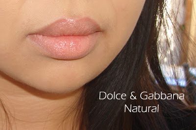
Dolce & Gabbana Natural goes well with Chanel Rose Paradise
Natural is a soft shimmery light peachy-pink. It’s similar to Darling, but Natural is darker and a tad more peach. It has a glossy finish with a subtle shimmer (not frost).
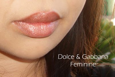
Feminine is a frosted neutral pink-tan. It’s very similar to Desireable. Feminine is just a tad more brown.
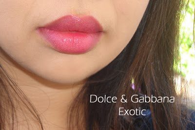
Exotic is a bright purple-orchid-pink. The color is extremely intense. I tried to blot it to tone it down a little, but it still looks very bright.
Tropical is a hot neon orange-red. This is also intensely pigmented and not an easy shade to pull off for me.
Overall, I’ve been extremely impressed with the colors I’ve tried in the Passion Duo Gloss Fusion Lipstick formula. All the shades I purchased sight unseen are neutrals. The two I received for review were on the opposite end of the color spectrum for intensity/brightness. While the texture, quality and finish of Exotic and Tropical are superb, the colors just aren’t me.
Bottom line, I see a trip to the Saks counter in the near future to check out the entire line. Have you tried Dolce & Gabbana’s Passion Duo Gloss Fusion Lipsticks?
Passion Duo Gloss Fusion Lipsticks are available at select Saks counters in the US for $34 each. I’ve seen/ordered from Houston (my favorite), NYC, Beverly Hills and San Francisco. See the new shades swatched on The Non-Blonde, Makeup and Beauty Blog and NY Mag – The Cut.
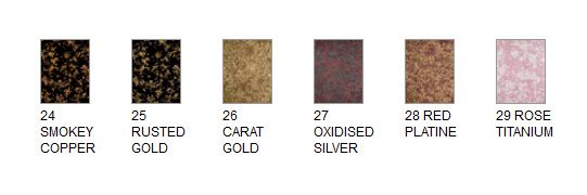
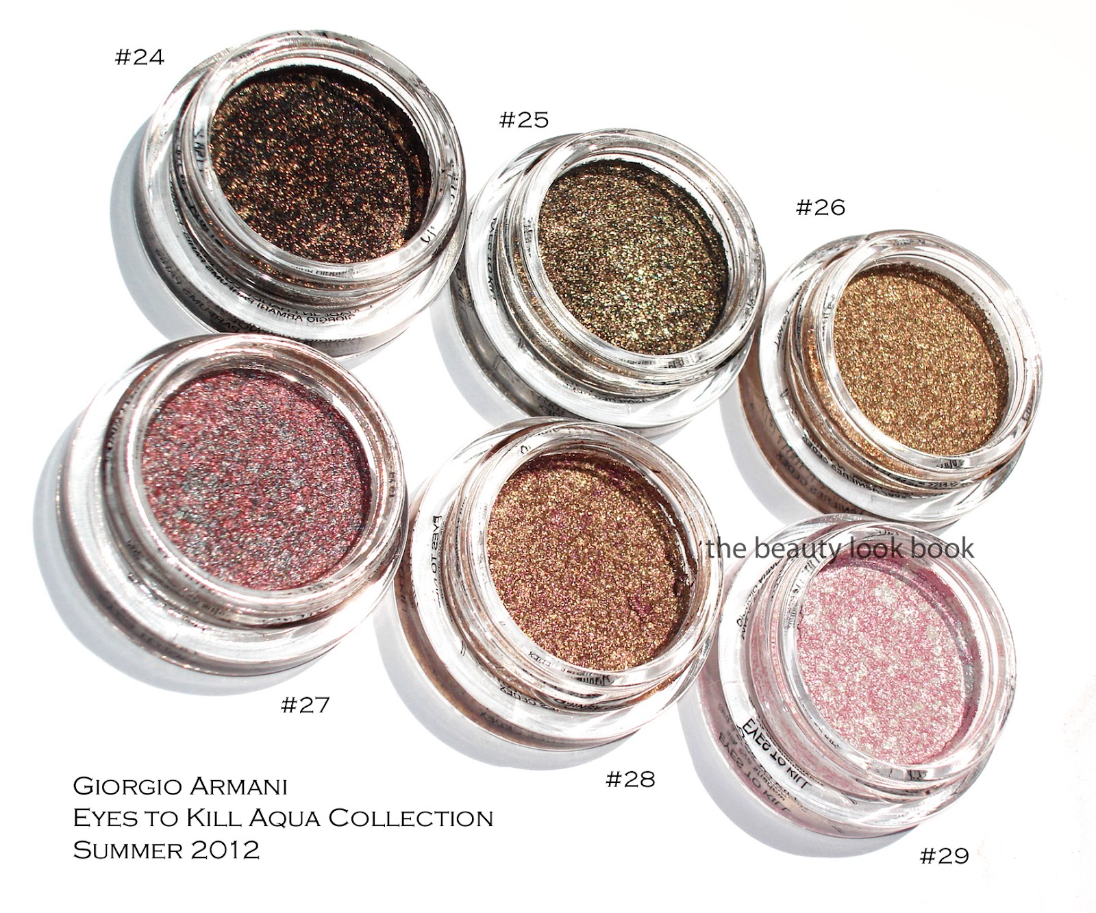
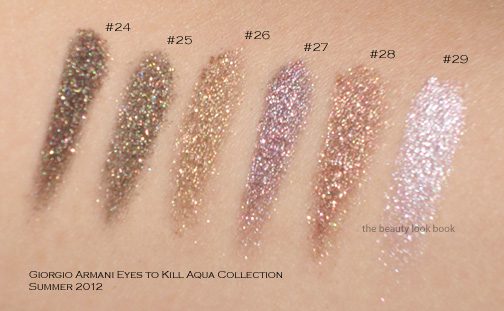
This summer Giorgio Armani has released a few mini collections focusing on lips and eyes. The new Gloss d’Armani shades from the Skin Lacquers Collection was featured last month here. The latest release is their Eyes to Kill Aqua collection featuring six new Eyes to Kill Intense shades, waterproof mascara and eyeliners. I ordered all six of the Eyes to Kill Intense shades from Saks sight unseen ($32 each for 4g/0.14 oz, all listed as limited edition, made in France). The colors looked amazing online and I am happy to report these indeed are stunners. The newest shades are #24, #25, #26, #27, #28 and #29. Some sources have actual names for these. For Armani, I always reference the numbers since the names are rarely printed on the box or packaging for shadows or lipsticks or glosses. Here is the lineup from Saks online and then one of my photos below. I have to give the thumbs up to Armani and Saks for improving their online swatches for these.
I’ve reviewed the Eyes to Kill Intense formula before, but to recap for those new to these shadows, Armani’s Eyes to Kill Intense are a potted hybrid cream/powder eyeshadow. The texture is spongy and almost-cream like but not quite. They are indeed intense in pigment and sparkle. Most contain a complex blend of colors almost like a kaleidoscope making them multidimensional. I like to think of them as a pumped up version of MAC’s MSFs but for the eyes and in a cream formula. Armani boasts that these are long-wearing shadows with 24 hour lasting power. I have never worn any type of makeup for 24 hours straight, but I do find the lasting power to be stronger than the typical shadow. If I don’t touch my eyes at all during the course of a regular day, I find that they last without fading.
The formulas are easy to blend and layer under and over shadows. I do find layering a powder over these will sometimes make the Armani cream shadow fade a bit. If you want to layer over these but still want to maintain the sparkle intensity, I recommend you pat. These aren’t emollient enough for me to be a base though.
Compared to Chanel’s Illusion d’Ombres, Armani’s Eye to Kill Intense last longer and have a less bouncy feel in texture. Although some are more sparkly, I find Armani’s easier to wear and pull off for everyday or for evening. Now onto the colors:
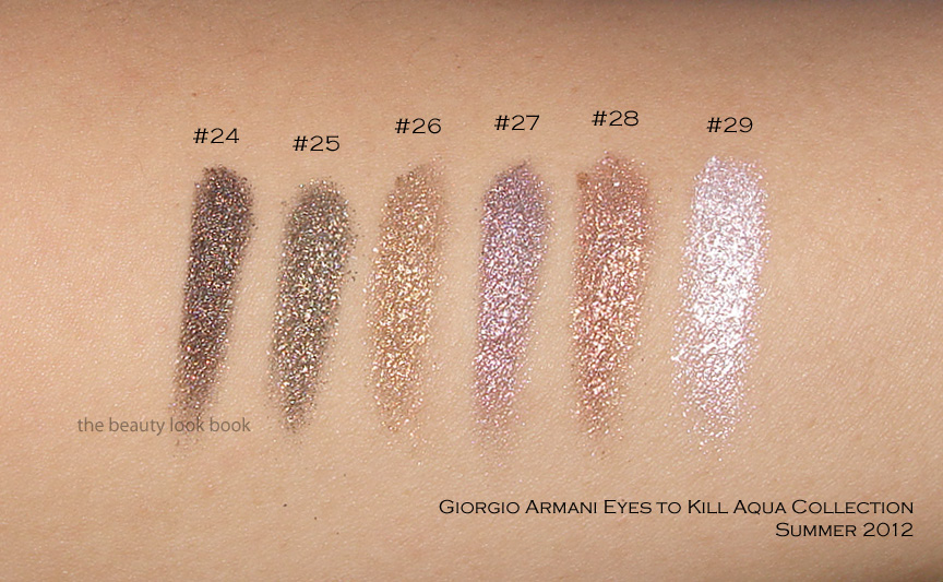
#24 is a blackened gold sparkle. It’s beautiful for a smokey liner or smokey eye. What I love about these is that they the pigment is easy to control by layering.
#25 is another black-gold sparkle but with more of a lighter khaki base. On me it pulls slightly olive because of the gold tones.
#26 is a beautiful warm gold. Some of you may wonder how close this is to #5, #6 and #15. It’s close but slightly less khaki and more golden/warm. I’ll show a few comparisons below.
#27 is a complex silver-taupe-red sparkle. I expected a silvery-taupe but mixed together it pulls more purple on my skin due to the red metallic streaks.
#28 is a gorgeous gold with burgandy/purple blend. It’s what I wanted NARS Kuala Lumpur to look like on me (which was way too warm/red). This has just the right amount of copper and burgandy blend to work for me.
#29 is a pale frosted pink-white pearl. I would say if you have either #8 or #9, this might be too similar to justify owning for you. I do find it’s brighter and whiter (even with the pink veins) so it’s a bit more contrasted on my skin (especially with a tan). This one and #28 arrived a bit cracked/separated from the container. If you search other reviews you will see the packaging comes with a black insert which you can use to press down the product. I used those to try and press down the shadows and fix the cracks a bit.
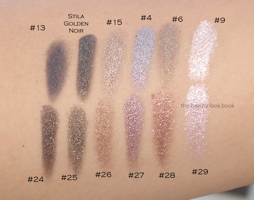
Now swatching these will definitely vary depending on what kind of brush or how much pressure you use. I’ve swatched these a few different ways and under different lighting to show the complexity. Messy Wands has swatched these on her skin (which I believe is lighter than mine), definitely check out her blog to see how they look on her.
Swatch set #1 on the arm:
Swatch set #2 at an angle so you can see the sparkles shine in the sun:
Swatch set #3, bigger swatches blended:
These were all swatched without a base and with a variety of cream shadow brushes (from MAC, Bobbi Brown and Becca). Note that while these look uber-frosty and metallic, they are wearable on the eyes without being too frosty. At least on me. I only had time to swatch a few comparisons to other Armani shades, sorry my schedule can’t accommodate more comparisons right now. I do find these relatively unique compared to the existing Armani lineup. Two views below.
Overall a huge thumbs up. I do think #24 and #25 are very similar and you definitely don’t need both. I prefer #24 because it’s darker and more intense. Have you checked out the new Armani Eyes to Kill Intense shades yet? Thoughts? Did you pick anything up?
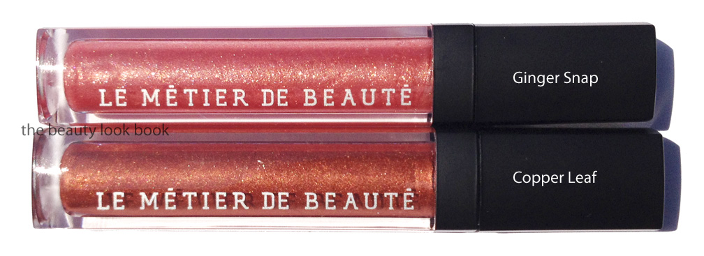
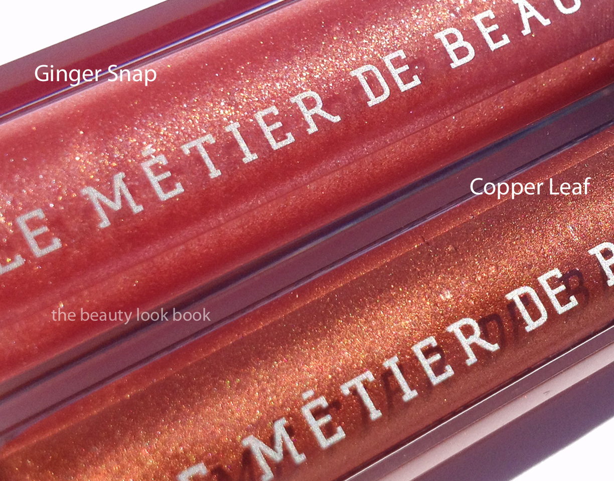
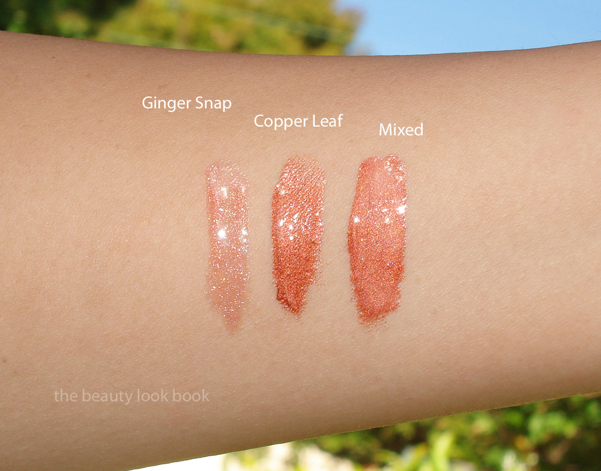
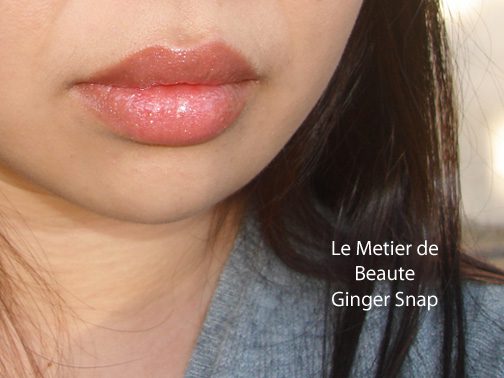
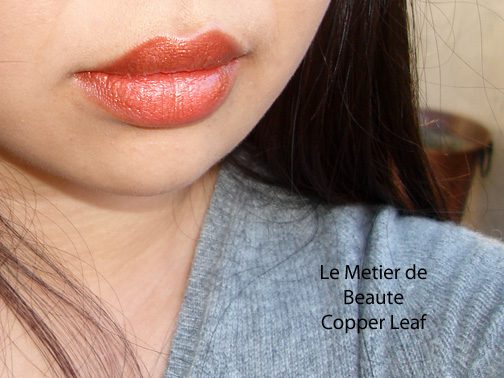
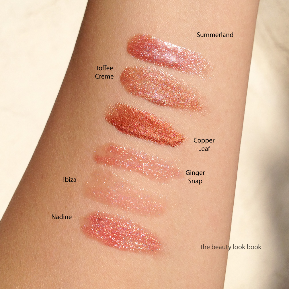
Le Métier de Beauté has released another Haute House Hues Lip Crème Lip Gloss Duo called Indian Summer ($65 for 0.44 fl oz/13 ml). The two new shades are called Ginger Snap, a sheer sparkly warm pink and Copper Leaf, a warm metallic coppery orange bronze.
Both are labeled as the Lip Crème formula, but it Ginger Snap is more glossy and sheer than the typical Le Métier Lip Crème. It goes on fairly sheer on the lips giving a tint of sparkly pink. It’s quite stunning in the tube and naturally pretty on the lips. I think this shade works for me alone, but I think most will find it sheer and prefer it over lipsticks.
Copper Leaf is highly pigmented with a lightweight mousse-like creme feel. It’s on the orangey-side of copper but not overly so. I think this would look lovely on darker skinned girls. I like it but think it would be more flattering if I had a tan. This shade did bleed a little while wearing this. I recommend using a lip liner with a non-glossy texture to help matte-out the lip area.
Here are the Lip Crèmes swatched, Ginger Snap, Copper Leaf, then mixed together (Copper Leaf dominates even when mixed in equal parts)
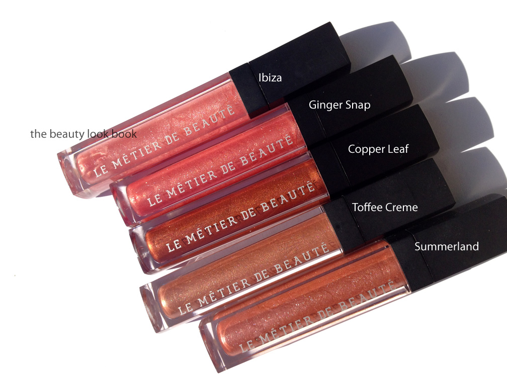
Comparisons to other Le Métier de Beauté lipglosses:
Swatched comparisons to other Le Métier de Beauté lipglosses: Nadine is more pink/red (not photographed above but swatched below), Ibiza is lighter and more pink, Toffee Creme is more neutral/brownish, Summerland has loads more sparkles and more pink/sand.
I like them mixed best but my love for Le Métier de Beauté lip crèmes and glosses still burns strong. Both are fairly unique for the colors I own. I don’t think you’ll find dupes in the Le Metier line (which is nice). For reference, the spring pinks lip creme duo was reviewed last month here.
There are two additional items in the collection, two orangey nail lacquers. I decided to pass for now, but I’m looking forward to upcoming Le Métier de Beauté releases (more kaleidoscope kits soon please!). I found my lip crème set in-store at Neiman Marcus. It should be available at all Neiman Marcus Le Metier locations.
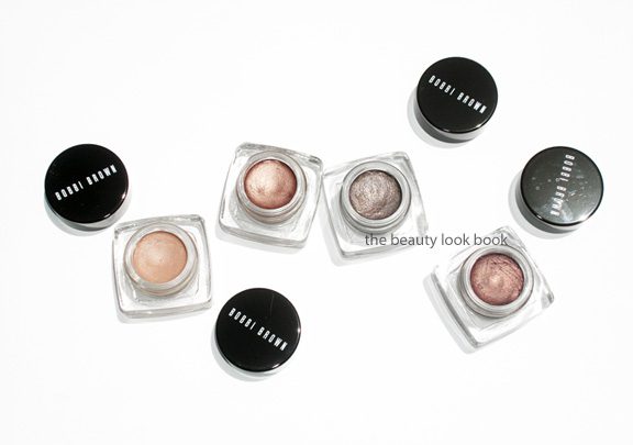
I’ve been a long-time fan of Bobbi Brown’s Long-Wear Cream Shadows (her regular version). Staples in my collection include easy-to-wear classics such as Ballet Pink, Sandy Gold, Sand Dollar and Sand Castle (now discontinued). They’re compact and have a soft velvety smooth texture that makes them easy to apply with fingers or her cream shadow brush. Recently, she released a number of new shades in her Long-Wear Eye Collection and Miami Collection. I picked out a few shades recently from both: Nude Beach, Bronze Sugar, Smoky Topaz and Velvet Plum ($24 each). All work well alone or as a base under powder shadows. Occasionally I will layer the darker shimmer shades with a powder shadow to help blend colors or intensify certain shades. They are extremely versatile and I like the quick and easy swipe-and-go application these offer. For me they last all day from morning to afternoon. Near the end of the day they do start to fade like most creams do, but I like that these don’t budge on my eyes.
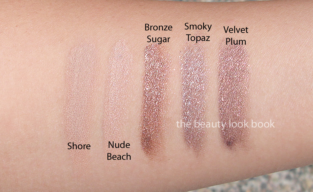
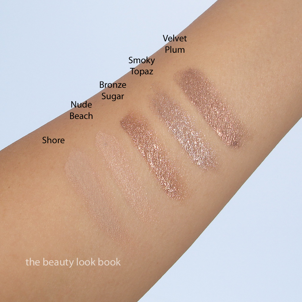
Nude Beach is my new holy grail perfect nude. It has a bit of shimmer and gives a luminous glow. It’s similar to Shore (which I have swatched below) but brighter and slightly less grey. I still adore Shore, but Nude Beach has the perfect amount of shimmer to prevent this from looking flat. It’s a medium-toned nude which matches my Chanel B30 skin exactly.
Bronze Sugar is a highly metallic warm bronze. Note that these new shimmery shades are her regular Long-Wear formula, not her Metallic Long-Wear formula (which I did not like at all). There is a silvery sheen to some of the shimmery particles making this sparkle. I found this one dried quickly on my lids so it required fast blending. Times I did not blend fast enough it dried on the lids and did not budge. If you have oily lids you will like these. If your lids are more normal or on the slightly dry side, you might want to apply a good dose of eye cream first.
Smoky Topaz is a taupe-lover’s dream come true. It’s a high-sparkle taupe/mauve/grey. Check out Karla Sugar’s swatches to see how it looks on different skintone and applied with a heavier hand. On her it appears more silvery, while on me it’s more taupe.
Velvet Plum is a bronzed-plum. It’s very similar to Bronze Sugar but dries with a plum finish. If I had thought about these longer, I would have opted for Velvet Plum and skipped Bronze Sugar.
Note that I applied these with Bobbi Brown’s Cream Eyeshadow Brush with medium intensity. You can definitely layer these easily for more pigment. The shimmery shades from the recent collections do have a bit more kick/sparkle than her other cream shadows, but I find them still very wearable for everyday. Bottom line gorgeous. Also, Best Things in Beauty has me wanting Candlelight.
I found mine at Neiman Marcus but these should be at all Bobbi Brown counters now.
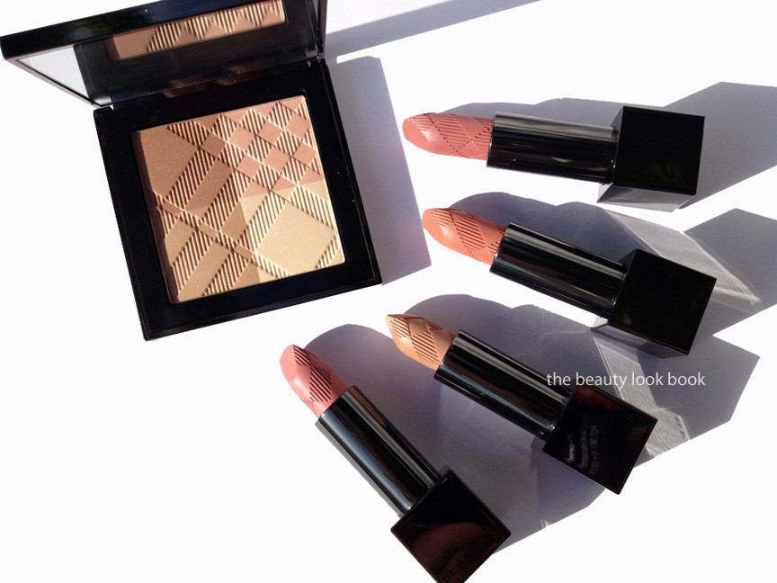
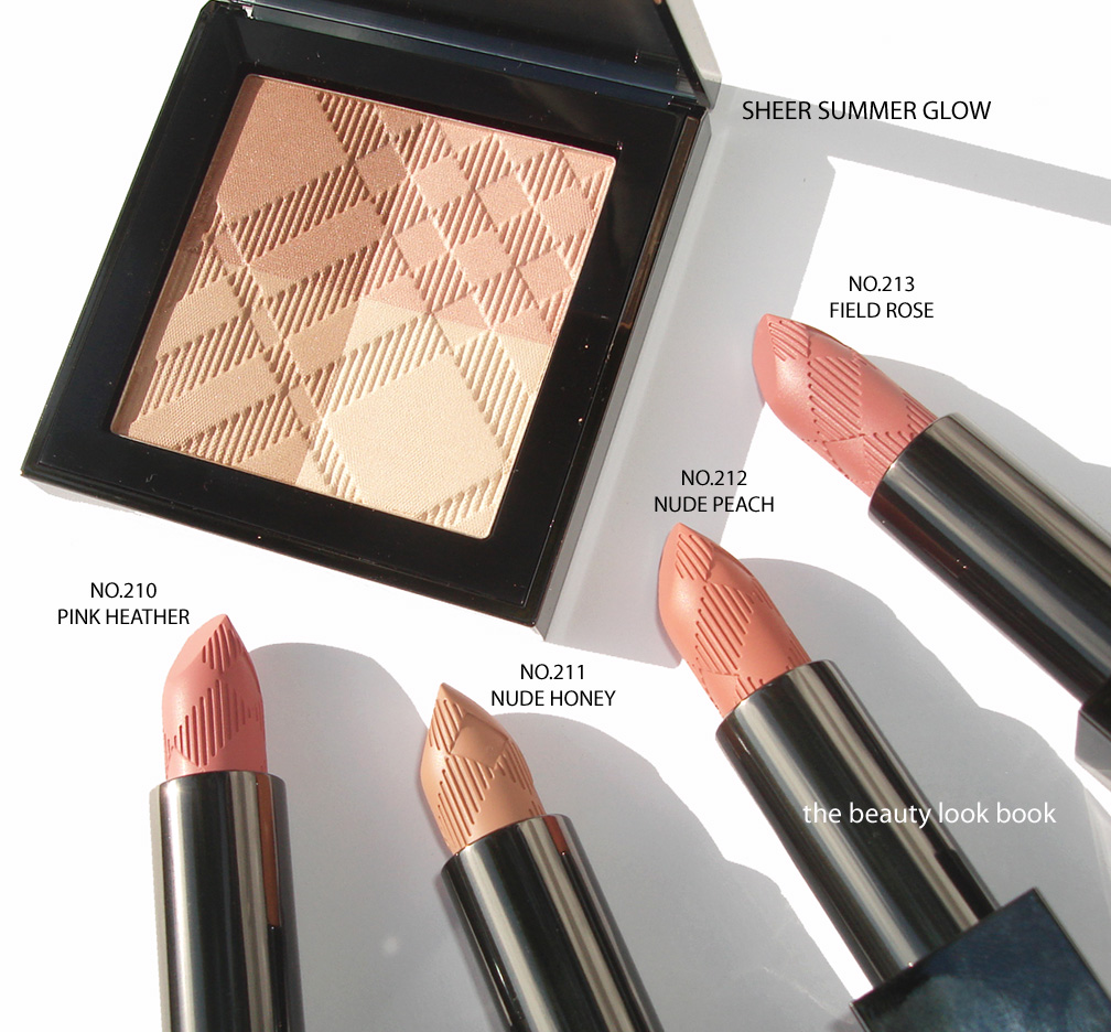
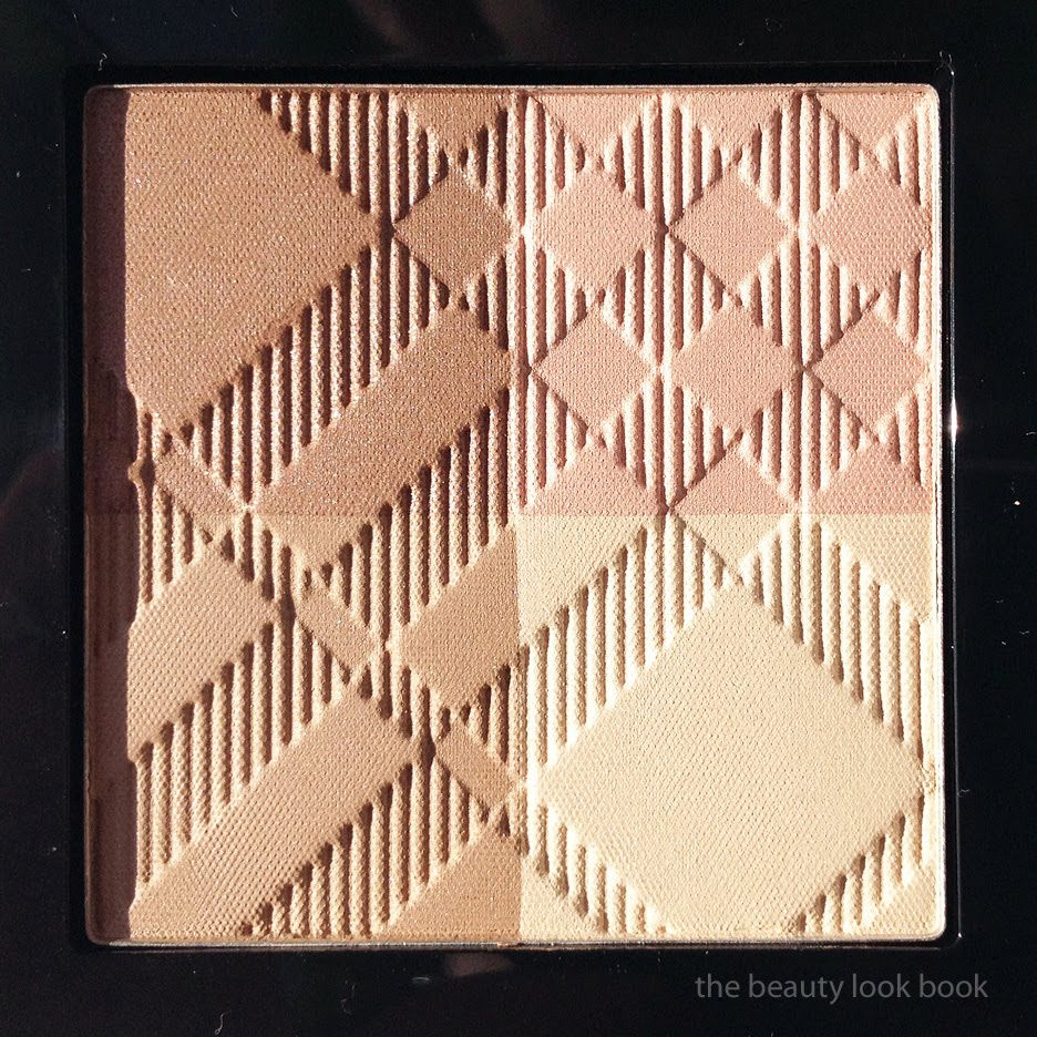
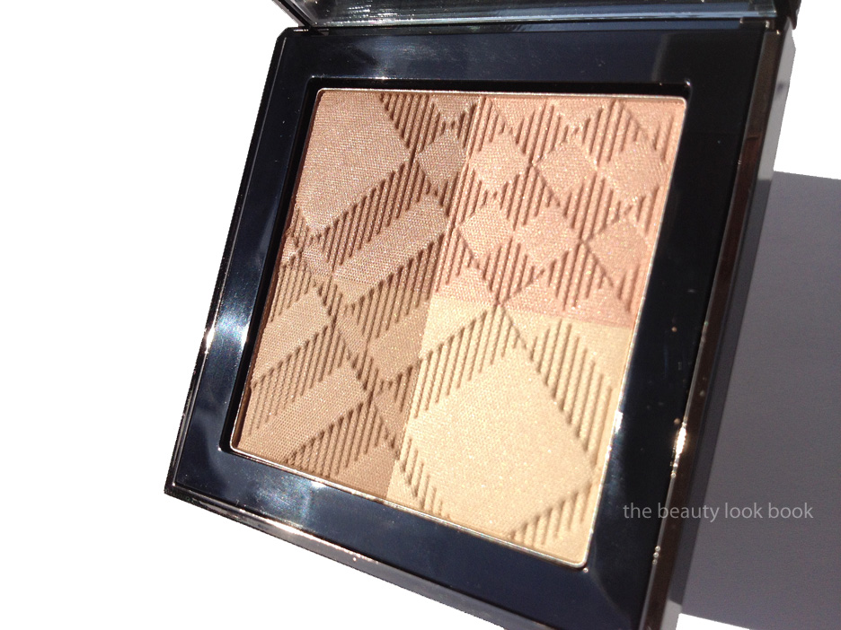
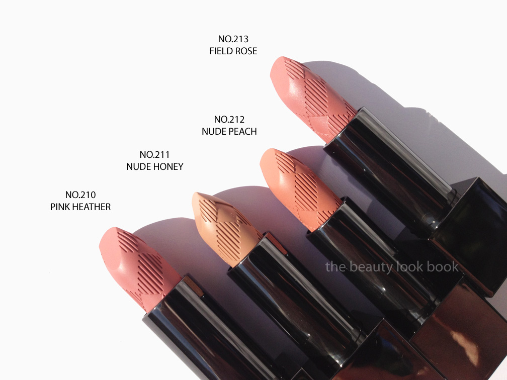
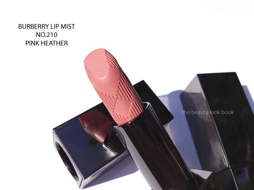
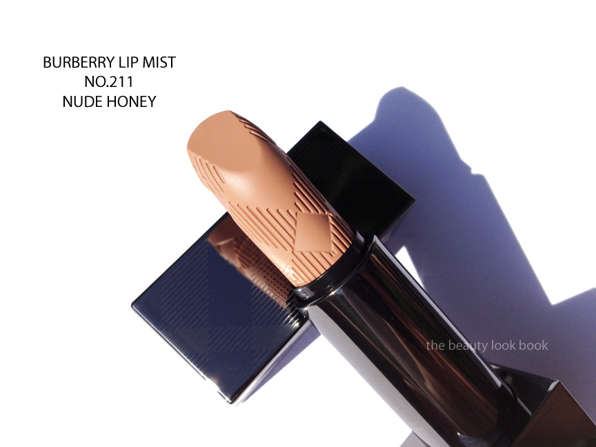
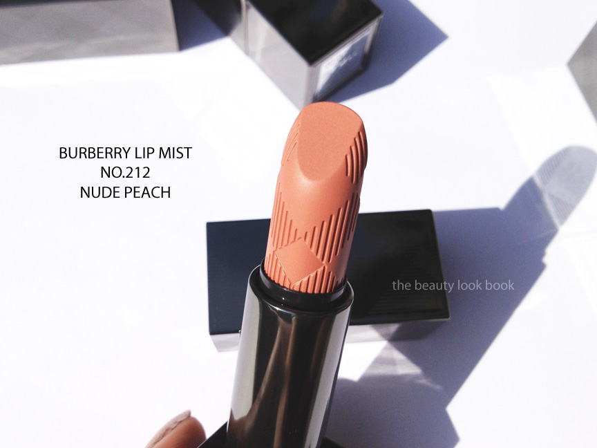
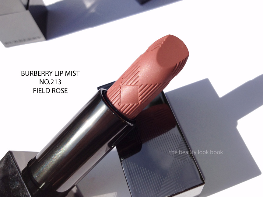
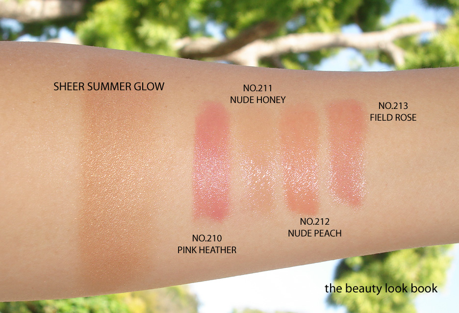
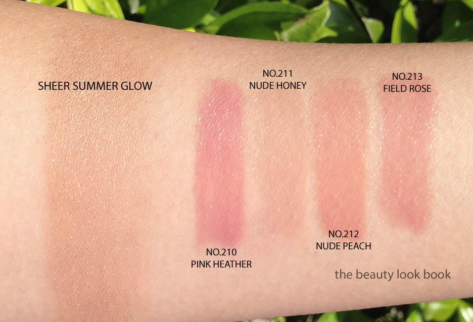
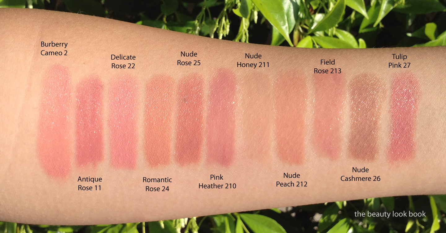
This summer Burberry Beauty has released a small collection featuring a new highlighter quad Sheer Summer Glow ($50) and four new shades of their sheer lipstick in the lip mist formula, 210 Pink Heather,211 Nude Honey, 212 Nude Peach, and 213 Field Rose ($30 each). The theme for the entire look is subtle nudes. Everything is extremely natural.
Based on preview promotional photos, I envisioned the Sheer Summer Glow to be subtle and natural, but I didn’t expect it to be that natural. The quad is designed for the face as a highlight or contour. There are two shades of tan, a soft mink pink and a warm pearly ivory color – all shades have a luminous sheen. Some have discussed using this as an eyeshadow as well. I personally think it is too sheer to pull off on the eyes for my coloring, although it does create a soft wash of color (high emphasis on soft). Note that the wash is extremely subtle and sheer. On the face, to have this show up better on my skin, I applied over a cream bronzer like Chanel’s Tan Soleil (their cream bronzer in the round tub which I’m not sure if it’s still available) or NARS St Barts Multiple. The finish is a luminous sheen without the frost.
Lip Mists are a sheer creamy gelled type of lipstick formula. They are the sheerer option in the Burberry line. This season has four shades, don’t let the swatches below fool you. They are indeed sheer but apply with much more coverage on the lip with excellent lasting power. The impact on the lips surprised me with Pink Heather and Nude Peach. I have not yet tried Nude Honey but it looks extremely nude.
210 Pink Heather is a soft cool pink
211 Nude Honey is a sheer flesh beige
212 Nude Peach is a nude light peach
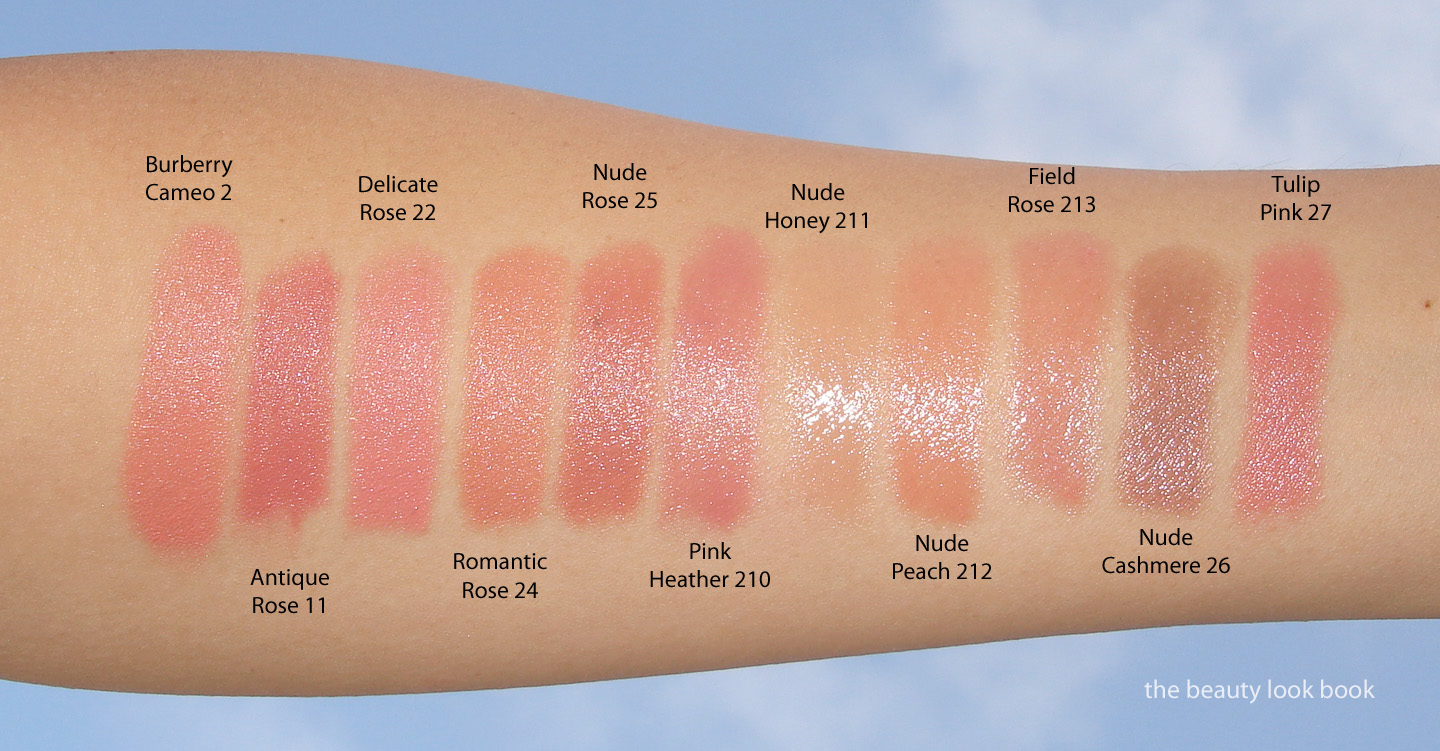
213 Field Rose is a soft rose pink (warmer than Pink Heather)
As many others have noted the entire Burberry Beauty line has been extremely well designed in all aspects from packaging, to quality, product finish and color selection. I’m currently obsessed with Pink Heather Lip Mist – it’s the perfect natural cool pink. The highlighter I could have passed on mainly because I like a more defined contour rather than something so subtle. Swatches of the entire collection (note I swirled and swiped the highlighter palette with a heavy hand, be sure to check other blogs for individual swatches and different application methods):
See other reviews and swatches on other skin tones:
Swatched comparisons below, two views of each set in different lighting.
You will notice with the lip shades that most swatched comparisons have more pigment because they are the Lip Cover Formula (Burberry’s regular lipstick). Yes, there are very similar colors in the existing lineup, there are subtle differences between each shade in the undertone or base color. Do note that the colors will apply differently on your lip based on your skintone and natural lip color. For more detailed descriptions on the differences, I highly recommend you call your local Burberry counter for extra assistance. In my experience they’ve been extremely helpful in describing the differences between all the nudes, pinks and roses in the line.
I found the entire line at Nordstrom. It’s currently available online at Nordstrom.com as well.
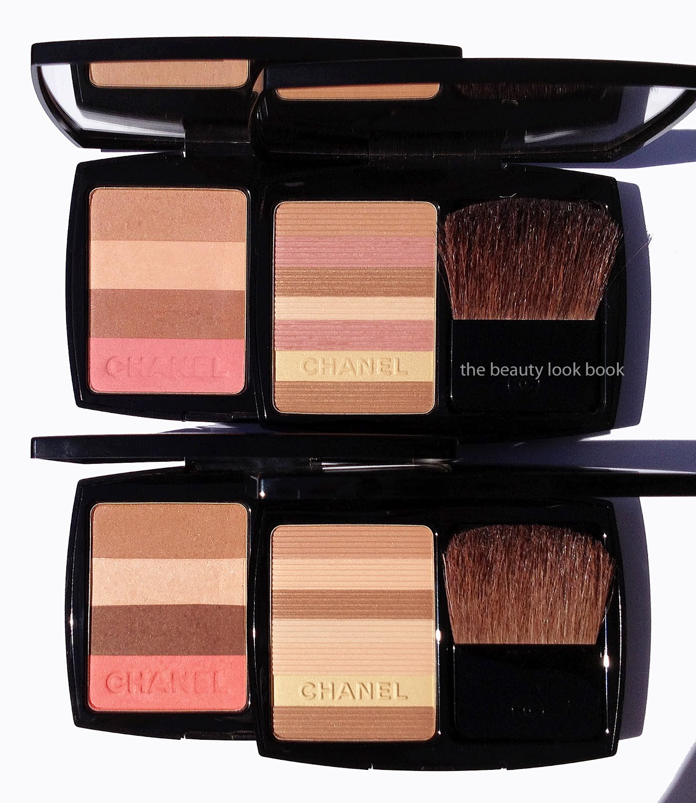
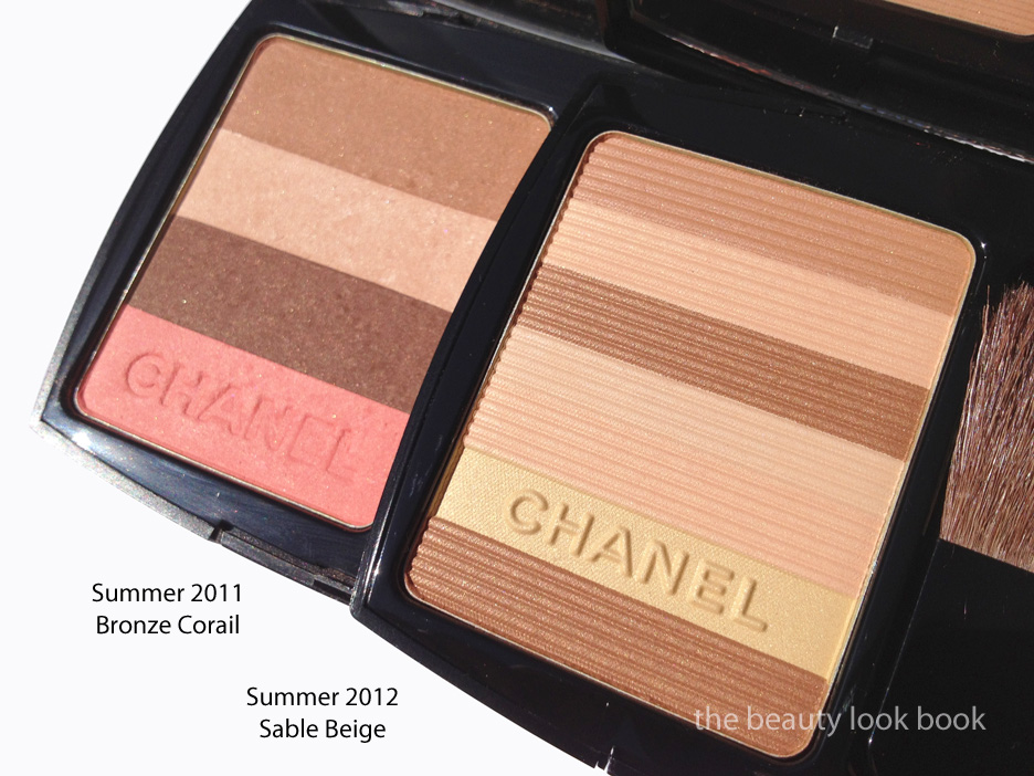
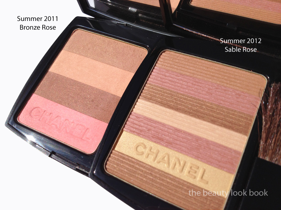
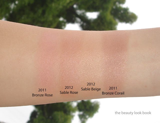
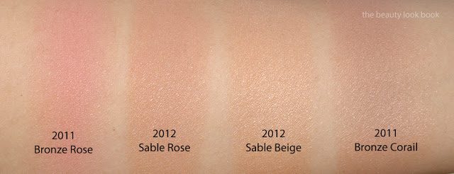
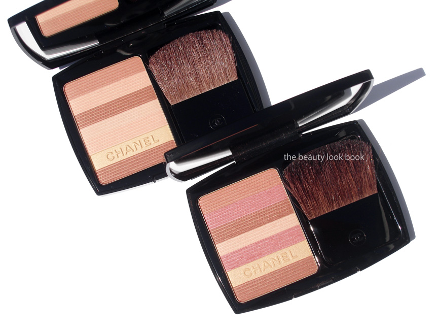
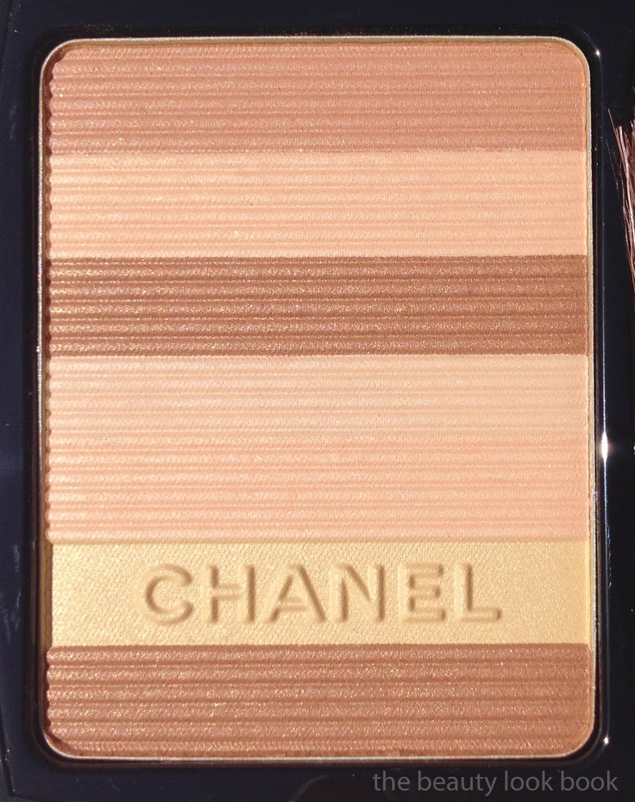
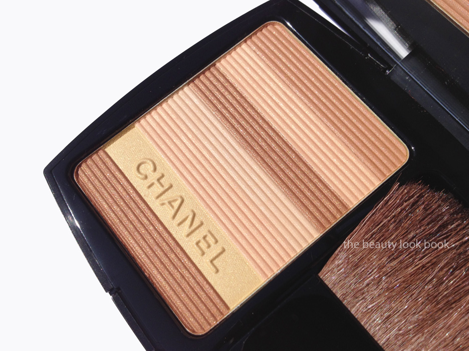
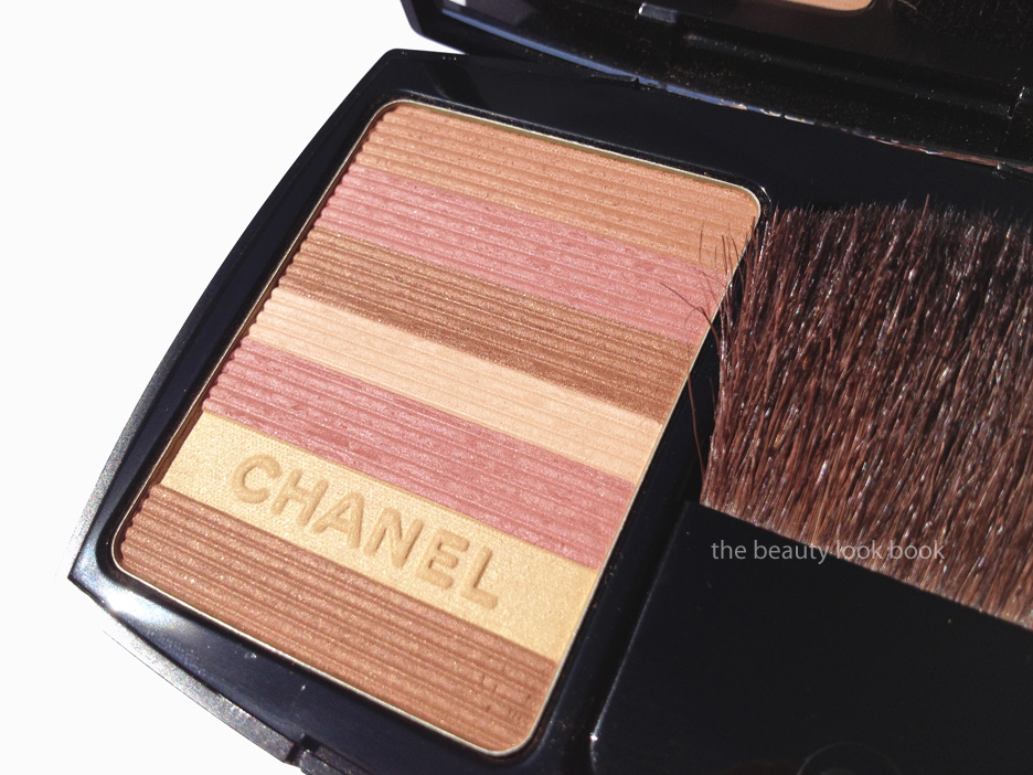
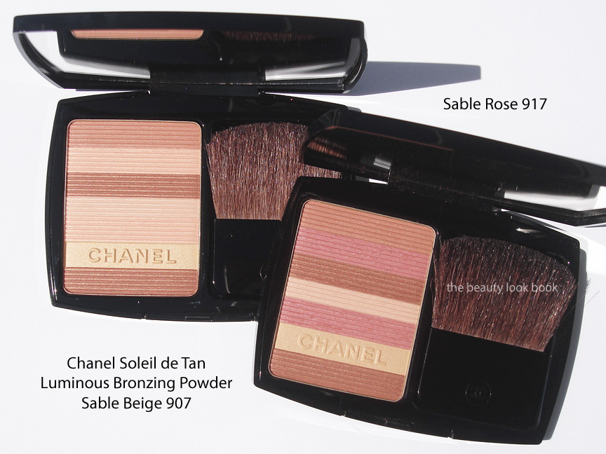
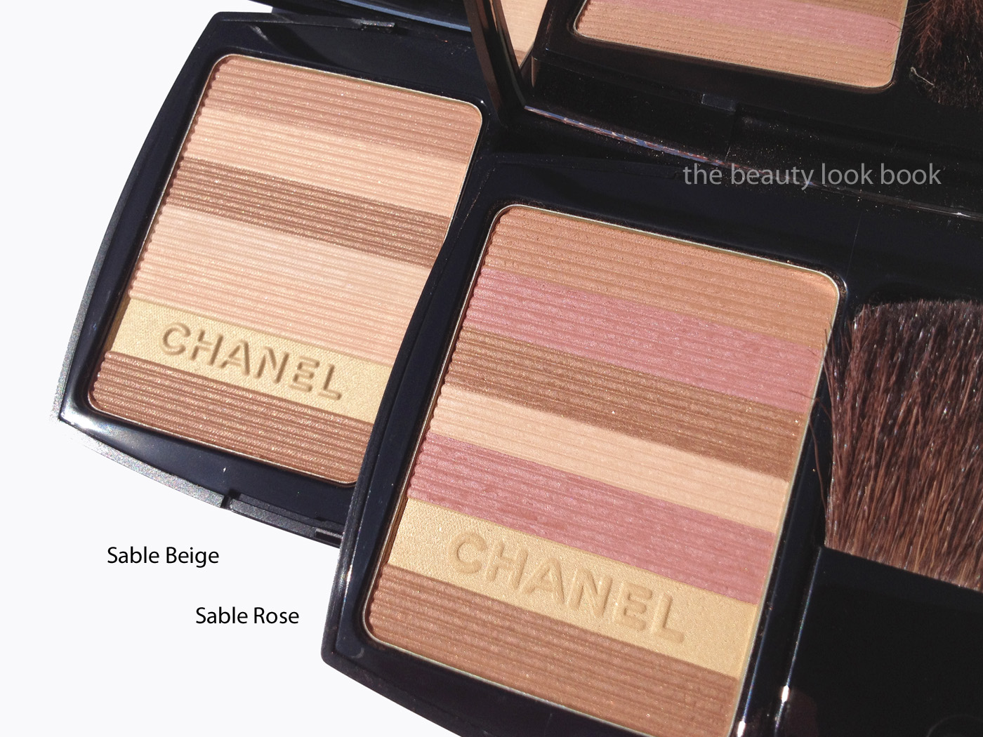
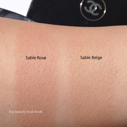
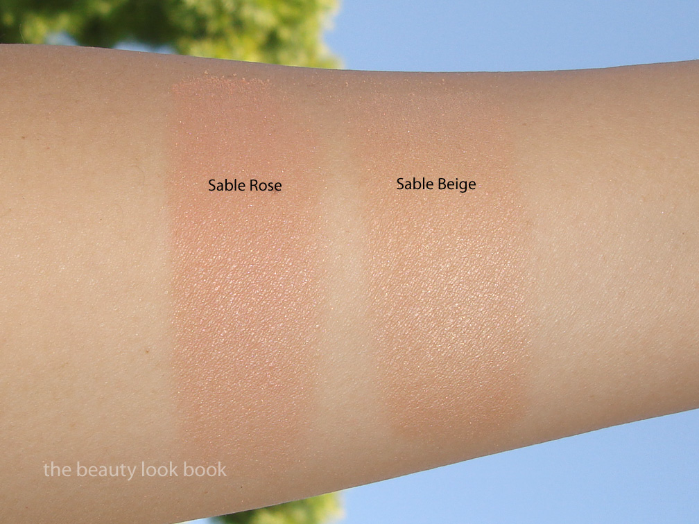
This summer Chanel has continued in the striped-bronzer theme and released two new variations of their Soleil Tan de Chanel bronzers in a luminous powder compact. The two colors this year are Sable Beige 907 and Sable Rose 917 ($60 for 15g/0.53 oz, both limited edition). Both shades contain 7 stripes of color each although to my eye, it appears that there are some repeats of colors within each pattern. The finish of both of these are subtle with a finely milled shimmer. It makes the skin glow without having too much shimmer. I recommend testing on the face in person since swatching on the hand or arm will not give you the same effect as on the face. I had similar thoughts/experiences to Product Doctor. The finish of these are softer than previous years. I also did not find these to be the typical bronzer, but rather a more luminous glow blush/highlighter – minus the frost or shimmer. This year’s releases are more glowy and sandy/beige than last year’s which I found more brown/bronzey.
Sable Beige 907 is a soft light beige bronze shimmer. I found this to be a lovely subtle warm contour. It can be used as a blush alone for lighter skins or over other colors of blush as well. I don’t recommend applying over a bare face. The texture needs some kind of base (foundation or tinted moisturizer) to show up. Sable Beige is the lighter of the two.
Sable Rose 917 is the darker bronzer. It has more bronze and pink stripes which make this more of a soft luminous rose-brown blush on my skin. On me the brown/beige dominate over the pink and shows up as more of a soft tawny bronze with a slight hint of pink. It’s lovely alone as a blush and has enough color to wear by itself.
More shots of both Sable Beige and Sable Rose shown side by side.
Swatched:
Overall thumbs up. When I called my Nordstrom Chanel associate, she thought I did not need either of these if I had both of last year’s bronzers. I still bought both. After playing with both I think she is correct, however if you found last year’s muddy on your skin, give these new ones a try. I can’t emphasize enough that what you see on the arm/hand will not translate to what you will see on the face. I’m about a 1/2 shade lighter (Chanel B30) than I was last year so I think both show up well on my skin. If you have doubts about which shade would look best on you, I recommend calling your Chanel counter to have a specialist help.
Are these must-haves? At $60 each and given my current bronzer collection, I could have probably just bought 1 although I can’t pick my favorite. I’ve been wearing Sable Rose regularly since I purchased it. It’s an easy no-fuss go-with-everything kind of color that works with all types of lip colors. I haven’t found one yet that didn’t work well with it.
Many have asked how these compare to last year’s. A more detailed comparison post to come soon.


