A quick look at the latest from Le Métier de Beauté: re-release of their limited Blush Kaleidoscope (swoon!) and Limited-Edition Haute House Hues Lip Crème Lip Gloss Duo in Mum’s the Word and Two Lips and the new Snappy Dragon Nail Lacquer. More detailed thoughts, photos and swatches to come this evening, but I can tell you – call your Neimans counter ASAP if you’re interested. The Blush Kit arrived in very limited supply.
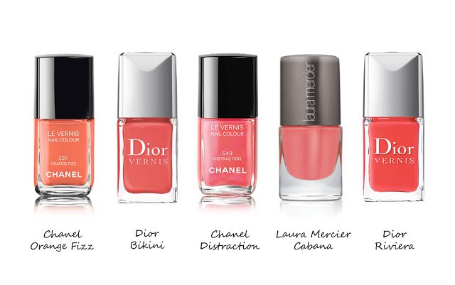
Coral seems to be all the craze this year for spring and summer nail polishes. My peachy-coral obsession for blushes has now transitioned into nails. I’ve already reviewed a number of new peachy corals this year: Chanel June, Laura Mercier Cabana, Dior Riviera and Chanel Distraction. Many have asked about the newest from Dior Bikini. From promo photos it can be difficult to identify differences between so many similar shades. I gathered what I could find online, here they are lined up:
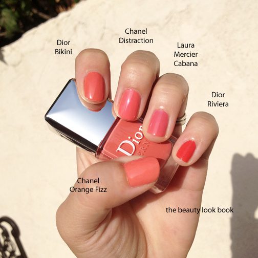
In real life, here is what I see below, they are all more similar than promotional digitized photos appear to be. (Many thanks to my Twitter friends who let me know Dior Bikini arrived online at Sephora.com.) Here is the verdict, left to right:
Chanel Orange Fizz – is the lightest and brightest, it’s more orangey than all the rest
Dior Bikini – has the best coverage, it’s more of a true peach, with slight reddish tones, slightly darker
Chanel Distraction – semi-sheer medium jelly finish with the subtle iridescence
Laura Mercier Cabana – most jelly-like, slightly more pink undertones
Dior Riviera – most vibrant coral red
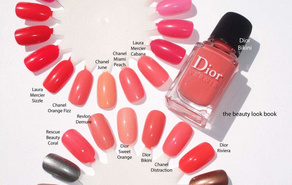
A few more swatches to other oranges, peaches and corals: Rescue Beauty Lounge Coral, Revlon Demure, Dior Sweet Orange 334, Dior Bikini 231, Chanel Distraction, Dior Riviera 537, Laura Mercier Sizzle, Chanel Orange Fizz, Chanel June, Chanel Miami Peach, Laura Mercier Cabana.
Overall, if you have Chanel Distraction or Laura Mercier, you do not need Dior Bikini. I do believe Dior Bikini has the best formula and richest coverage. I really do love it (even though it’s almost identical to other corals) and it would be my vote for the season’s best coral. At this time I haven’t seen Dior summer anywhere on counter on the West Coast (Southern California), although it has just arrived online at Sephora.com and Nordstrom.com as well. I suspect it will arrive any day in store.
Have you checked out any corals for nails this summer? What is your favorite? Or do you have a classic coral in your collection that you’re loving right now?
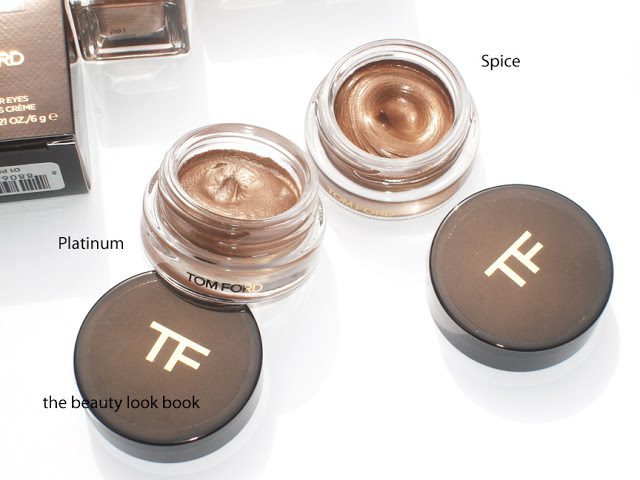
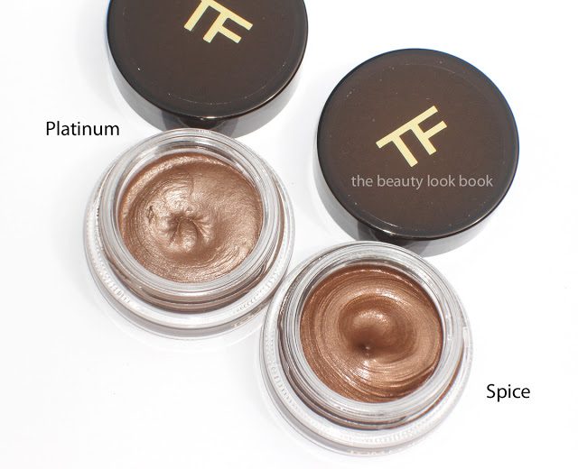
Tom Ford’s new Cream Color for Eyes come in four different warm metallic shades, $40 each. These come encased in a small round potted container similar to that of many other cream shadows. I purchased Platinum and Spice sight-unseen based on a few photos online, to me these seemed the most neutral-toned, the others appeared to be very warm in color.
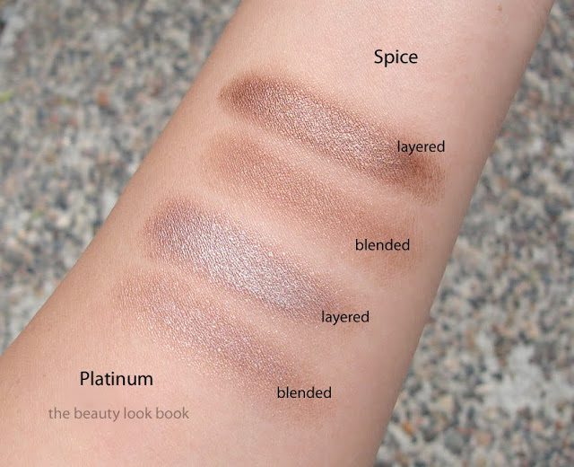
Platinum is a warm taupe-nude-silver. It applies very sheer but is layerable. I’ve used it as a base all over the lid for a subtle contoured glow on the eyes. It looks very nude on my skin, partly because the formula is semi-sheer. Spice is a warm bronze, also sheer, but buildable. I find it very warm-toned, but not too reddish like some bronzes can be.
The texture of these are a soft almost mousse-like cream. They have a softness that is like Chanel’s Illusion d’Ombre but without that bounce you find when you press your fingers into the Chanel. The Tom Ford Cream Colors have a soft sheer but layerable texture. I found them most similar to Laura Mercier’s Metallic Crème Eye Colours in terms of how they apply and layer on the eyes.
The finish is smooth and very light-weight. Not quite a full cream, not like a liquid eye color, not like a gel. It feels like a mix between a cream and a mousse. Color applies smoothly and sheer with the fingers or a brush but is easily layerable. The colors are shimmery but not frosty. The finish just glows which I think is very pretty.
Lasting power seems fairly decent for a cream shadow … that is if you just don’t touch the eye area once applied. I wouldn’t say they are budge-proof if you touch your eye makeup. However, for me, they did help my makeup last longer throughout the day.
My first impressions were … well, luke warm. The colors were pretty, but at $40, I felt the packaging was a bit lacking. There is no applicator for the product and the actual packaging seems a bit cheap (the top has a sticker slapped on for the TF logo, most other brands at least have the brand name or logo embossed onto the actual lid). Still, the packaging is sturdy and functional. My first attempts at applying the product resulted in a barely-there look. No matter how I layered, it seemed that the color disappeared as soon as I did any sort of blending.
After playing with these for a week now I’ve grown to like them more. Particularly Platinum which works as a base or as a stand alone color. For me, the first layers have to be blended (either with a finger or brush) and the color does disappear, however, I’ve found that putting a second layer on top of the first helps the color show up better. Second layers are applied with a patting-motion rather than blending to help the color show up better.
I couldn’t find dupes for either of these shades. I did pull a few other cream shadows to help compare the finish/texture a bit.
L to R: Bobbi Brown Smoky Topaz Long-Wear Cream Shadow, Laura Mercier Platinum Metallic Crème Eye Colour, Tom Ford Platinum Cream Color for Eye, Tom Ford Spice Cream Color for Eye, Armani #4 Eyes to Kill Eye Shadow, Chanel Epatant Illusion D’Ombre, Bobbi Brown Sand Dollar Long-Wear Cream Shadow, MAC Constructivist Paint Pot.
Overall I’m pleased with the performance of Platinum. It’s a highly versatile cream shadow. Spice is a shade I still need to work with a bit more. The warm tones are suitable when layered with other colors, alone it’s a bit too warm for me right now. The are both rather pricey at $40 but you do get a lot of product. I probably would have preferred a powder shadow in these colors rather than a cream, but they are still very pretty.
Have you checked out the new collection from Tom Ford? What were your thoughts?
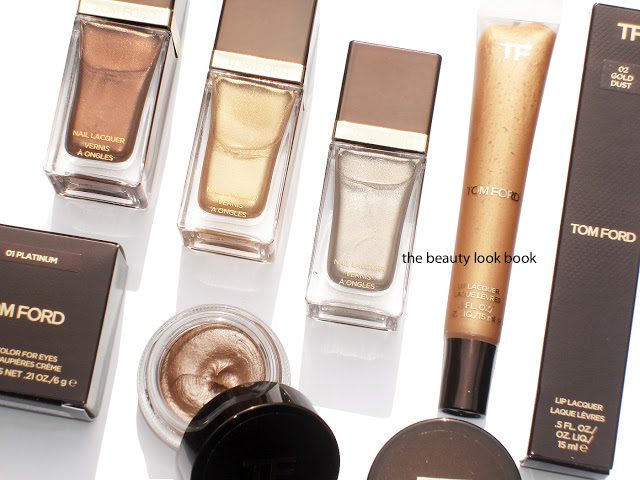
Just arrived from Saks.com: Tom Ford Metallics. My picks, sight unseen include Burnt Topaz, Gold Haze, Silver Smoke Nail Polishes ($30 each), Gold Dust Lip Lacquer ($30), and Cream Color for Eyes in Platinum and Spice ($40 each).
I’m going to test these in the upcoming week. In the meantime check out these for more photos, swatches and thoughts:
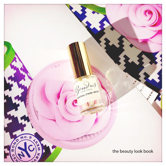
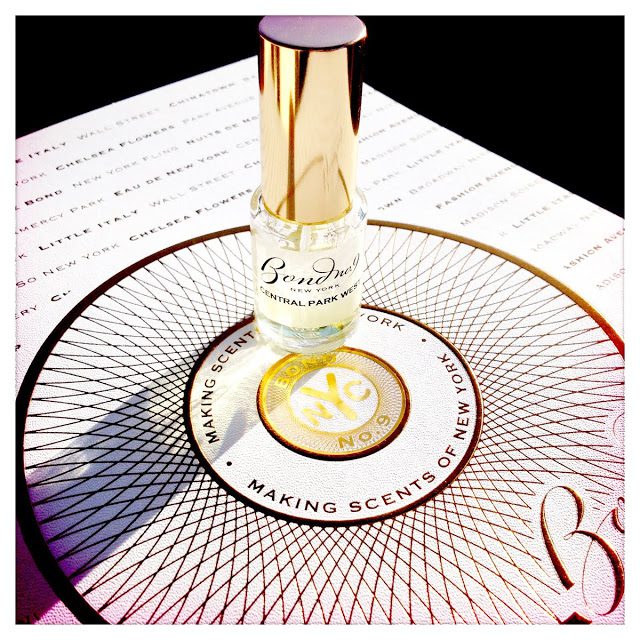
The latest from Bond No. 9 is the 7th city-inspired fragrance called Central Park West. The actual packaging of the bottle is exquisite with the houndstooth checkerboard pattern and large pink flower (the vial shown is a lab sample sent for review). The description of this scent indicated this would be a highly complex floral. I was surprised to find that it’s more of a pure clean scented floral. Since this is in the Eau de Parfum formula, the fragrance is quite intense. A single spritz provides a highly-concentrated floral mix of gardenia and jasmine. As Central Park West dries down, it becomes slightly less floral/green, but still remains a pure floral throughout the life of its wear (which I found lasted all day from early morning to late evening).
Top notes include narcissus, ylang ylang, black pepper
Middle notes are gardenia, jasmine, citrus-like linden, orris
Base notes are vetiver, must, white oak and treemoss
Central Park West is perfectly suited for spring, but I have other fragrances that I prefer. I found this one a bit too mature for my taste, but I do like it more than the fragrances that were recently released Jo Malone London Bloom Collection. If you’re looking for a new spring floral scent to wear, this is definitely one to check out. Although I found it too mature, it’s light enough to not be too heavy, but I still prefer scents that are on the lighter side. I do envision myself wearing the sample down to the last drop, however, right now I’m just not quite smitten enough to justify a full bottle. Currently my favorite Bond Fragrances are the ones my husband wears (Chez Bond, Copper Square, New York Amber). I’m also quite fond of Chinatown as well (for me) and occasionally West Side (I have these in the mini bon-bon sprays).
Central Park West is currently available at Bond No. 9 New York Stores, Saks, Nordstrom and bondno9.com and available in a 100 ml ($250), 50 ml ($180), body silk ($130), candle ($110) and shower gel ($75). You can visit BondNo9.com for more details.
Have you tried Central Park West? What did you think? Do you have any other favorites from Bond No. 9?
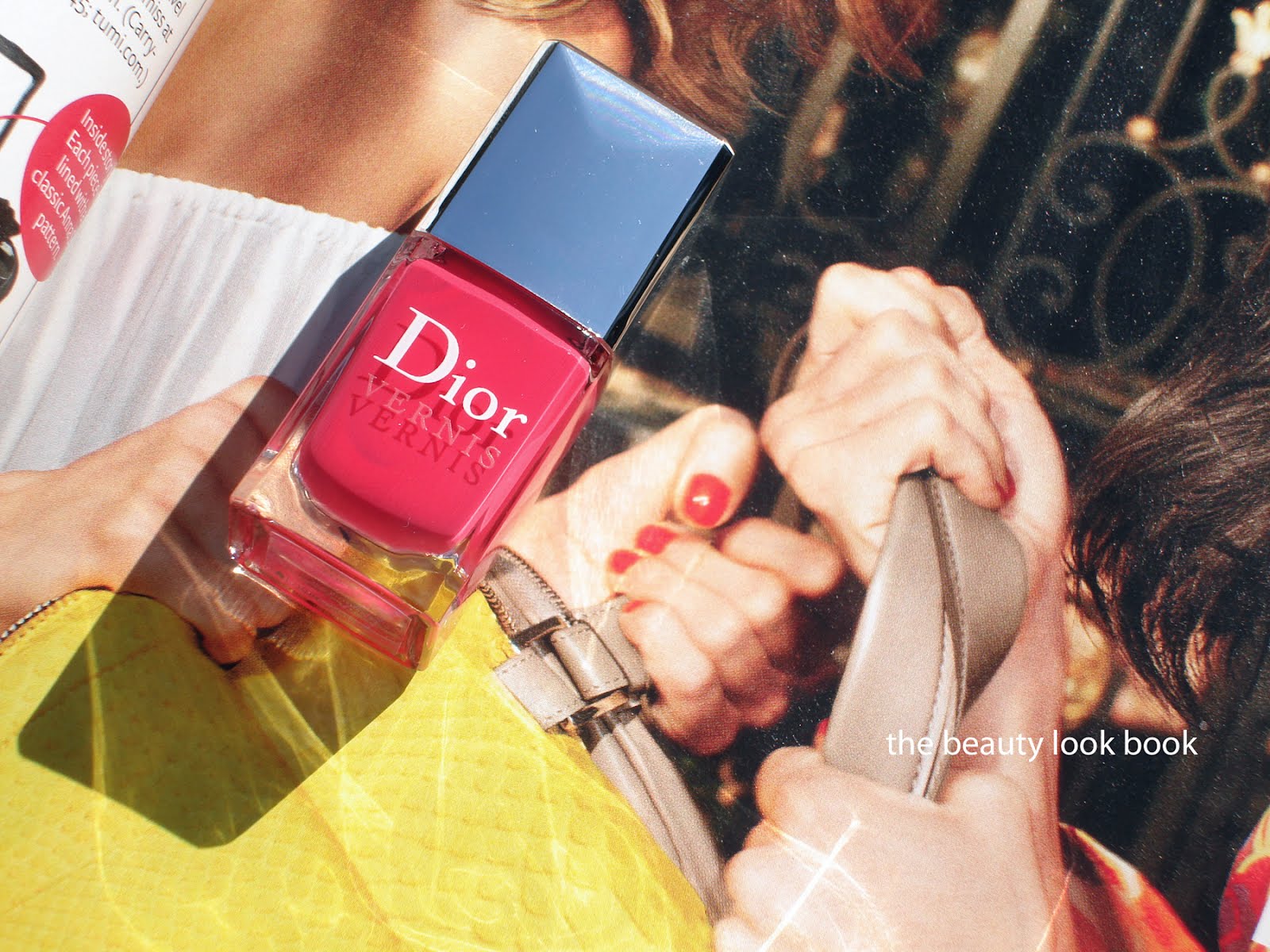
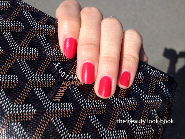
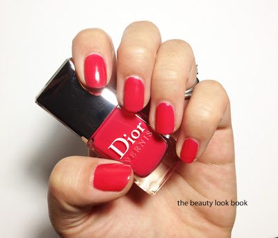
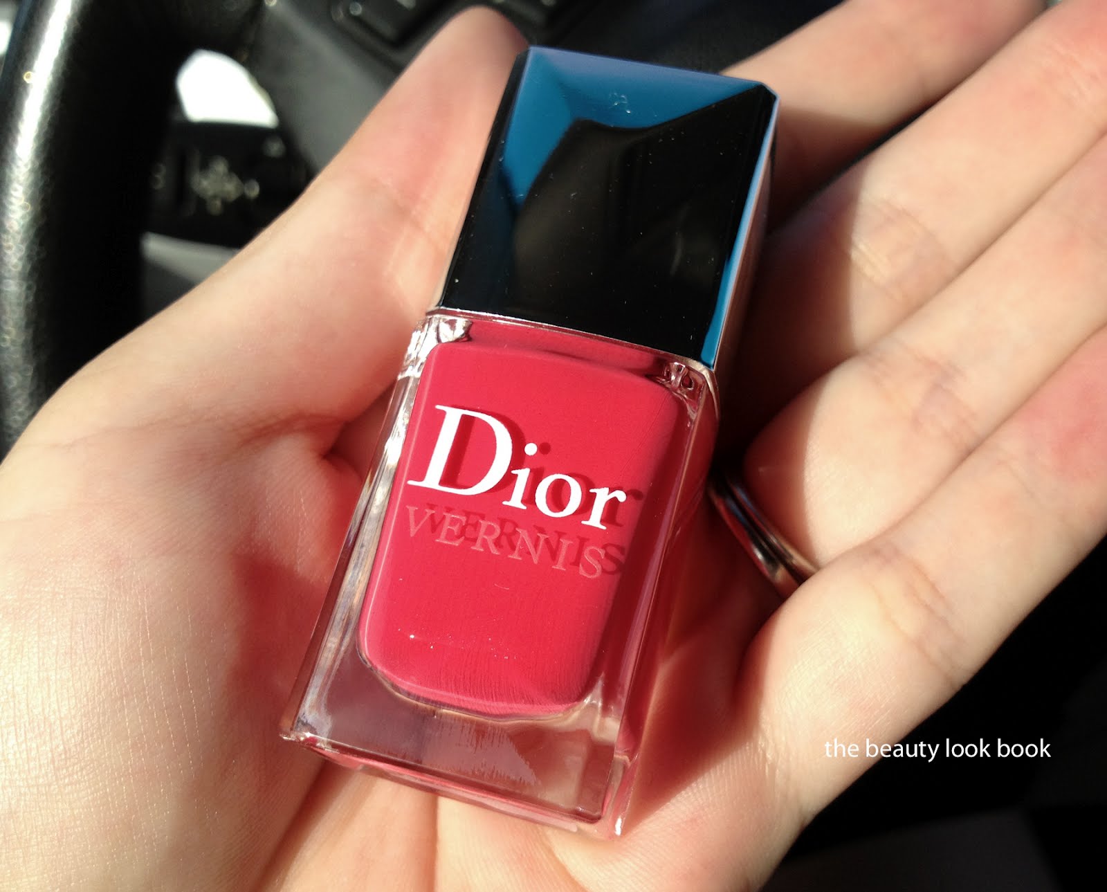
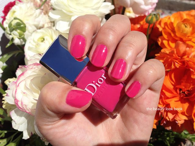
Dior Lucky 659 ($23 for 10 ml/0.33 fl oz) has stolen my heart and made into my top three favorites this season (three-way tie with Chanel Distraction & Laura Mercier Cabana). Dior Lucky is a rich pink-red cream. It’s one of those shades that’s an in-between kind of color. Sometimes it looks pink, other times it looks more red. Either way, it’s a stunner knock-out kind of bright that looks great on both tips and toes. I love that it’s vibrant and full of life but in a wearable way. It’s photographed above on top of a Jimmy Choo ad. I loved the bright nails in that photo and Dior Lucky is a slightly pinker version of what I saw.
Here it is swatched after 3 days of wear (2 coats with Rescue Beauty Lounge’s top coat). I found it lasted quite long.
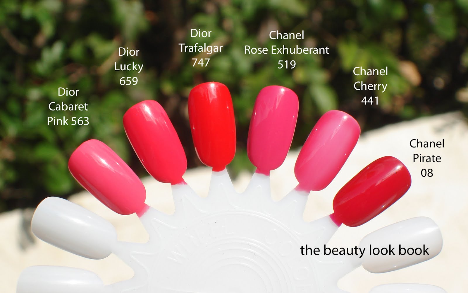
Out of all four shades released with the Dior Color Block nail polishes, Lucky is my favorite and the most unique in my opinion. Yes, it’s similar to other bright pinks and reds, but the mixture of red/pink makes it different from most others. Compared below to Dior Cabaret Pink, Trafalgar, Chanel Rose Exhuberant, Chanel Cherry and Pirate.
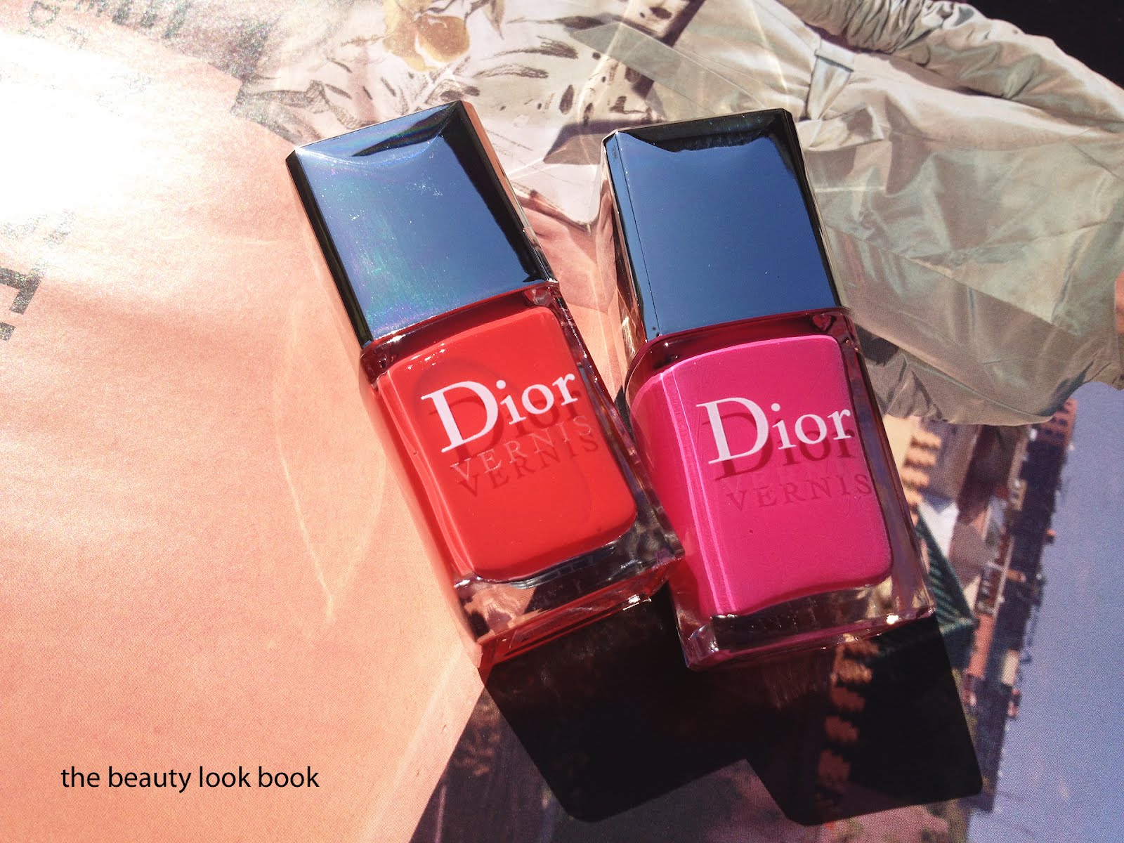
Dior Riviera 537 and Plaza 579 Nail Lacquers ($23 each) are both vibrant highly saturated creams. Riviera is a hot orange coral, while Plaza is a hot pink. These have a similar vibe to last summer’s Aloha and Paradise, but without the neon quality. I found both to be slightly thicker in texture which requires a slow and steady application. The chiseled brush is something I’m still trying to get used to. I find it easier to use with their metallics/shimmers, although it does apply nicely for creams. It has a very slight jelly finish – not quite as jelly-like as Laura Mercier’s though. The Diors have a bit more coverage.
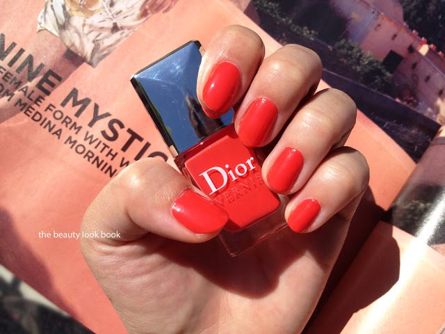
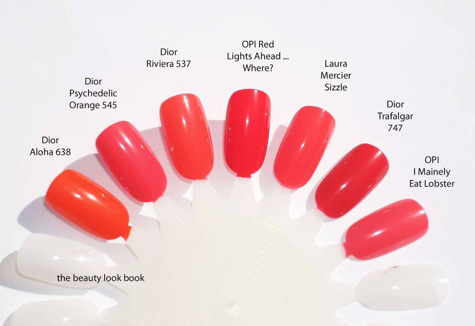
Riviera 537 is shown below. It’s very similar to other orange-corals. I wouldn’t call it a straight orange or coral, but it does lean more on the orangey side with a slight reddish undertone. Two coats and you get rich full coverage. Scroll down a little and you’ll see this isn’t all that unique in color. Still gorgeous and for those who don’t like Chanel’s formula, Dior’s is amazing.
Riviera Comparisons: Aloha, Psychedelic Orange(more pink, less orange), OPI Red Lights Ahead … Where? (a shade and a 1/2 darker), Laura Mercier Sizzle (closest match just the slightest bit deeper), Dior Trafalgar (more red and deeper), OPI I Mainely Eat Lobster
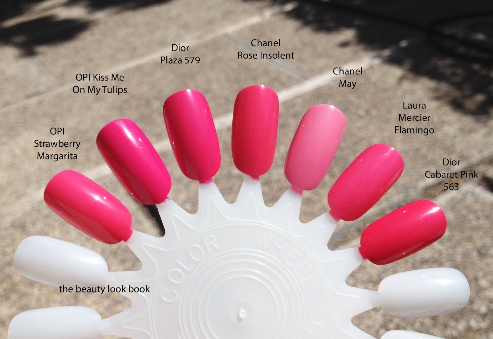
Plaza 579 is a hot pink. This color too is very similar to other releases from OPI and Chanel. The difference is in the undertone. Hard to detect on the color wheel or in the bottles. My recommendation would depend on what works best with your skintone. Some people want a warmer pink, others like a cooler pink.
Plaza comparisons: OPI Strawberry Margarita (slightly warmer than Plaza and 1/2 a shade lighter), OPI Kiss Me On the Tulips (significantly more blue), Chanel Rose Insolent (warmer in tone), Chanel May, Laura Mercier Flamingo (lighter in color), Dior Caberet Pink (slightly warmer)
Are either of these must-haves? I would say for me not really, but I really love these. If you’re new to nail polish and are looking for good brights, Dior’s are a good pick. The quality and finish of the polishes is amazing. It really is getting better and better by the season. If you’re on a budget looking for something less expensive, there are definitely many options from OPI. I really adore their brights, especially from their recent Holland collection.
Many of you have asked if I’ve tried the new Dior Addict Extremes yet. I purchased 2 but haven’t had a chance to wear or try them yet on the lips. After a few quick swipes at the counter, I think they look promising though! Another FAQ relates to the nail wheels used on the blog. The nail wheels were purchased from Sally’s Beauty Supply. I don’t know the name of the brand since I’ve thrown away the label/packaging. So far I’ve only seen 1 brand at the store. I think they also carry them online.
Have you seen the new Dior lip and nail items? Thoughts?
P.S. Dior Nail Polish fans who missed out on Saint Tropez Nail Polish last year will happy to know it’s out again!! Check your Nordstrom counters! I spotted it last week. No sign of the rest of the summer collection yet. (See Cafe Makeup’s and Steph’s Closet swatches from last year.)


