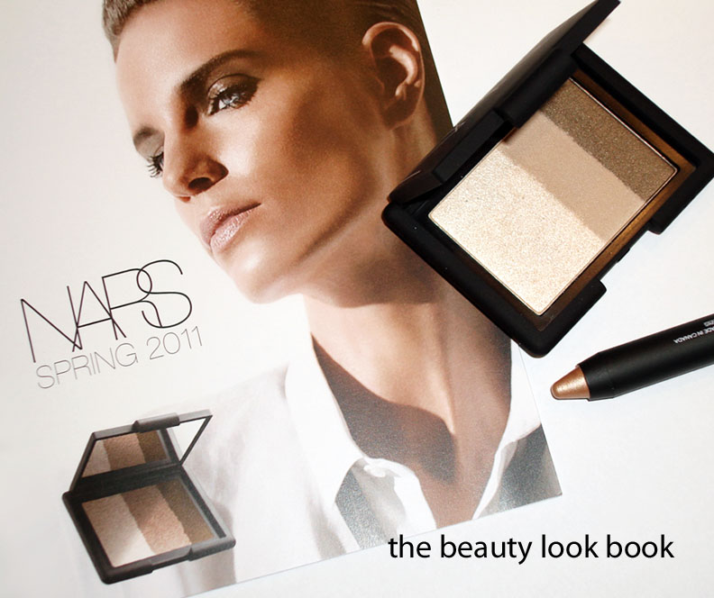
There’s something irresistible about a shimmery palette of neutral eyeshadows for me. I immediately jumped on board for the Calanque shadow trio and Hollywoodland soft touch shadow pencil from the NARS Spring 2011 collection. Perhaps I jumped a bit too soon for the trio, although I do love the new shadow pencil.
Calanque Trio Eyeshadow $45: To date, NARS has released 2 eyeshadow trios, this is the first one I’ve tried. I bought the Calanque Trio sight unseen – my Nordstrom NARS SA was out for the whole week so I used the Order Online Pickup Instore option since there was no tester unit in sight nor were there any NARS reps available. The colors in the palette are:
Pale soft champagne chunky sparkle
Neutral camel fawn with a satin finish
High shimmer bronze
I used this today over NARS Corfu Cream Shadow applying the powders on the eyes in layers with fingers. Step 1: Apply Corfu, Step 2: apply lightest sparkle first, camel second, Step 3: Apply a smudgy bronze liner, Step 4: Apply bronze with finger smudged and blended over the liner.
Thumbs up for the middle and darker shades. The camel color is soft and almost buttery like and blends easily. The darker shade is borderline khaki but has enough brown to be a beautiful unique shade. If you’re looking for that true minimalist look this is lovely.
Thumbs down for the poor layering quality. These colors really need to be layered over creams (cream base, cream shadow or smudgy liner). The powders in this trio do not layer well over each other. I normally layer and blend over creams anyways – these just take a bit more work. I recommend using a denser thicker brush to apply the colors by patting and softly blending. Thumbs down for the price as well (at least for the size and amount of product you get). The cons for me exceed the pros.
Amy from Café Makeup has a lovely review of Calanque for lighter skin. Her photos are phenomenal!
Hollywoodland Soft Touch Shadow Pencil ($24) is a gorgeous shimmery warm beige-gold. I have these pencils in Goddess (soft pink champagne) and Aigle Noir (black with gold sparkle) and like the lighter colors better. They are pretty when applied all over the lid alone, as a base, or just combined with a liner. Lasting power is medium for the lighter shades and non-existent for the darker ones (at least in my experience). Do they crease? I wish I could answer – the only cream product I have had crease on my monolids is NARS’s Eyeshadow Base (and yes I know it has no color, but it still showed crease lines on me). This pencil is gorgeous and right up my alley.
Calanque Comparisons (all swatched over UDPP, neutrals don’t show up well on my arm):
Hollywoodland Comparisons (over bare arm):
Overall – love the pencil, but I could have passed on the trio. I think the texture of Edie and Abyssinia singles are far superior to the Calanque trio. The colors are hard to dupe but not must-haves in my opinion. Perhaps it will take more experimenting for me to really like it. Surprise for those of you who think I’m way too obsessed with neutrals! I have found a neutral palette that is too neutral for me.
Applying with the fingers worked just fine this morning and lasted all day over the cream shadow, but it’s not ideal as the oils from my fingers are bound to ruin the surface texture. I thought I loved it earlier this morning when I applied it, I really liked the result, but after playing around with it more at home this evening with brushes I’ve become less in love, especially after comparing it to the soft texture of the NARS singles and duos. Again, I know this is supposed to give a minimalist effect – but All About Eve, Edie, Silk Road, Abyssinia & Nepal are all minimalist neutrals but give a better payoff enhancing the eyes much better with natural glowy highlights.
On the upside for NARS – you can see they are doing much better in their promotional campaigns with accurate photos! I received a spring flyer in the mail and you can see their photos are pretty darn good. Yay for better presentation to help us get a more realistic idea of what to expect before we get to see the real live product =)
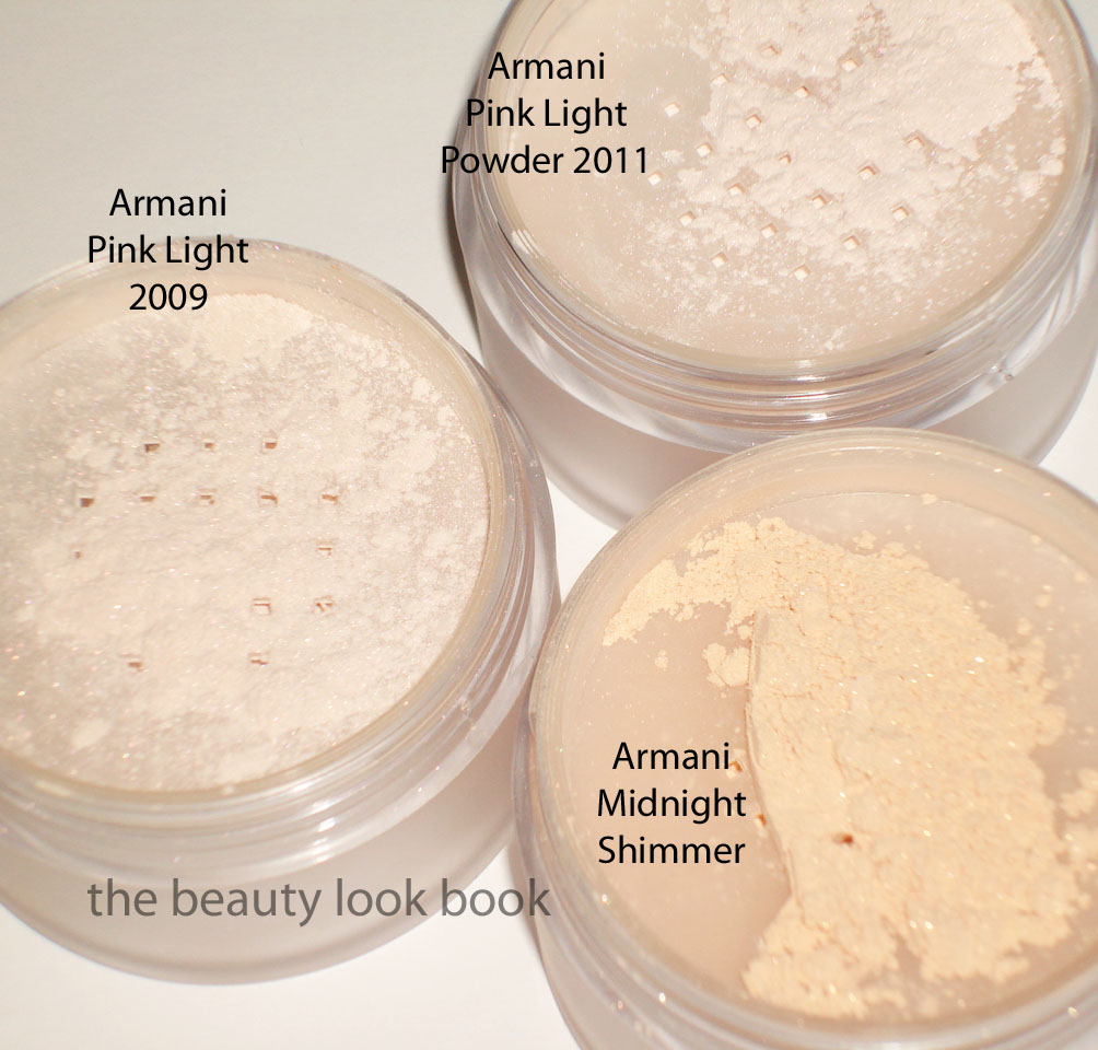
Photos, swatches and what I’m coordinating with the Armani Spring 2011 items. Picks include: Pink Light Micro-fil Powder for Spring 2011, Rouge d’Armani #518 and the new La Femme Bleue Blush Palette.
*Update Friday Evening* What a week! TGIF a million times over. The Spring 2011 Collection from Armani is lovely and fresh with soft feminine pinks for lips and cheeks. I viewed the eyeshadow quad as the misfit in the collection – lovely and vibrant and very original, just not for me. I ended up with the classic soft pinks – gorgeous and naturally flattering, but dupeable and a bit unoriginal. Photos are separated by Spring Product Picks first, followed by comparisons all the way at the bottom.
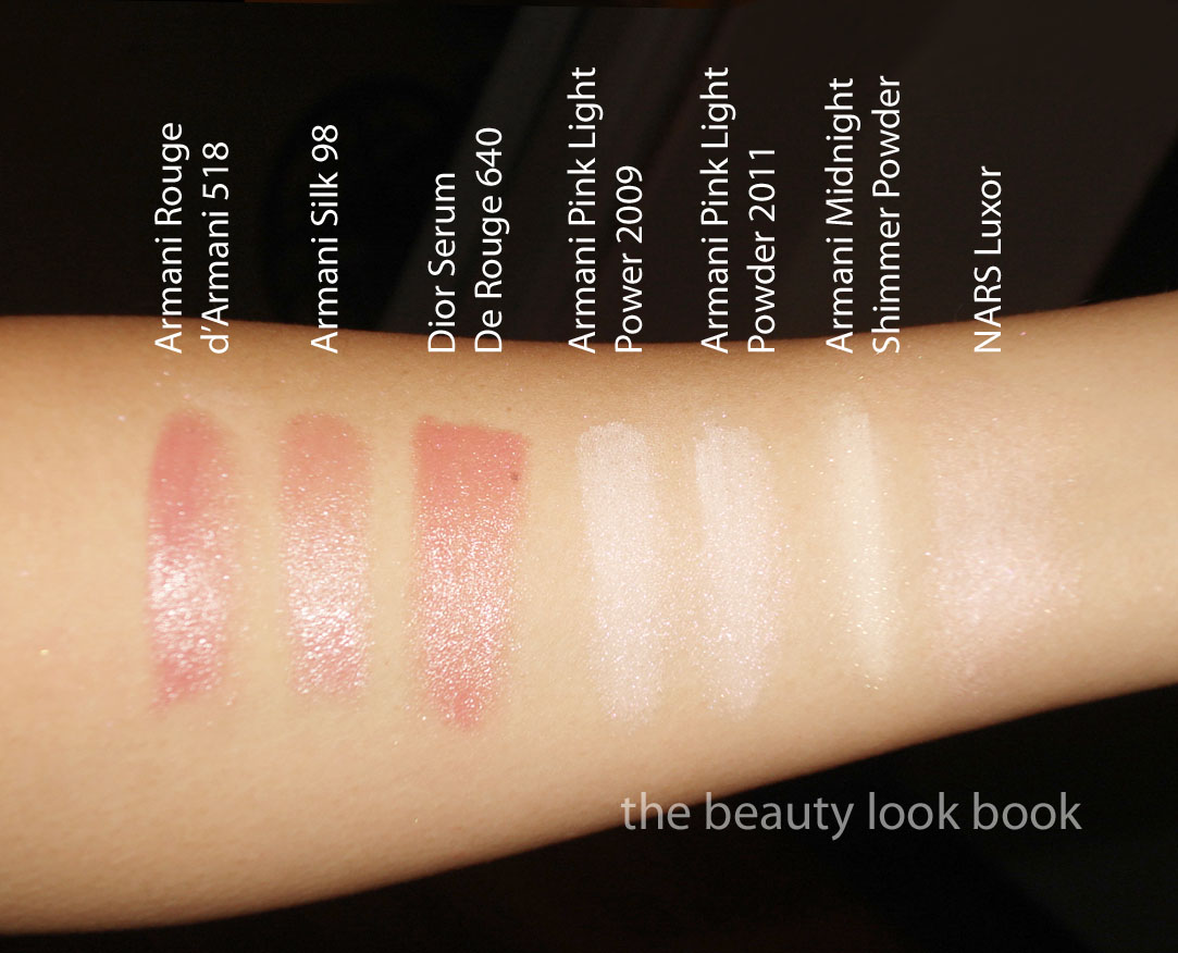
#518 Rouge d’Armani is extremely close to last spring’s Silk Lipstick #98 and Dior’s Serum de Rouge in 640. It’s a lovely soft cool pink but I found it applied a bit streaky and uneven. It took a bit of work layering combined with a brush for me to get an even application. I like the effect but it’s been done before. The texture is smooth and creamy and those who avoid Armani Lipsticks because of lack of staying power – the good news is the Rouge d’Armani formula does last longer. The finish is natural with a soft shine. No detectable scent.
The Spring 2011 blush was the item I was anticipating the most. I’m a huge fan of Armani blushes for their subtle natural finish. They are soft and light but noticeable on my skin and I love the way they look when layered over a soft cream highlighter. The Spring Blush is a soft powder pink with a luminous glow. There’s a soft silver sparkle that you can barely see. The finish of this blush is very natural. More comparisons down below.
I was a bit disappointed to find this season’s Pink Light Powder is the exact same as 2009’s Pink Light Powder. I think my sister will be happy to take this off my hands. If you missed out a couple years ago, definitely try to find a counter to try this. It’s like their Fluid Sheer #7 and NARS Luxor in a powder form. It’s a soft opalescent pink that is beautifully luminous and gives that glow from within effect. I love this layered over other blushes to add shimmer. It’s really lovely without being too sparkly or frosty. Can’t rave enough even though I wish this was slightly different than the previous release, it’s still an awesome product.
What I’m wearing with the Spring 2011 items today:
I’m venturing into newer territory with Guerlain this spring. I haven’t tried much from the line except a few seasonal items here and there over the past years. I’ve loved everything I have (quads, singles, rouge g) but for some reason still find their high prices and glitzy packaging a bit intimidating at times. However take the Twitter buzz and excitement from @naturalNchicmak and @CafeMakeup and combine it with the beautiful swatches from Yuki’s Lazy Channel and the cause-effect outcome is that I had to check it out.
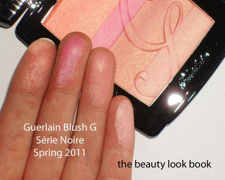
Série Noire Blush G, Rose Desir Rouge G, Ombré Éclat in L’instant D’une Ondee 186 & L’instant D’une Soupir 187
The most highly-anticipated item of this collection is the new Blush G, Série Noire ($67), which is labeled on the compact as the “Secret to a Healthy Glow.” It is indeed glowy with four layers of embossed shimmers. NaturalNChicMakeup has lovely swatches on her blog as well and really captures the shimmers in great detail (see her review here). She also has a great feature on the packaging.
So does it really give a healthy glow? Yes, but it’s almost too glowy. When all shades are swirled together it creates a vibrant golden-pink blush but at the same time it applies cool on my cheeks (even if it swatches warm on my arm). To me, this is like a cool-pink version of NARS Orgasm blush. It also applies similar in the sense that it’s very easy to go one swipe too heavy and end up looking sunburned. The pigment is a difficult thing to describe – the texture is finely milled and very soft which allows you to build up layers to suit your preference. I had a difficult time playing with it today, it either looked too sheer or too fake. I have a similar experience with Chanel Fresque which is a lovely light peach, but one stroke too many leaves me looking like a clown.
I personally prefer something a tad bit warmer on the skin like Bobbi Brown’s Antigua Illuminating Shimmer Powder, but the Guerlain Série Noire is unique and beautiful. I will simply need more practice and experiment with different blush brushes to see which one will give the best application.
All the lipsticks from the Guerlain Spring Collection are beautiful. Due to the high price tag, I decided to limit myself to just one, Rose Desir #71 ($47). It’s very sparkly on the back of the hand, but on the lips it sheers out and you get a healthy pink tint. Those concerned that these might be too sheer to show up need not worry. They definitely show up! They just have a glossy shine with has a soft texture. I couldn’t detect a scent and it feels nice on the lips. The packaging this spring is still the metal mirrored tube but this season’s color is black. I like it much better than the silver ones which tarnish easily.
The last items I wanted to feature include two of the new eyeshadow singles, Ombré Éclat in L’instant D’une Ondee 186 & L’instant D’une Soupir 187 ($36 each).
I’ve found the Guerlain single shadows to be hit and miss. Some are simply too sheer, but the ones that do have a good soft texture show up better. #186 is a cool dove-grey with very subtle shimmer. #187 is a high frost bronzey taupe.
Overall thoughts: This collection has the most beautiful packaging this season. My interest in Guerlain is growing as I start to explore their primers and foundations. Still the high price tag prevents me from putting this brand at the top of my list of things to check out. I personally have avoided the Guerlain counter (like the Cle de Peau counter) simply because I find the price points intimidating, but easy to justify with an eager sales associate there to help push you along. Still, the quality is excellent and formula/textures beautiful. The packaging is a true work of art down to the little details of the embossed powders and clever mirrored lipstick.
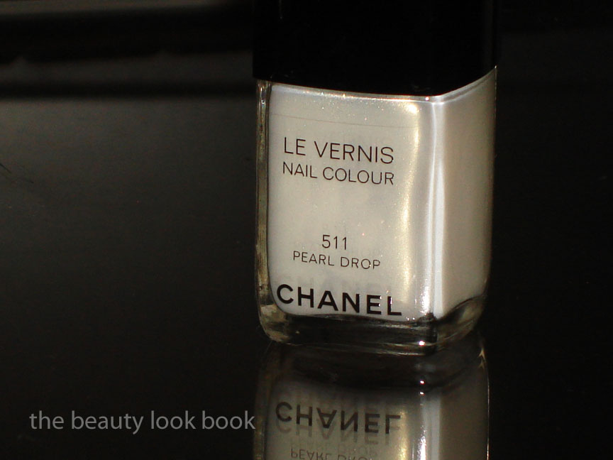
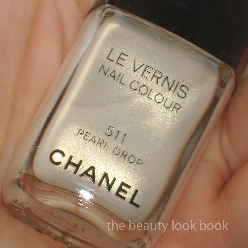
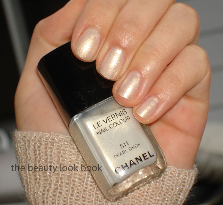
I had a girls’-day-out with my mother and sister the other day and we all treated ourselves to a mani/pedi together. My sister texted me earlier in the day, “can you bring a light red for mom?” so I brought 3 different shades of Chanel red for her to pick from. She ended up picking Dragon (one of my favorites). I decided to go light and give Chanel’s Pearl Drop #511 Le Vernis a try even though it is my least favorite color out of all the spring shades (see review and comparisonshere). After trying it out on a full manicure with 2 professionally applied coats, my heart softened a little for this color – but only in the slightest bit.
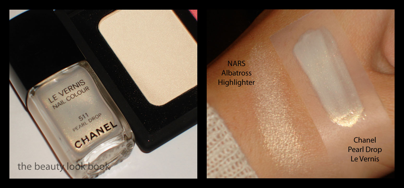
Chanel Pearl Drop #511 is a frost-finish white gold shimmer. The base is mostly white with a bit of pink and the shimmer is golden. It’s not the easiest shade to apply – the frost in this makes it easy to streak if not applied with a steady hand. Also, the gold shimmer makes this yellow, much like NARS Albatross Highlighting Powder. I already have yellow undertones being Asian so I feel like yellowy-golds aren’t the most flattering for my skintone. (If you’re wondering why I have Albatross even though I don’t like it, the compact was received as a gift.)
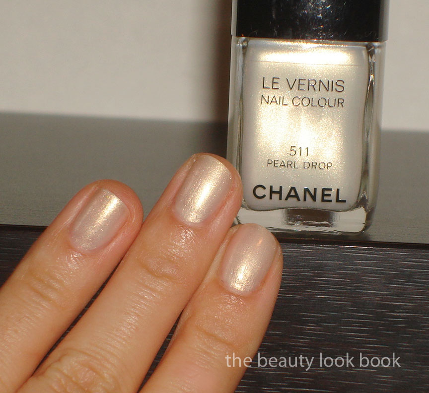
Now that I’ve ranted enough about it, you might wonder: is there anything good about this color? The answer is yes. I actually like this color in brighter lighting or natural light because it appears less yellow and more pearly. The coverage is decent, but you definitely need 2 coats with this color. It’s definitely a brightening color because it’s on the lighter side. Compared to actual pearls, Chanel’s Pearl Drop flashes more yellow-gold than most pearls do.
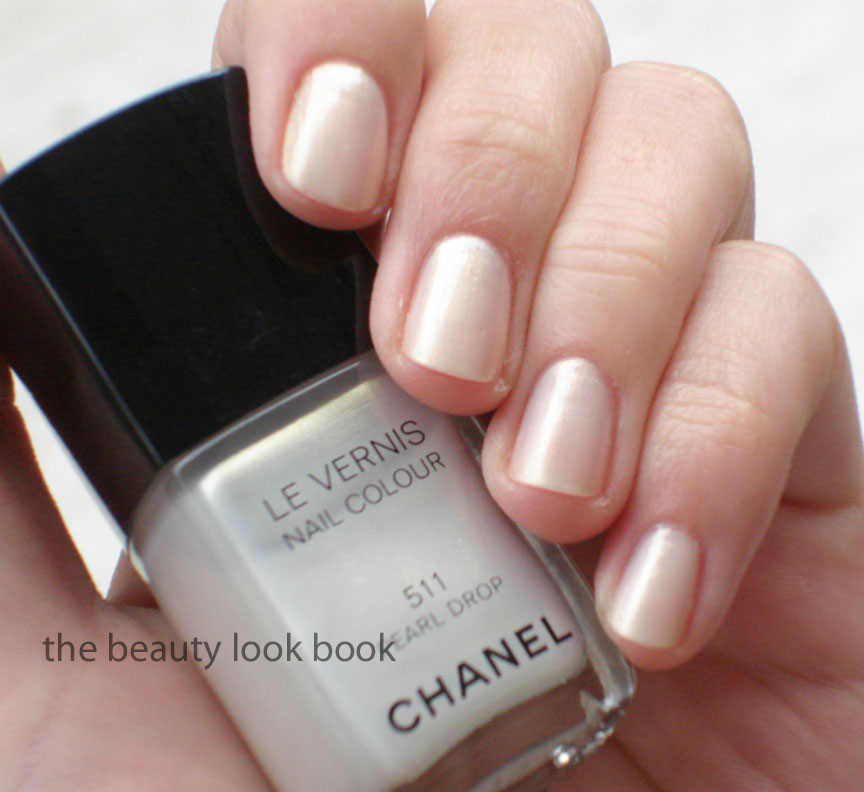
With flash:
Outdoors without flash:
My mom and sister were wowed by this color. Their comments were, “it matches your outfit perfectly!” So don’t write this off just because I’m not so wowed by it. Overall I think I am just picky when it comes to lighter colors. If you try this on at the counter, definitely try and apply 2 coats, not just one. My heart still belongs to Black Pearl (reviewed here).
I think it’s pretty but I don’t think it’s a must-have. You can probably get a similar effect with other colors but most will be more gold or more white. The streaks aren’t too visible at arm’s length. At this time I do not know if this is limited edition or not. I found mine at Nordstrom. By this time, most counters in the US should have the spring collection available for sale.
I scanned these from Maquia’s February 2011 issue. A few sneak peeks of what’s to come. Note, I cannot translate this so I won’t be able to answer questions about the products, your guess is as good as mine is. However, there are number indicators on some of the products which help me try to figure out the coordinating product number to name. Also note Maquia is a Japanese publication so I don’t know if the US will get all the items featured, I know in years past we haven’t, but I’m not sure about this year.
For more previews, check out Rouge Deluxe for her preview scans/photos from Biteki’s February 2011 publication. She’s great at finding out new information and has a number of sneak peek and links to previews of stuff coming out this spring.
At the moment I have no information about what else is coming out or when items will be released except for Chanel, MAC and Bobbi Brown: I do know the Bobbi Brown Pretty Powerful palettes have been released, I saw them at Nordstrom this morning but passed since they combine creams and powders in the same level for the palette – a BIG NO-NO for me.
Please do not republish these on message boards, blogs, websites or anywhere else as it took me some time to scan each in and format them to fit this blog. Thank you.
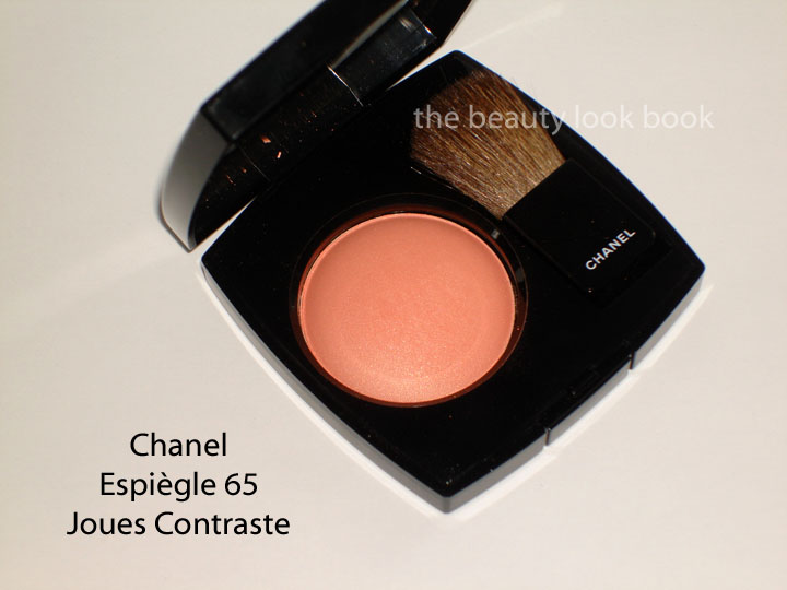
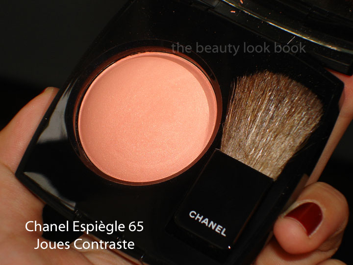
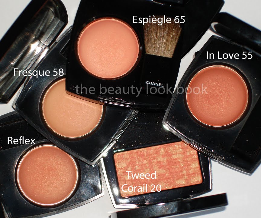
Chanel Joues Contraste in Espiègle #65 ($42) is a soft luminous light peach with gold shimmer and the slightest hint of pink. It gives a pretty soft peach glow and in the US is made in the regular US formula (instead of the Euro Baked style). What I like about this color is that it simply glows. It’s not a full matte – the shimmer is finely milled so it’s not frosty on the skin. I find it more wearable than In Love and Fresque – both of which I like, but find difficult to get just the right amount of color. Both end up looking either too sheer or too orangey if applied with one-too-many brush swipes.
* On the nails, still Chanel Rouge Fatal
If you have a lot of peaches, you might find this one unoriginal. It looks a bit boring in the pan and swiped on the fingers, but if you have a Chanel counter near you, give this a chance and try it on the face with a blush brush. I love that it brightens the face with a soft peachy glow and also like that it has a bit of pink to it to prevent it from looking orangey. I personally think it’s a must-have for any peach-blush lover. It’s naturally flattering that gives a beautiful glow without looking overly frosty or too gold like some peachy-golds are.
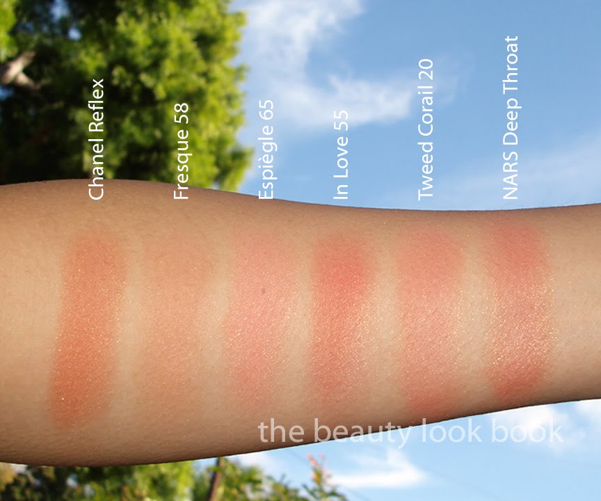
I have two sets of comparisons for you. I wasn’t planning on doing any comparisons but everytime I leave them out, I always get asked to do some. The first set shows Chanel Reflex, Fresque, In Love and Tweed Corail.
* Nars Deep Throat was added in the swatch above, but the product wasn’t photographed
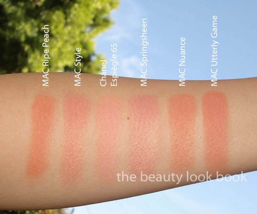
The second set compares the new Chanel Spring 2011 blush to MAC Ripe Peach, Nuance, Style, Springsheen, Utterly Game. Note that all the MAC shades are quite a bit more frosty and shimmery than the Chanel which has a nice glow. These were applied with a heavy hand.
One last view:
Overall: I love this, but I don’t think it’s a must-have. Still it has a beautiful finish that isn’t easily replicated in other brands or colors. It definitely leans towards peach but has just the right amount of pink to balance out the warm tones making it not-too-warm. Chanel.com currently does not have the “limited edition” indicator on their website for Espiègle #65 but I’m not 100% sure that I ever really trust any response on the LE factor.
If you don’t have many peaches in your collection, this is a great one to start with. Otherwise, if you already have a lot of peach – reshop your stash and wait for summer collections later in the year. Yes, I know spring isn’t even here and I’m already talking about summer. However, I’ve seen a sneak peek of what’s to come for spring and the blush colors seem to be blah this year for spring.


