Browsing Tag

Holiday 2011

Uncategorized

Dior Vernis in Silver Lake 071

November 12, 2011

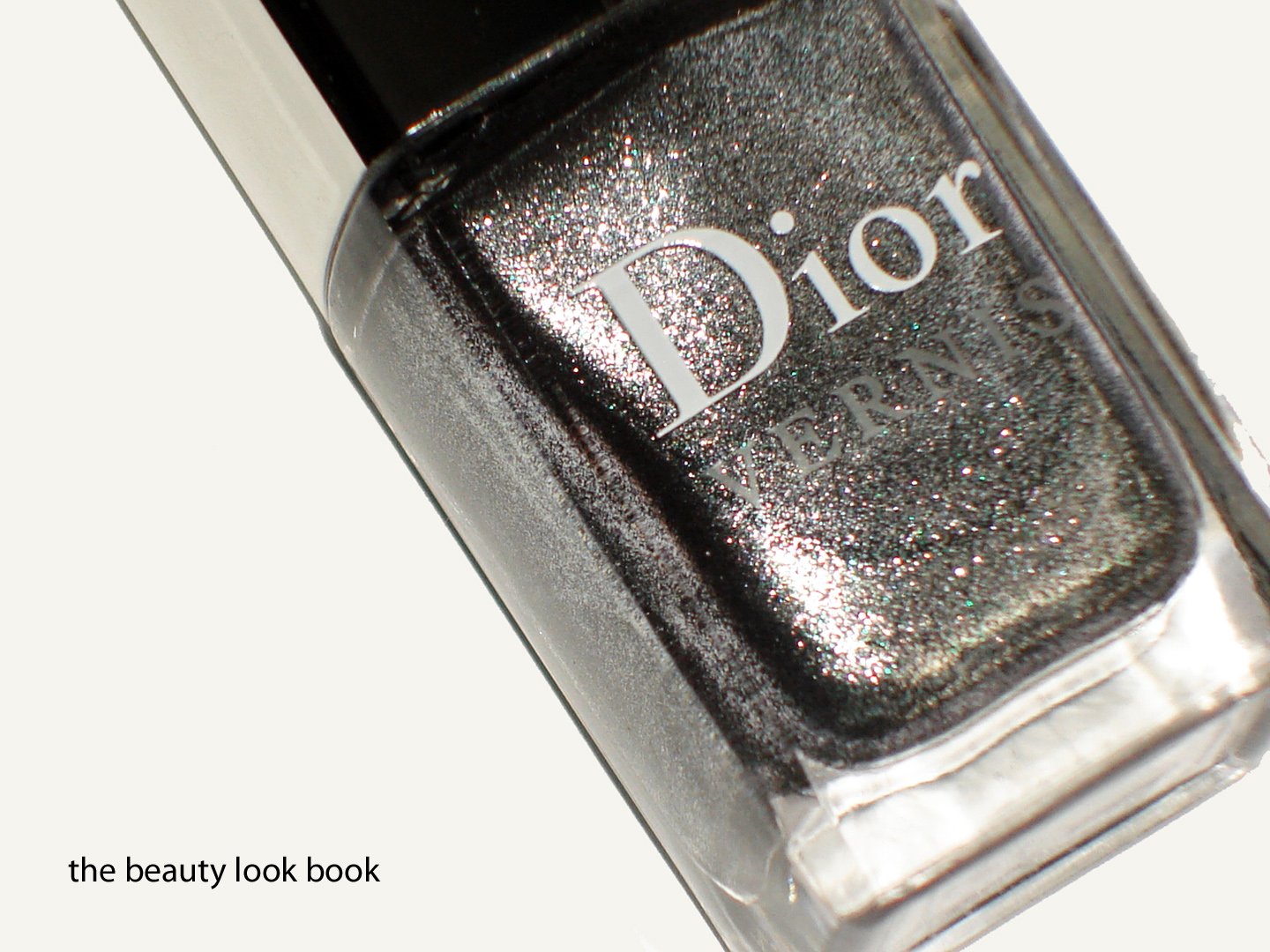
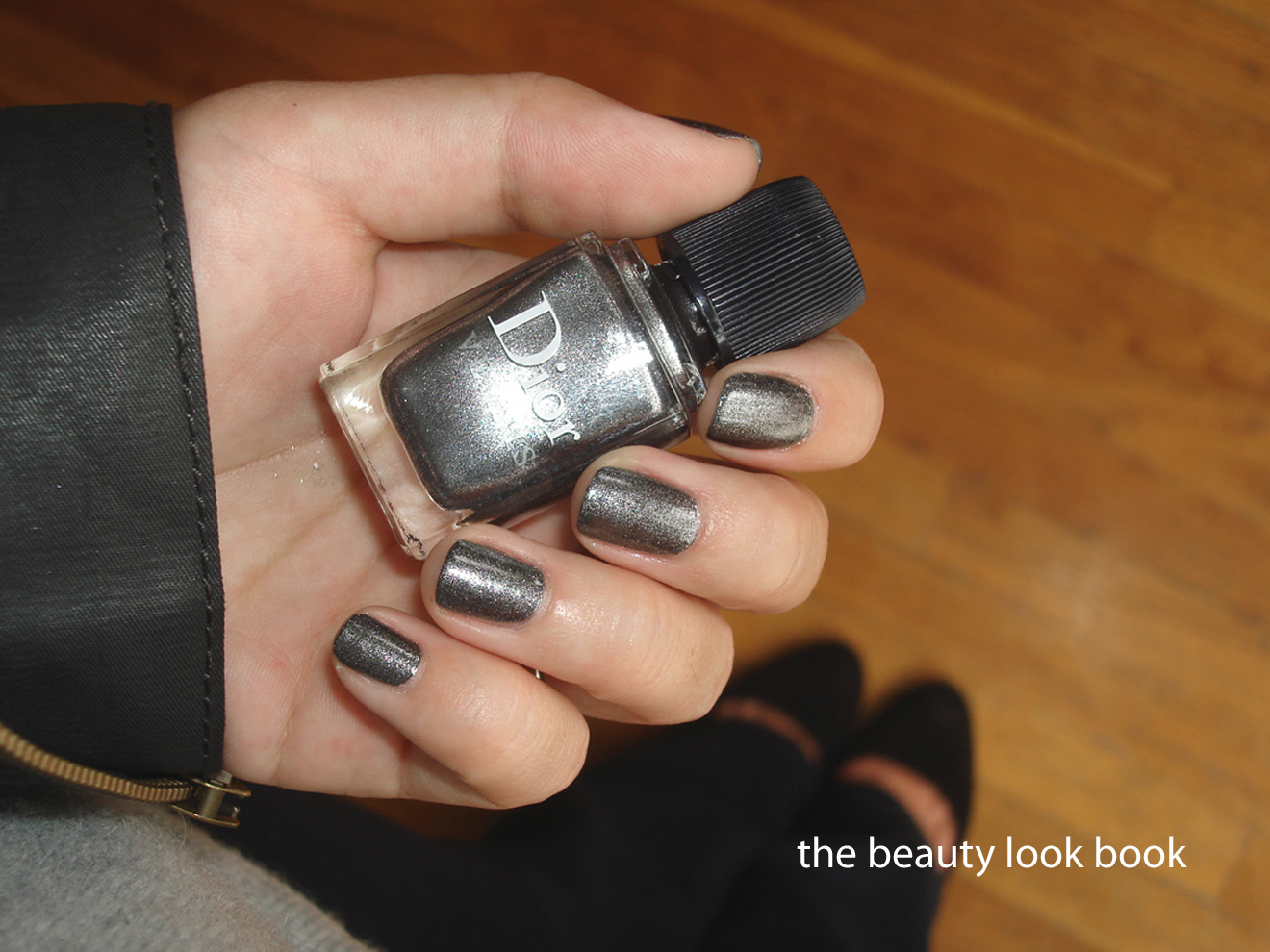
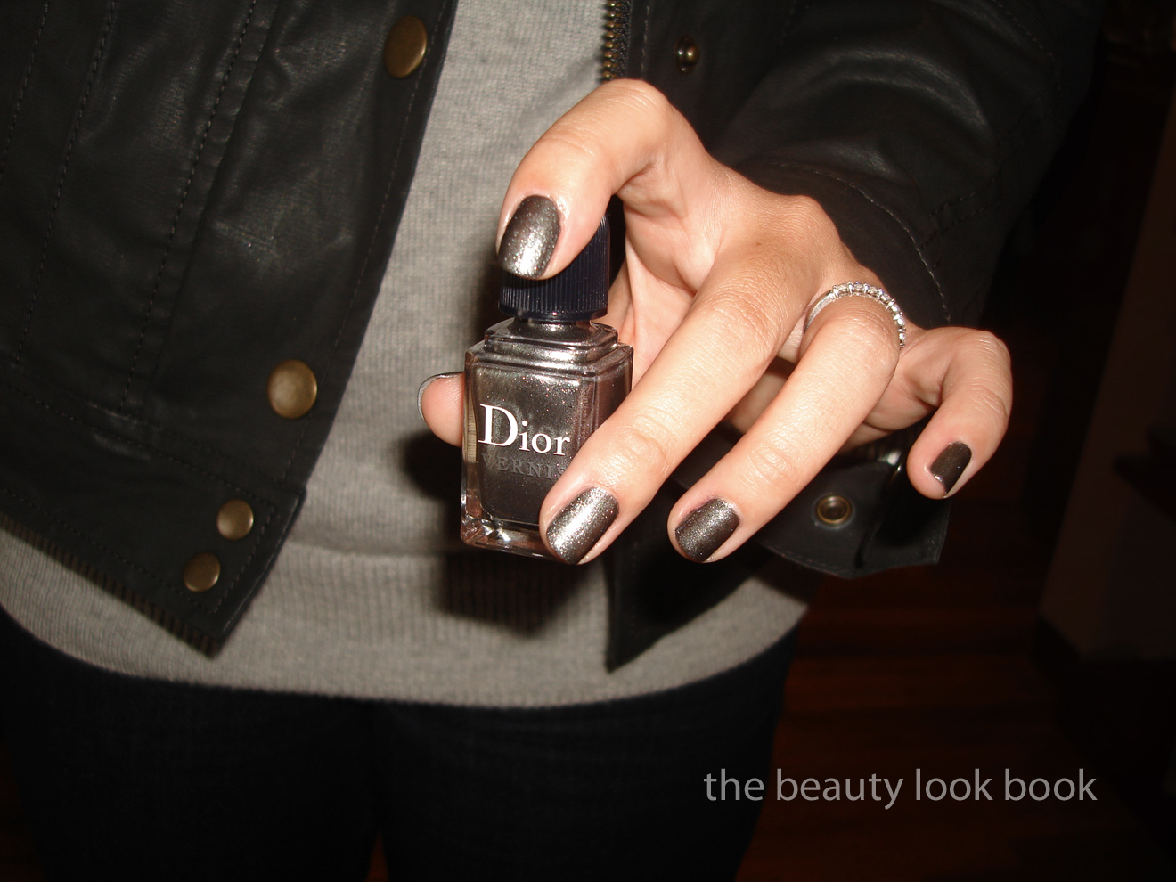
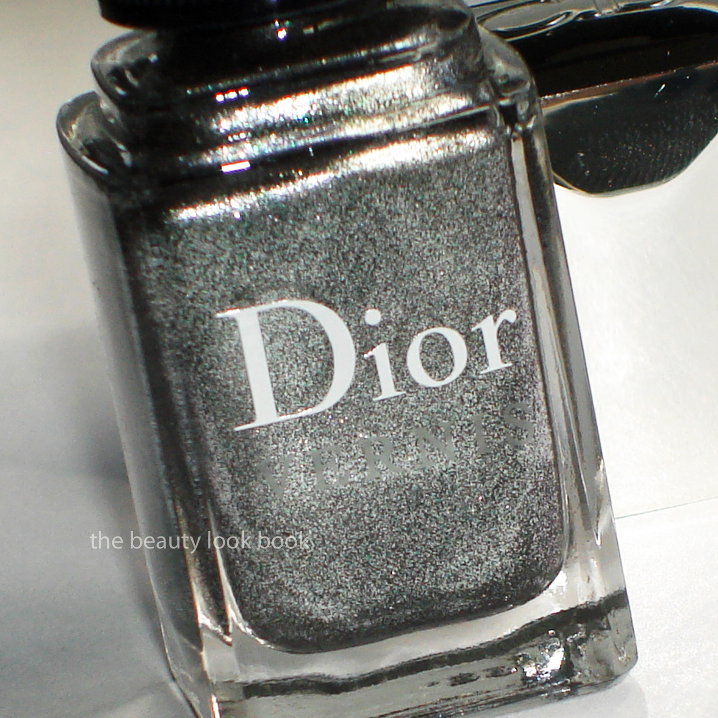
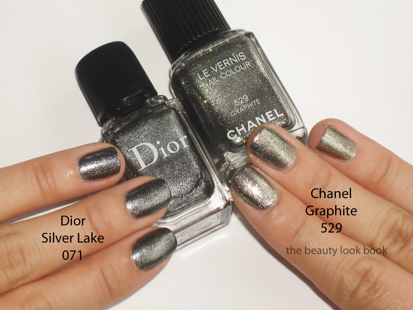
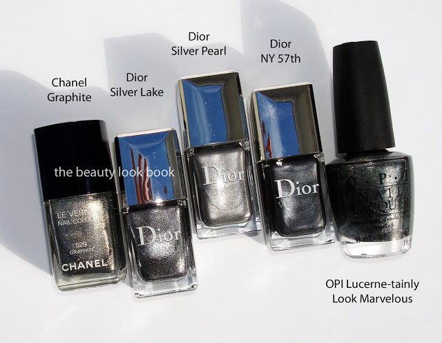
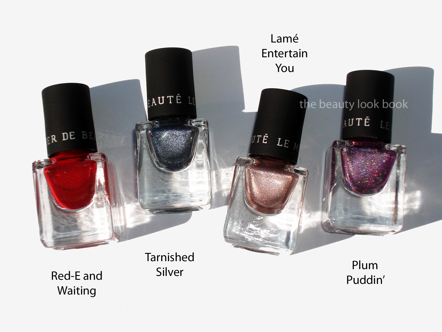
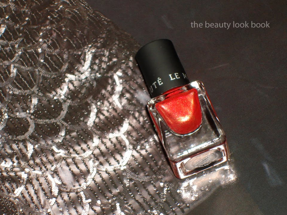
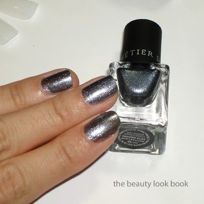
Dior has released a new edgy metallic silver nail polish called Silver Lake in celebration of Allure’s 20th Anniversary. It’s exclusive to Dior.com for $22. If you’re interested I suggest you act fast because it’s limited edition. Silver Lake 071 is a gorgeous complex silver loaded with all sorts of sparkles in shades of silver, gunmetal grey, blue and black. On the nails it’s a cooler-toned metallic with very slight blueish tones. I adore it. First question on everyone’s mind is: how does this compare to Chanel Graphite (click here for feature from last July)? It’s similar in the complexity but different in color. The Dior is more of a silver-gunmetal while the Chanel flashes more gold. I think they are different enough to justify owning both, but that’s just me. Scroll down below for the comparison details but first up are some more shots of Silver Lake. Applied with two coats below.

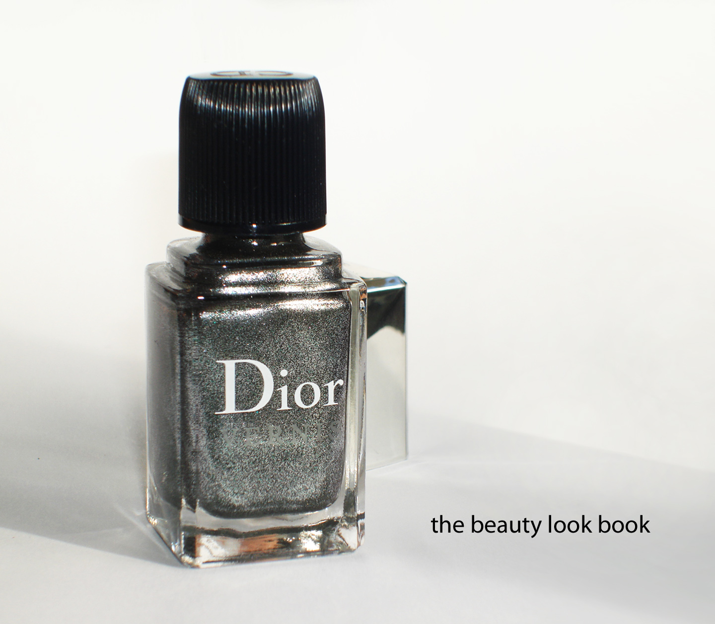
Dior Silver Lake 071

Dior Silver Lake versus Chanel Graphite

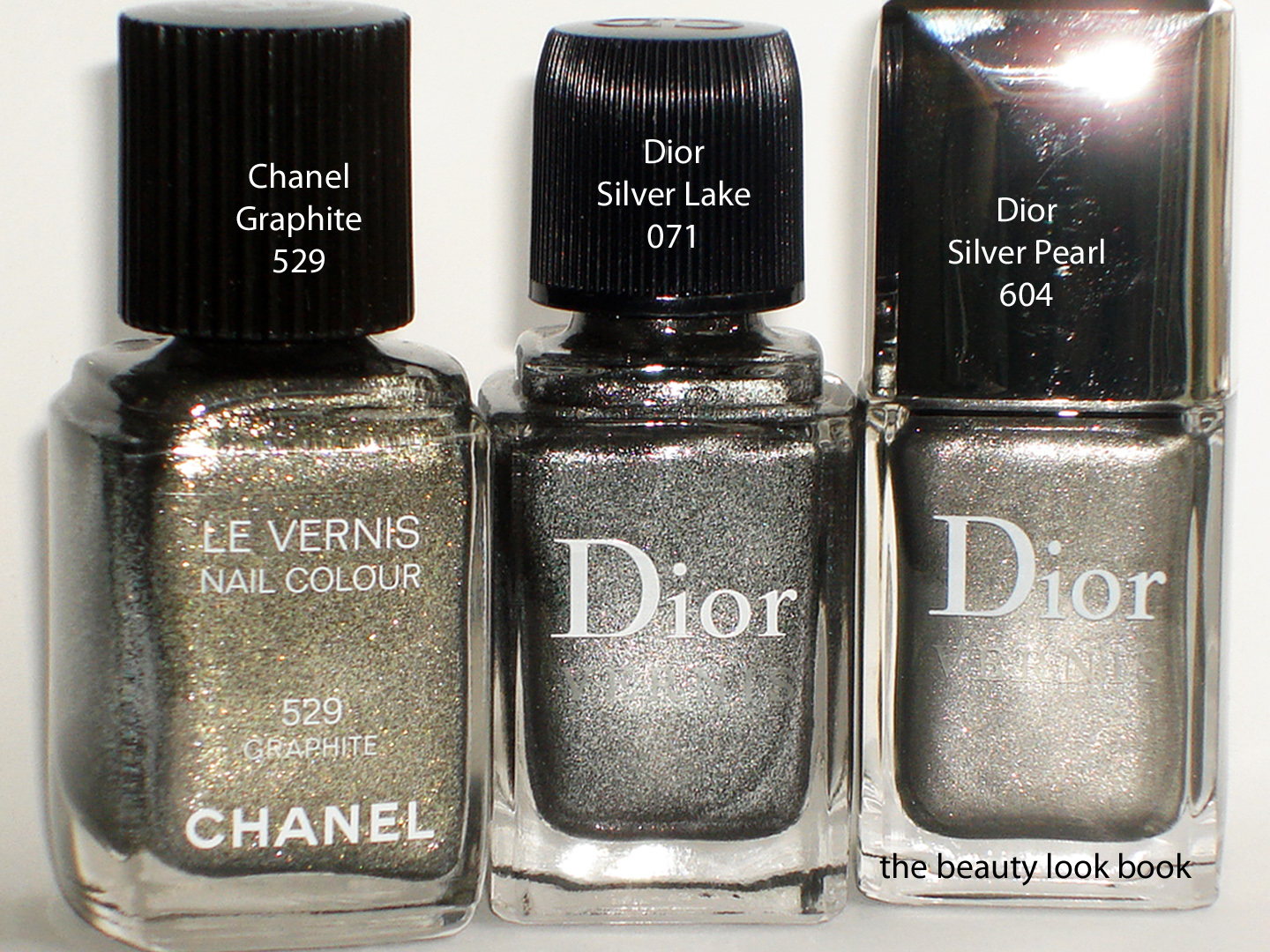
Close up comparison shots to a few other metallic silvers:
Chanel Graphite, Dior Silver Lake, Dior Silver Pearl

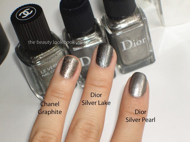
Comparisons to more shades: Chanel Graphite, Dior Silver Lake, Dior Silver Pearl,
Dior NY57th, OPI Lucerne-tainly Look Marvelous

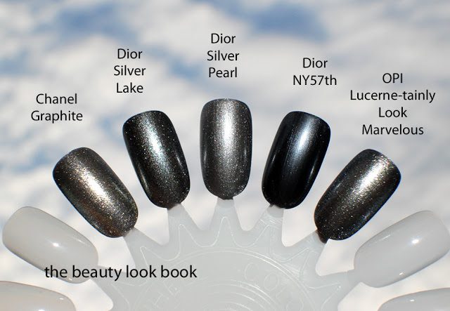
Bottom line: Yes, you can dupe it with other brands, but I love Dior’s quality and finish. The color is to die for and I prefer it over Chanel Graphite. Those new to my blog, welcome! Kindly do not leave links in the comments as I like to keep this an advertising-free and spam-free blog. Also note all content and photos are copyrighted which means I do not allow photos to be republished, hot-linked, or used on other websites, message boards, forums, blogs etc.
Also, check out Makeup Magpie for her lovely swatches and comparisons.
Uncategorized

Le Métier de Beauté Merry Metallics

November 12, 2011

Le Métier de Beauté has released two beautiful nail sets exclusive to Neiman Marcus this holiday. Each set is priced at $32 and contains four beautiful metallic nail polishes with a stunning leaf ornament. You can see Café Makeup for the press release details and Karla Sugar for swatches of both sets. I died for Merry Metallics and did not hesitate to buy an extra set as a gift. Each come in the signature mini Le Métier nail polish packaging, the colors:
  • Plum Puddin’ – a rich light plum spun with sheer silver and micro-glitter sparkles
  • Red-E and Waiting – a sheer red with metallic gold undertones
  • Tarnished Silver – a moonlit highly metallic platinum
  • Lamé Entertain You – a foiled shimmering copper with silver undertones

Red-E and Waiting is a beautiful rich red with a gold shimmer infused throughout. On the nail it applies beautifully and smoothly with just one coat although I did not really see any gold shimmer on the nail once applied. I adore this color. One simply cannot have enough reds.

Tarnished Silver is a highly metallic frosted platinum with blueish tones. It’s very similar to OPI Lucerne-Tainly Look Marvelous but more blue. I find it very festive and gorgeous for holiday. Even though the shimmer factor is high, it’s still office appropriate.

Lamé Entertain You is a beautiful complex coppery pink silver frost. It’s almost foiled-like when you apply it. I adore this one. I put it on as a full manicure and it lasted all week without any chips or tip wear. This color screams “holiday” to me. I want an eyeshadow this color.

Plum Puddin’ is the most fun color in the set but least office-appropriate (in my mind). Still for a glittering purple it’s more wearable than most other frosted purples. I’m not a glitter fan at all but the tiny micro-sparkles in this shade add a kick to make this fun to wear. I found the finish on the sheer side even with 2 coats.

One last photo since I know everyone likes comparisons. I found each shade in Merry Metallics unique but here are a few other shades to help you gauge the color based on varying computer screens and my skintone.

Bottom line: Totally gorgeous, festive, and fun. The Le Métier de Beauté StocKen Stuffer Nail Sets are $32 each and currently exclusive to Neiman Marcus. I found mine in-store. The set is worth every penny. Happy Friday to everyone!
Uncategorized

Edward Bess Berry Chic

November 9, 2011
Edward Bess Berry Chic is the more dramatic pink-plum palette option this season. I ordered this sight unseen and did not ask for descriptions in advance so I did not know what to expect. I will say that Back to Basics is my favorite of the two, but Berry Chic is surprisingly wearable even though it has pinks and warm plums for the eyes (which I normally cannot wear at all). The formulas/textures are the same as his other palette so I will mainly describe the colors. The cream products also have the same fig scent as his lipsticks, glosses and bronzer.
  • Lip/Cheek color – muted plum rose (not as bright as his Island Rose Compact Rouge)
  • Highlighter – pale shimmery pink (smoother in texture than his Back to Basics highlighter)
  • Eyeshadows -soft satin ivory, warm pink-tinged plum shimmer, warm pale bubblegum pink, warm brown shimmer (all very pigmented, layerable and easy to blend)
  • Glosses – top shade is a sheer cool light fuschia, bottom shade was a complete surprise, the top layer seemed to be slightly oxidized, the color once top layer was swiped was a warm rich plum-red (the bottom color is very pigmented)

I applied this over the weekend with slight hesitation. I think the eyecolors in this palette aren’t the easiest to pull off with ease. If you can wear warm pinks or plums (think NARS Kuala Lumpur or MAC Swish) then this will be pure love for you. I tend to avoid pure pinks or warm reds/burgandies/plums on the eyes because they give me that pink eye look. Edward Bess Berry Chic was surprisingly wearable and naturally flattering. I applied the eyeshadow colors by layering them (lightest to darkest). Still I will mainly stick to my safer neutrals for eyes. Perhaps the next time I visit the EB counter I will ask someone to show me how to use it. Bottom line: still undecided but trying to go outside my comfort zone.
LA/OC girls, not to sound like a broken record, but Edward will be in LA starting tomorrow for a week. If you can get to the Beverly Hills Neimans I highly recommend you try and visit.
Berry Chic retails for $75 and is available online at EdwardBess.com and instore at Bergdorf Goodman.
Uncategorized

Edward Bess Back to Basics and Berry Chic Palettes (Preview)

November 8, 2011

Edward Bess has released his first two palettes this holiday season ($75 each). Each palette comes in a black mirrored rectangular compact containing:
  • one lip/cheek color (similar to Compact Rouges)
  • one cream highlighter
  • four eyeshadows
  • two glosses
  • a double-ended brush (one side for creams other for shadows)
Back to Basics is the neutral-nudes option and Berry Chic is a palette which has cool-toned pink plum shades. The palettes are currently available at counter in-store at Bergdorf Goodman and also on EdwardBess.com. Here is the packaging:

A few close ups of the lips/cheeks:

Next up will be details, descriptions, reviews and swatches of each palette individually. Both were purchased sight-unseen. I’ve only been testing for a few days but initial thoughts are thumbs-up. All the cream items in this palette have the beautiful EB fig scent (I can’t smell anything from the shadows). I’ll be putting up my reviews as fast as I can. For more details you can call the Bergdorf Goodman Edward Bess counter (212) 872-8826.
Uncategorized

Edward Bess Quad Royale in South of France

November 5, 2011

Edward Bess has released some new things for holiday this month including his new South of France face quad and two palettes Berry Chic and Back to Basics (see sneak peek here and also featured on The Non-Blonde). These items literally just arrived at counters to Bergdorf Goodman and the palettes are now on EdwardBess.com. First up is a review on his newest Quad Royale palette, South of France 01 ($45 for .25 oz/7 g), a beautiful glowing opalescent powder quad of pale shimmers. The palette is inline with this year’s holiday theme of subtle-glow and has the slightest bit of overspray on top (at least it appeared so in my eyes). Underneath the powder is still shimmery and glowy and beautiful.  The colors from the top left clockwise are: soft cream beige-peach shimmer, soft nude pink, soft darker nude pink, subtle golden pink beige. When mixed together the effect is subtle and South of France gives the cheeks a soft pale opal pinkish glow that is understated but visible. Using the brush in the compact (soft and fluffy) gives an ultra sheer wash. I prefer using a denser blush brush (like Bobbi Brown’s or Shu Uemura’s) for a more visible look.
With the overspray and a high flash, the powder simply glows:
In direct sunlight, overspray removed, without the flash you can see the palette is subtle and not overly frosted. Here you can’t really see the glow well, but this gives you a good look at the base colors and undertones of each shade. Note that even with the overspray gone it still glows depending on the angle you hold this against the light.

See here this still glows when held at an angle:

Note this is swatched with a very heavy hand, on the face it’s lighter and more subdued:

Here are his two Quad Royale quads, South of France 01 (more pink and glowy) and Summer in Capri 03  (more contoured and peachy, reviewed a few days ago), I’m hoping there is a #02 to be released soon, maybe for spring?

Overall I adore. Subtle, refined, and absolute glowy perfection. These are sheerer than his cream highlighter in Sunlight so if you want something more visible I think you will be happier with the creams. I tried to think of something I could compare South of France to but just couldn’t. The mixture of gold, pearl, beige, pink in South of France is just gorgeous and the powder gives depth with the darker tones of the bottom left corner shade. Is this a must-have? Absolutely yes. If you asked me to choose between the two quads, I would not be able to, I need both.
Uncategorized

NARS Mandchourie Duo Eyeshadow

October 30, 2011
NARS Mandchourie Duo Eyeshadow ($33) is the new holiday duo from NARS this season. It’s an intensely smoky palette of olive-golden-indigo shimmer and a deep dark matte indigo blue. The colors are deep and dark and not for the faint of heart. Playing around with this resulted in a super smokey dramatic eye. I recommend having a paler neutral shimmer on hand to help tone down the intensity or to help blend harsh edges out. My favorite way to apply so far is to use Laura Mercier’s Platinum Metallic Creme Eyeshadow as a base and then apply the dark golden-olive shade on lids with a soft fluffy brush like MAC 217 then apply the darker matte navy with a pencil brush and smudge over the lash line upwards. The pigment in this duo is quite good, the matte shade can be a bit chalky on first swipe but layers well.

Compared to other NARS duos, Mandchourie is quite different and unique. Here are comparisons to Brumes, Dogon and Underworld. I also swatched Stila’s Diamond Lil to show how intense the NARS Mandchourie is by comparison.

Overall NARS Mandchourie is beautiful, unique, dramatic and intense. It’s lovely but a bit too dramatic for my taste – for everyday. For smokey eyes I will be reaching for NARS Brumes or Cordura more often since I feel those duos are easier to pull off although Mandchourie does go well with a softly bronzed cheek and pink lips. I’m one who prefers a natural smokey eye and while Mandchourie can easily be layered lightly for a less smokey look I still think it’s very intense (in a good way though!). It’s neutral enough in color so it won’t look too harsh on any skintone (at least in my mind). Some pure greys/blacks can look harsh and even some navy blues can look too contrasted on the skin. Mandchourie has an excellent blend of other colors in the undertone to make this intense/smokey/dramatic without being too harsh on the skin.

(For inquiring minds, the only other holiday items I picked from NARS were the multiple and highlighter but those are on presale for Nordstrom’s Trend Show, so they most likely will not be making an appearance on the blog for quite some time.) 

What do you think of NARS Mandchourie?
Uncategorized

Dior Couture Golds 554 Eyeshadow Palette

October 22, 2011

Dior Couture Golds 554 Quint ($59 for 6 g/ 0.21 oz) has finally been spotted in-store at Nordstrom. I’ve looked everywhere online for this and have yet to find it listed anywhere yet. It appears to have had a slight delay in release compared to the other items in this year’s holiday collection (much like last year’s Five Golds). If you’re looking online I suspect it might be a while before we see it show up. I’d recommend you call your Dior counter to see if it has arrived. Couture Golds is a particularly festive mix of golds and creams. The colors in the palette are all high frost/shimmer with the exception of the dark blackened-brown. I would describe the shades as (from top left going clockwise finishing at the center):
  • frosted ivory cream
  • frosted warm coppery gold
  • shimmery warm golden bronze with slight beigey tones
  • dark matte black-brown with gold flecks
  • sparkling yellow-gold champagne that has slightly chunky reflective particles

All have excellent color payoff, except for that dark color which I think needs a dense brush and quite a bit of packing on to get decent pigment. All together Couture Golds has a beautiful glowy quality that is perfect for holiday.

Is this a must-have? My initial thoughts were “yes! this is the best palette of the season yet!” I still feel that last year’s holiday quint, Five Golds wins hands down, but I did think this year’s Couture Golds was a huge thumbs up until I swatched it on the arm and thought it looked oddly familiar – like Endless Shine. Here is Couture Golds with some comparisons and swatches. You can judge for yourself on the similarities. There are differences in sparkle quality and undertone. Perhaps they just look identical because of my skintone. For me, they are too close for comfort. After seeing them swatched side-by-side I couldn’t help but feel a bit let down thinking this was simply a re-hash or a previously released quint. I couldn’t fit everything on one arm, so swatches are grouped into twos.

Overall, I still feel that Couture Golds is the best eye palette of the holiday season. The sparking champagne in the center is so gorgeous with the chunky reflective particles. I prefer it over Endless Shine (even though they are very similar) so I can justify keeping it instead of re-gifting it to someone else. Will I be using Couture Golds this season? Absolutely yes. I just feel it could have been a bit more different than something previously released by the same brand.
Have you seen Dior Holiday in person? What were your thoughts?